Results 1 to 13 of 13
Thread: Can I let go now?
-
30th September 2019, 08:08 PM #1

- Join Date
- Feb 2016
- Location
- Cambridge, UK
- Posts
- 928
- Real Name
- David
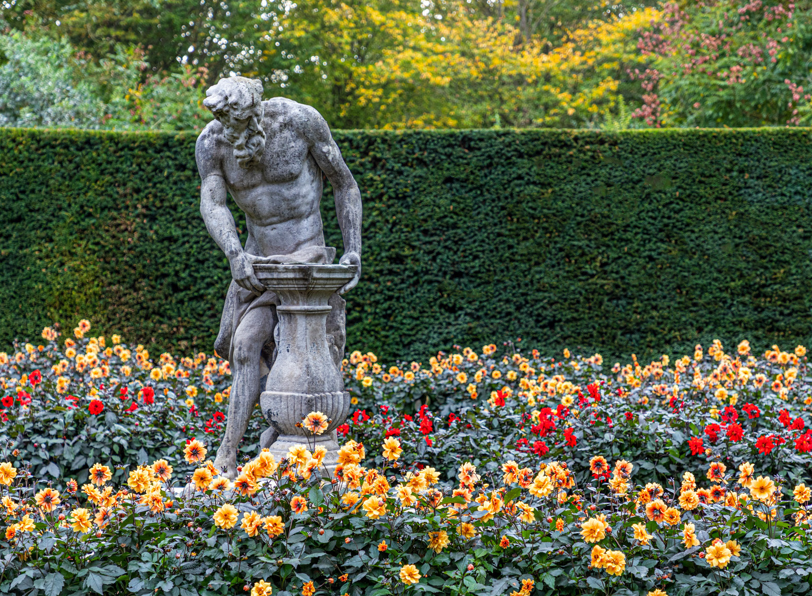
Can I let go now?
-
30th September 2019, 08:40 PM #2

- Join Date
- Jan 2010
- Location
- Central Texas, USA
- Posts
- 1,165
Re: Can I let go now?
Love the caption. Clever.
-
30th September 2019, 09:56 PM #3
Re: Can I let go now?
bit to the left
-
30th September 2019, 10:55 PM #4
Re: Can I let go now?
Nicely seen and captured.
-
1st October 2019, 06:43 PM #5

- Join Date
- Jan 2009
- Location
- South Devon, UK
- Posts
- 14,641
Re: Can I let go now?
The flowers are a bit over exposed/saturated, particularly the reds. But perfection probably wasn't achievable with just one exposure and such a wide range of light levels.
Do you need so much of the flowers? I wonder about losing a bit from the right side and going to something like 5 x 4 ratio?
-
1st October 2019, 10:13 PM #6

- Join Date
- Feb 2016
- Location
- Cambridge, UK
- Posts
- 928
- Real Name
- David
Re: Can I let go now?
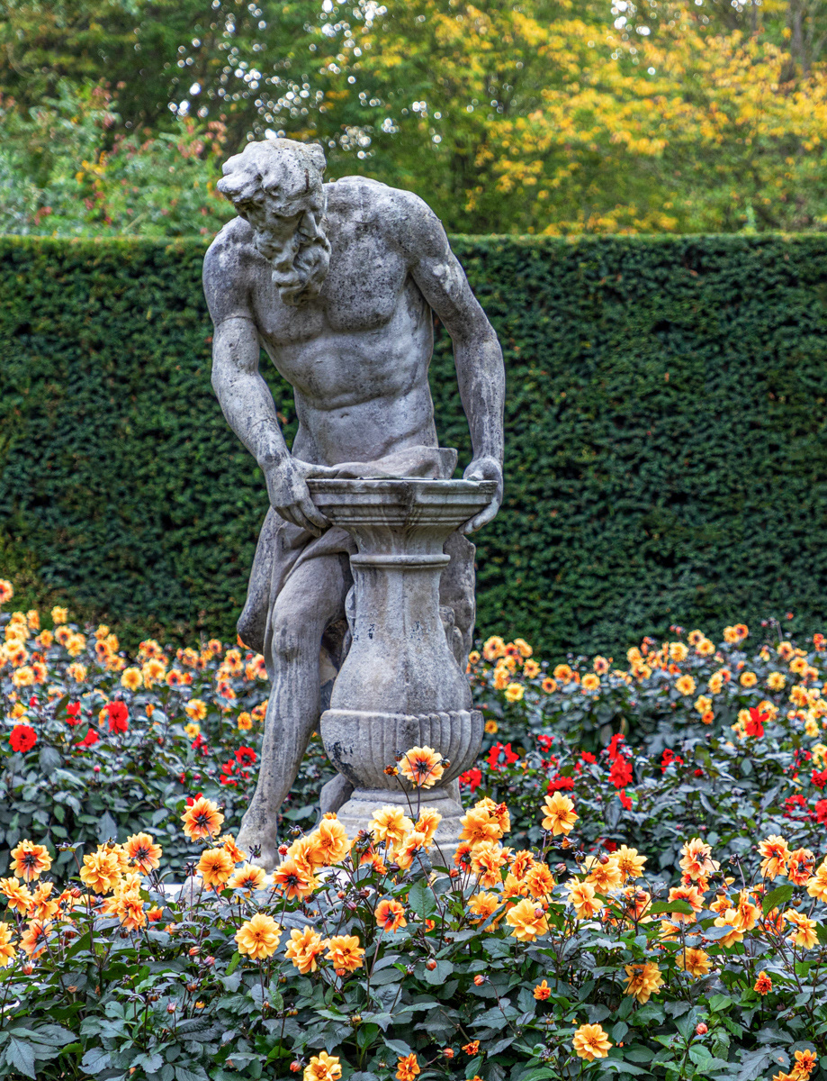
Thank you for your thoughts Geoff. Here it is in portrait format with the brown sections of the hedge cloned to be green and some adjustment to the flowers, too:

The crop is getting a bit severe and affecting the quality of the image (or maybe my editing is the root cause), and the bright spots over the head of the sculpture are becoming more prominent and distracting as is the OOF hedge. The flowers have not changed much. On balance, I think I prefer the previous version.
-
1st October 2019, 11:07 PM #7
Re: Can I let go now?
I think the biggest problem with the image is the top of the hedge in the background cuts right trough his shoulders. if one were doing a portrait shoot you would never pick such a background.
I am well aware that the physical limitations of the shooting position means that unless David carries a step ladder in his camera bag he is never going to do this subject justice. A very common theme I find again and again with my own photos.
-
1st October 2019, 11:21 PM #8

- Join Date
- Feb 2012
- Location
- Texas
- Posts
- 6,956
- Real Name
- Ted
Re: Can I let go now?
-
2nd October 2019, 09:17 AM #9
Re: Can I let go now?
Nicely done Ted.
-
2nd October 2019, 10:42 AM #10

- Join Date
- Feb 2016
- Location
- Cambridge, UK
- Posts
- 928
- Real Name
- David
Re: Can I let go now?
Peter - I agree the hedge line is not ideal, but it is part of the garden scene and maybe, without it, a full height hedge would be quite a heavy background. As you say, we have to work within the limitations we encounter.
Ted - In the original landscape format the flowers were like a carpet and part of the garden context. In the portrait format the flowers become less important. In the versions I have posted I had tried to add some "pop" to the colours of the flowers; but perhaps I should have left them alone, then they would be more like your versions albeit without the 3D effect! Thank you for showing what can be done and how.
-
2nd October 2019, 12:45 PM #11

- Join Date
- Feb 2012
- Location
- Texas
- Posts
- 6,956
- Real Name
- Ted
-
2nd October 2019, 12:54 PM #12

- Join Date
- Feb 2012
- Location
- Texas
- Posts
- 6,956
- Real Name
- Ted
Re: Can I let go now?
Thanks, I understand, David.
Yes the flower colors, although not blown, were quite highly saturated (As a pedant should, I peeked at the saturation layer extracted in the GIMP).In the versions I have posted I had tried to add some "pop" to the colours of the flowers; but perhaps I should have left them alone, then they would be more like your versions albeit without the 3D effect!...
I found it interesting how color tends to draw the eye away from a neutral subject; playing with the saturation almost seemed to move the statue fore and aft.
Thanks for posting a technically interesting image.
-
2nd October 2019, 03:59 PM #13

 Helpful Posts:

 Reply With Quote


