Results 1 to 15 of 15
Thread: Red, White & Black
-
15th December 2019, 03:44 PM #1

- Join Date
- Apr 2019
- Location
- NYC / North Fl
- Posts
- 1,163
- Real Name
- Daniel
Red, White & Black
-
15th December 2019, 04:34 PM #2
Re: Red, White & Black
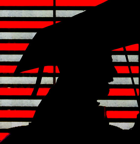
Conceptually, it is an interesting shot, but from a technical and compositional standpoint, it's not working all that well for me.
Let's start on the compositional side. The human visual system is primed to see bright areas of a scene and high contrast areas of a scene, so our eyes will tend to wander over to the bright and high contrast parts of the image on the left hand side. It takes effort to pull back to your subject. As you have posted this in the People & Pets thread, my assumption is that the person is your subject. A harder crop to eliminate some of the distractions on the left hand side would be where I would look.
Another common consideration in photography involving people (and animals or anything else that could be moving) is to allow more visual space in the direction that the person is looking towards to give the image more visual balance.
Both of these issues suggest a fairly hard crop of the material on the left hand side would be worth considering. Perhaps something along these lines.

The second is a technical consideration. This is a high dynamic range image and you have lost all shadow detail in the silhouette. Once you have gone black, you have lost all data in those areas of the image and there is absolutely no subtlety in that part of the shot. The blue shown in this screen shot taken of this image using Adobe Camera Raw shows where this occurs.

Is there a possibility that the scene had more shadow detail? The whites look quite gray, so that suggests the overall scene was a bit underexposed and looking at the histogram, I do see that you have a bit of headroom on the right hand side. I'm not sure it would have been enough, but some texture in the dark areas would be good.
-
15th December 2019, 05:22 PM #3
Re: Red, White & Black
I love this. Very fun, interesting, different.
-
15th December 2019, 07:41 PM #4

- Join Date
- Apr 2019
- Location
- NYC / North Fl
- Posts
- 1,163
- Real Name
- Daniel
Re: Red, White & Black
Thank you Manfred for your analysis.
-
15th December 2019, 07:47 PM #5

- Join Date
- Apr 2019
- Location
- NYC / North Fl
- Posts
- 1,163
- Real Name
- Daniel
-
15th December 2019, 08:50 PM #6
Re: Red, White & Black
I think this is a nice image. I prefer the original to Manfred's crop; I think the lines are more interesting and more balanced. I personally don't mind the blacked out area. It just makes it a silhouette, which I think is fine.
-
15th December 2019, 10:04 PM #7
-
15th December 2019, 11:09 PM #8

- Join Date
- Feb 2016
- Location
- Cambridge, UK
- Posts
- 928
- Real Name
- David
Re: Red, White & Black
-
16th December 2019, 04:19 PM #9
Re: Red, White & Black
I personnaly prefer the original but may be the idea to eliminate black RH part is possible too.
-
16th December 2019, 05:11 PM #10
Re: Red, White & Black
nice photo i agree with crop Manfred
-
16th December 2019, 05:40 PM #11

- Join Date
- Jan 2015
- Location
- Maryland , U.S.
- Posts
- 1,226
- Real Name
- raymond
Re: Red, White & Black
It's all about creativity and the attempt to convey,interesting and I needed some time to digest , but indeed I like it as you presented it. Albeit Manfred's crop does add a great dimension of movement.
-
16th December 2019, 06:24 PM #12

- Join Date
- Apr 2019
- Location
- NYC / North Fl
- Posts
- 1,163
- Real Name
- Daniel
Re: Red, White & Black
I do like David's crop. It's neat, compact, and balanced. I prefer the original with the blackband. The blackband creates an element of interest. I think it would cause the viewer to pause a moment longer.
Last edited by escape; 16th December 2019 at 06:32 PM.
-
17th December 2019, 08:49 AM #13
-
17th December 2019, 01:12 PM #14

- Join Date
- Apr 2019
- Location
- NYC / North Fl
- Posts
- 1,163
- Real Name
- Daniel
Re: Red, White & Black
We all view photos differently. A crop would alter how I see the photo. I view it metaphorically.
The flag in the background is equally divided by a vertical line. The times we are in. The silhouette has traveled some distance in adverse weather. With mouth gaping open, he is on the verge of entering the black band, the unknown with its endless posibilities. (I think I just spun a pretty good yarn there.)
-
17th December 2019, 05:58 PM #15

- Join Date
- Apr 2019
- Location
- NYC / North Fl
- Posts
- 1,163
- Real Name
- Daniel
Re: Red, White & Black
Another one.[IMG]

IMG_6645-3 by pongo now, on Flickr[/IMG]

 Helpful Posts:

 Reply With Quote


