Results 1 to 10 of 10
Thread: Cyclist up High
-
11th March 2020, 10:05 PM #1

- Join Date
- Nov 2016
- Location
- ex Auckland, now Porirua, New Zealand
- Posts
- 957
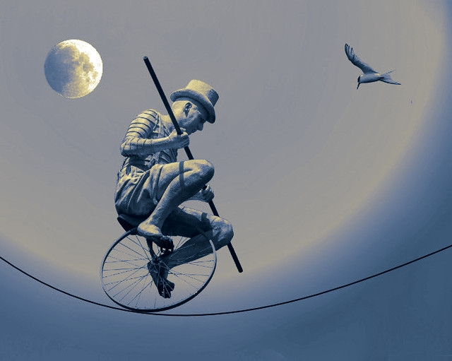
Cyclist up High
-
12th March 2020, 01:07 AM #2
Re: Cyclist up High
Lovely work Jim. These are always a lot of fun to do and a great learning experience in understanding light and shadows.
With your choice of materials, you have eliminated one of the major challenges in doing a photocomposite; getting the shadows right so that the images are anchored properly. As they are "floating" in the air, this is less important.
On the other hand, the lighting on the unicyclist and the bird don't quite line up. Look at the shadows and the light source that would light the subjects that way.
-
12th March 2020, 01:33 AM #3
Re: Cyclist up High
Liked it; since it is moonlight, B &W will work even better?
-
12th March 2020, 03:32 AM #4
-
13th March 2020, 03:50 AM #5
-
13th March 2020, 08:11 AM #6
Re: Cyclist up High
Jim , sorry for using your using your image, to clarify the point Manfred sir has pointed out
-
13th March 2020, 01:04 PM #7
Re: Cyclist up High
Your point seems to be that you feel that the blue colours are a distraction and eliminating that gives a stronger image.
I tend to stick with a pure black and white when I do monochrome images, but will occasionally go monochrome with a some other colour to replace the white when I want to establish a particular mood or feel to the scene. When someone else does this, I generally take that into account when looking at the image; the blue tone are a deliberate move on Jim's and he wanted to give his image a cool tone.
The question I would ask is whether or not that this was an appropriate approach and here I would say that in my view Jim's approach gives us a bit more context / mood regarding the image he has created. The blue suggests Jim wanted us to view this shot in a cooler toned context; like the light that would occur during blue hour or in a theatrical context when the main components are lit with blue and cyan gelled lights.
To demonstrate this, let me go warm toned (replace the blues and cyans with their complementary colours; yellow and red) and it gives the image a completely different context.

This is the opposite of Jim's approach and gives the shot a different look and feel. Going pure B&W loses this and in my opinion we have lost a significant element in what the photographer is trying to say to us.
-
13th March 2020, 01:38 PM #8
Re: Cyclist up High
That was my humble thought only.....
-
13th March 2020, 07:23 PM #9
Re: Cyclist up High
And that is important. There is no right or wrong answer or approach here; the important part is getting an image that you like.
When it comes to B&W versus colour, there are a lot of photographers who tend to prefer one over the other. Donald MacKenzie works pretty well exclusively in B&W whereas I spend most of my time doing colour images; although there are times where I will go with B&W or monochrome work.
-
13th March 2020, 08:37 PM #10

- Join Date
- Feb 2012
- Location
- Texas
- Posts
- 6,956
- Real Name
- Ted
Re: Cyclist up High
Namaste and thanks for the B&W which I used to play with the color-toning in RawTherapee.
While realizing that Manfred's edit was for illustration, I prefer to apply light tints to a black & white image, color dependent on luminosity:

I find color-toning very effective when applied to an IR-saved-as-B&W image. (After a while, "pure" IR can get boring). With color-toning, one can for example apply green or brown to darks, some funny color to midtones e.g. sky and an outrageous color like red or magenta to highlights e.g. foliage.Last edited by xpatUSA; 13th March 2020 at 08:50 PM.

 Helpful Posts:

 Reply With Quote


