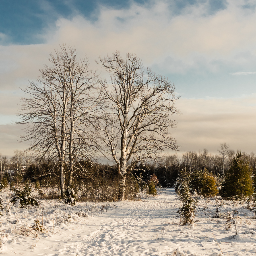
I took this photo late in the afternoon towards the end of december last year. It was, as far as I remember, the first time that I shot a landscape with the intention of framing it in a square format. I am pleased with the result and now that I have more time on my hand, I plan to print it as large as my printer will allow.
I am trying to decide if I should lighten up the band of dark trees in the background to bring out more details in that area. I am also toying with the idea of cooling the white balance slightly before printing the picture. I would welcome your opinions on these or any other point that you care to provide.
André
Results 1 to 9 of 9
Thread: Winter Scene
-
19th March 2020, 02:02 PM #1
Winter Scene
-
19th March 2020, 02:09 PM #2
Re: Winter Scene
Beautiful image.... the only thing i want to point out is the blurry look of the bush seen in between the trees....it may not be appearing that way in the enlarged image, i suppose.
-
19th March 2020, 02:24 PM #3
Re: Winter Scene
1. I would definitely open up the dark areas of the brush to bring out the texture. That is the first thing I noticed in the shot.
2. The warm of the scene is easy to test; see if you like it better a touch cooler or a touch warmer and let your personal taste decide.
3. I find the bright blue sky distracting and it takes away from the image, in my view. I know it will take away from the square crop, but I feel you will have a stronger image with most of it missing. The "ideal" crop will likely leave a bit of blue sky in the top left corner. If it were my image, I would look at cloning / filling that area out.
-
19th March 2020, 03:12 PM #4

- Join Date
- Feb 2012
- Location
- Texas
- Posts
- 6,956
- Real Name
- Ted
-
19th March 2020, 06:29 PM #5
-
19th March 2020, 06:31 PM #6
-
19th March 2020, 06:33 PM #7
-
19th March 2020, 10:37 PM #8
-
19th March 2020, 10:54 PM #9

- Join Date
- Feb 2012
- Location
- Texas
- Posts
- 6,956
- Real Name
- Ted

 Helpful Posts:

 Reply With Quote


