Results 1 to 4 of 4
Thread: Not quite black background
-
22nd March 2020, 02:20 AM #1
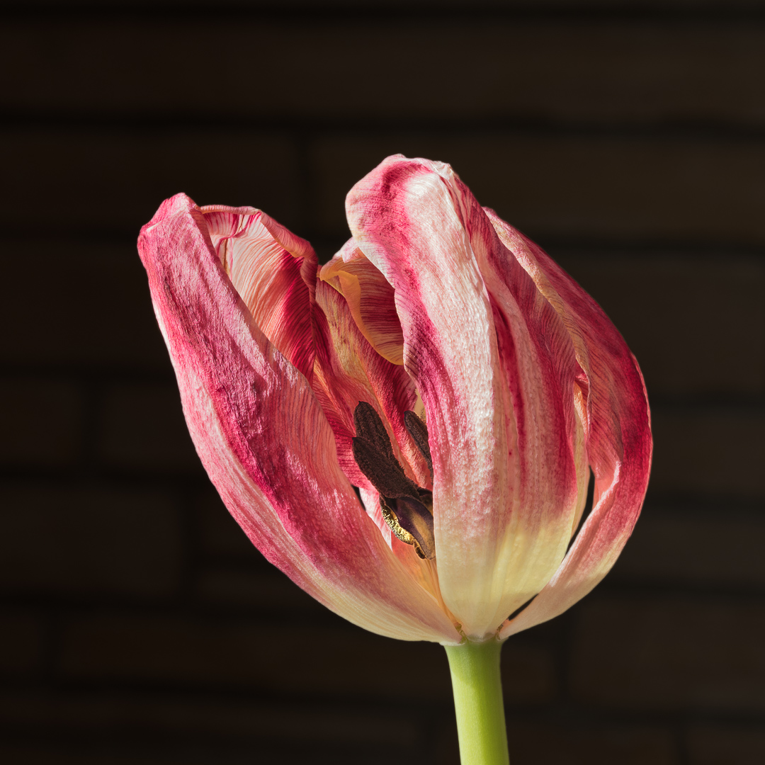
Not quite black background
-
22nd March 2020, 09:26 AM #2
Re: Not quite black background
Nice flower
-
22nd March 2020, 02:21 PM #3
Not quite black background
Very nice detail. I too am fond of wilting/wilted flowers, although I have just started doing more after a gap of a couple of years.
A few suggestions:
The lighting is harsh. I did a bit of editing, which I will show below, but I would still consider a diffuser.
Re edits: I don't want to reopen the argument about pure black backgrounds (I personally would use one because I think the brown hint of clapboard doesn't add anything), but it's trivially easy to do in Photoshop. If you are interested in doing this and don't know an easy way, let me know.
I did some simple edits to lower the brights, bring out detail in the shadows, and increase fine detail throughout. These are my edits:

The dodging and burning are self-explanatory. I wanted to tone down the stem and the brightest parts of the petals, the latter to make it less harsh. The "partial midtone contrast" layer boosts midtone contrast only the the darker middle of the flower, to bring out detail there. The local contrast layer at the top is very slight: USM in photoshop set to 10 percent, 50 px, 0 threshold, opacity 45%. The texture slider in LR/ACR might have produced better results. In any case, this is a rough edit and a little heavy handed, but it shows directions I would probably take to increase the already beautiful level of detail in the photo.

I'd frame this differently. I think there is a bit too much at the top compared with the left side. That's easily fixed if you agree. I think I might also want a little more negative space on the left because the flower is pointing into that space.
I hope this helps.
DanLast edited by DanK; 22nd March 2020 at 04:20 PM.
-
22nd March 2020, 08:05 PM #4
Re: Not quite black background
Dan,
Your edits have been very useful to me as they have allowed me to discovered what I believe is a flaw in my workflow. I downloaded your edited version so that I could do a proper a/b comparison between it and my posted image. The difference between the two is significant yet subtil. Had I carried on the edits that I did on my original a little bit further, I would have ended up very close to what you did. For example, I had darkened the stem quite a bit but not quite as far as you did. The same applies to the microsharpening and the toning down of the highlights, etc.
When I edit, I normally do an a/b comparison between the original and my edited version. The usually large difference between the two versions probably masks the subtil changes that may be still required to achieve the optimal result. I now believe that I should re-examine my "final" version a day or two later and make corrections without referring back to the original.
As for the not quite black background, it was not my intention to reignite the debate but I was experimenting with the idea of leaving some context for the flower. It doesn't work and I will go back to full black. By the way, the "clapboard" is actually a sandstone wall!
I like your suggestion for the crop.
Again thanks for taking the time to help. It is appreciated.
André

 Helpful Posts:

 Reply With Quote
