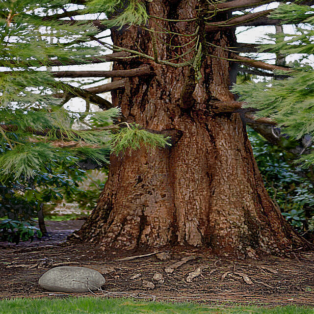
Needs input. I'm stuck in post processing.
Results 1 to 6 of 6
Thread: Trees1
-
29th April 2020, 06:16 PM #1New Member

- Join Date
- Apr 2020
- Location
- Kenmore Washington USA
- Posts
- 4
- Real Name
- James Cecil
Trees1
-
29th April 2020, 06:23 PM #2

- Join Date
- Jan 2009
- Location
- South Devon, UK
- Posts
- 14,631
Re: Trees1
My first thought is what is the subject?
Foreground is sharp but the actual tree trunk which occupies most of the image is out of focus.
-
29th April 2020, 08:11 PM #3
Re: Trees1
I agree with Geoff. If the subject is the tree, then think hard about what it is about the tree that interests you and eliminate all else. The lack of sharpness is important but is a minor technical element that can be corrected. Good composition needs some thought. My eye keeps coming back to the rock because it is : in focus, bright, light, and at the point my eye would usually enter the picture. After dealing with the sharpness issue, consider trying several crops, including eliminating the rock and base of the tree and also a crop which eliminates the right half of the trunk and the base. Both of these are pretty radical crops but may help you figure out what it is that represents this tree to you.
-
29th April 2020, 10:33 PM #4
Re: Trees1
James - I'm going to have to agree with Geoff and Judith. I'm also not quite sure as to what you are trying to accomplish with this image.
Their observation of the tree not being sharp, is correct in my view. If it is your subject, then there is a focus issue with the shot. It can be partially corrected in post by sharpening the image, but that only goes so far.
Another key principle in photography (and other graphic arts) is that the human visual system is keyed to see areas that are bright or have high contrast. If that isn't your subject, then the image is likely not as strong as it could be. When I look at this shot, I find that the light coming through the branches, the rock in the foreground and even the grass are all distracting elements. The tree is in shadow and needs to have the highlights exposed.
A few minutes of playing around with the shot gives me this:

-
30th April 2020, 03:46 AM #5
Re: Trees1
There is much improvement, here.
-
30th April 2020, 08:39 AM #6
Re: Trees1
:
In addition to the good points raised above, there appears to be a yellow tint in the image which is visible in the sky areas. As I do not know what the real scene looks like, the next comment is obviously subjective: the greens of the tree foliage and foreground grass look washed out to me. My memory of similar trees and grass wants them to appear darker and richer shades of green. I don't have Manfred's experience and skill, and I have left out any cloning. So this is just selective adjustments to brightness, contrast, saturation and sharpness, to give a rough idea of what I would prefer to see:

Philip
:

 Helpful Posts:
 Reply With Quote

