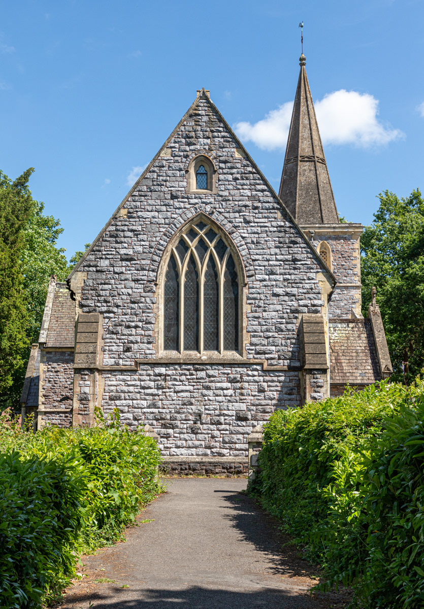
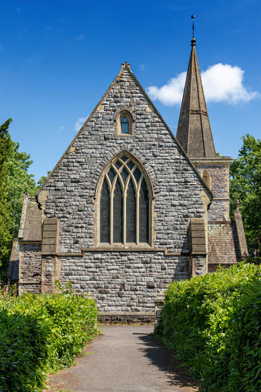
This is a Victorian era church (built 1855 and extended 30 years later).
The photograph was shot when the light was going to be at its best - from the side with the subject shadow free. In the morning it is in shade and in the evening the light is full on and provides far less modelling.
So far I have increased the contrast on the sloping roof tiles either side, reduced the impact of the white sign, cropped away some foreground shadow, and removed a white cloud in the top left corner which drew the eye away from the subject.
I realise it is a bit of a record shot, but could it be improved further?
Results 1 to 8 of 8
Thread: St John's Church
-
25th May 2020, 01:06 PM #1

- Join Date
- Feb 2016
- Location
- Cambridge, UK
- Posts
- 928
- Real Name
- David
St John's Church
-
25th May 2020, 01:19 PM #2

- Join Date
- Jan 2015
- Location
- Maryland , U.S.
- Posts
- 1,237
- Real Name
- raymond
Re: St John's Church
Great lighting, for me would like to see more distinction in the tones of the stones.
-
25th May 2020, 02:22 PM #3
-
25th May 2020, 03:18 PM #4

- Join Date
- Feb 2016
- Location
- Cambridge, UK
- Posts
- 928
- Real Name
- David
Re: St John's Church
Thank you Manfred.
1. I took some time to check the verticals. Could you indicate what is the give away that shows the perspective is not right?
2. I had cropped some shadow but left some as a framing device. I agree it should go!
3. I would expect a comment about the light if there was a lack of texture, but that is not such an issue here (on the main elevation facing the camera/viewer). One face of the steeple is in shade, and there is some shadow on the window tracery. Is it that the light is so bright and harsh on pale stonework?
-
25th May 2020, 03:50 PM #5
Re: St John's Church
The whole building looks like the verticals are leaning inwards a bit. To confirm what I saw, I dropped some guidelines on those verticals and used the perspective and skew tools to correct. This tends to make the whole building look a bit shorter, so I stretched it out a bit to compensate.
I thought that might have been what you had done. It's generally a matter of opinion / experience on that call. You have some strong leading lines made by the hedges that direct the viewer's eyes to the church. You also have an area of high contrast (where the dark shadows meet the light path) and that attracts the viewer's eye. I concluded that the distraction had more of an impact on the image than the frame (which should keep the viewer's eye in the frame), so I removed it. When I saw the before and after, I concluded the image was more effective without the shadow along the bottom.
The light is fairly hard (as shown by the distinct, hard shadow that the hedges cast. Stones are a fairly hard surface too.
Unfortunately, I don't know what the light does earlier in the day, but this looks like a scene that would work well if taken at golden hour. Unfortunately, I don't know if the light will work or be blocked by other things behind you or to the sides.
Yes, the steeple is in shadow a bit, but that is such a small piece of the overall image that it does not have a significant impact on the image.
-
26th May 2020, 02:03 PM #6
Re: St John's Church
Very nice image; removing the foreground shadow enhanced th appeal, i feel
-
27th May 2020, 08:26 AM #7
-
27th May 2020, 02:28 PM #8

- Join Date
- Feb 2016
- Location
- Cambridge, UK
- Posts
- 928
- Real Name
- David

 Helpful Posts:

 Reply With Quote


