Results 1 to 14 of 14
Thread: Dark days
-
2nd June 2020, 07:37 AM #1
-
2nd June 2020, 12:30 PM #2

- Join Date
- Aug 2014
- Location
- Melbourne, Australia
- Posts
- 3,017
- Real Name
- Ole
Re: Dark days
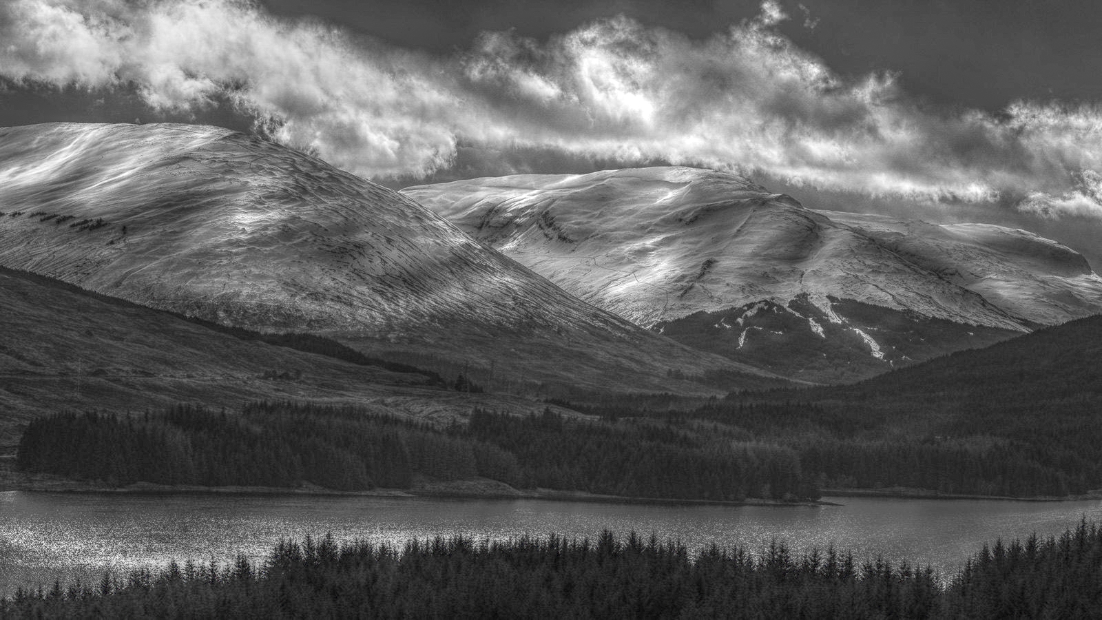
I would start by opening up the shadows. When that is done I think you will get a better view. Then the fun start.
Cheers Ole
-
2nd June 2020, 01:27 PM #3
Re: Dark days
Thanks Ole - I'll give that a go and see how it comes out.
Bill
-
2nd June 2020, 01:46 PM #4
-
2nd June 2020, 03:51 PM #5
Re: Dark days
That is a very nice work!!!
-
2nd June 2020, 03:52 PM #6
Re: Dark days
+1 to Ole and Dan's comments. Yes, the details of those trees needs to come out. The ACR / Lightroom shadows slider pushed to the right would definitely open up those details.
Being a B&W white image, I would push both ends of the histogram so that they just get into the pure black and pure white; you have a touch of room at both ends of your histogram.
-
2nd June 2020, 04:35 PM #7

- Join Date
- Feb 2012
- Location
- Texas
- Posts
- 6,956
- Real Name
- Ted
Re: Dark days
Out of interest, Bill, I tried the GIMP's Mantiuk 2006 tone-mapping on it:

"Adapt an image, which may have a high dynamic range, for presentation using a [lower] dynamic range. This operator constrains contrasts across multiple spatial frequencies, producing luminance within the range 0.0-1.0"
http://gegl.org/operations/gegl-mantiuk06.html
Obviously, a little further work would be desirable ...
-
2nd June 2020, 04:56 PM #8
-
2nd June 2020, 05:14 PM #9
Re: Dark days
Dan, Manfred and Ted
Thanks for your comments. Before responding, here's the original NEF more or less as it left LR to go on its PS adventures:

As I said, it's not exaclty in my comfort zone, but it was one of only 2 or 3 shot on the day that grabbed me and it was the dark, moody sky and parts of the mountains, with the light patches in the clouds and the snow capping that did the trick.
I used luminosity masking in PS to explore those dark areas that you mention, and selectively bring out some details and I'm happy tp go back and try pushing it a bit more but I would very much like to keep the "darkness" to contrast with the snow and clouds. Probably my approach is best summarised as I didn't greatly like what is in those dark areas and it's going to be a trial and error to bring out just a little more but not lose the drama.
Once I hit the brick wall with Dark Days it will be this one's turn.

-
3rd June 2020, 02:00 PM #10
-
3rd June 2020, 02:53 PM #11

- Join Date
- Feb 2012
- Location
- Texas
- Posts
- 6,956
- Real Name
- Ted
Re: Dark days
I have to admit that it's a fascinating capture to play with, Bill.
Looking at your later and nicer posts, my GIMP play was way too light. So maybe this would be more to your taste:

This time, used G'MIC "Pop Shadows" which was still too light, so cranked down the gamma in FastStone Viewer which re-dramatized the darks and the lights. Sometimes lowering the gamma in grayscale shots can pay dividends ...
Last edited by xpatUSA; 3rd June 2020 at 04:20 PM.
-
3rd June 2020, 03:54 PM #12
-
3rd June 2020, 04:44 PM #13
-
3rd June 2020, 04:45 PM #14

 Helpful Posts:

 Reply With Quote


