Results 1 to 9 of 9
Thread: Iris
-
11th June 2020, 01:03 PM #1
-
11th June 2020, 02:25 PM #2
-
13th June 2020, 08:14 AM #3
Re: Iris
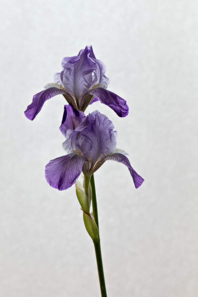
Yes, beautiful and well done !

-
13th June 2020, 08:36 AM #4
Re: Iris
I think it brings out the delicate detail very well.
-
13th June 2020, 01:23 PM #5
Re: Iris
Thank you Nandakumar, Antonio and Kay.
While I like the photo as is, I cannot say that I am completely satisfied with it. When I zoom in on the various part of the flower, every thing looks good. However, looking at the whole picture, I find that the flower looks a bit too dark as if the background is somewhat overwhelming it. I tried darkening the background but that just makes it look odd. I might try a tighter crop to put more emphasis on the flower. Any suggestion would be welcomed.
-
13th June 2020, 03:37 PM #6
Re: Iris
Andre - beautifully executed image and I agree that it needs just a few tweaks.
The first thing that strikes me is that it needs a bit of a crop off the top and right hand side. Not a lot, but just enough to eliminate a bit of negative space on those parts of the image.
I love the way that the texture of the background interacts with the textures of the flower. I would be tempted to reduce the orange tint in the lower part of the background and make it a bit more neutral. I'd also lighten it just a touch more by pulling the white point ever so slightly to the left.
I would also open up the delicacy of the midtones a touch by moving them more to the whites.
Finally, I would dodge a few of the dark areas where the shadows are causing some very minor issues.

-
13th June 2020, 08:23 PM #7
Re: Iris
I agree that it is a great image, and I also agree with Manfred's suggestions.
-
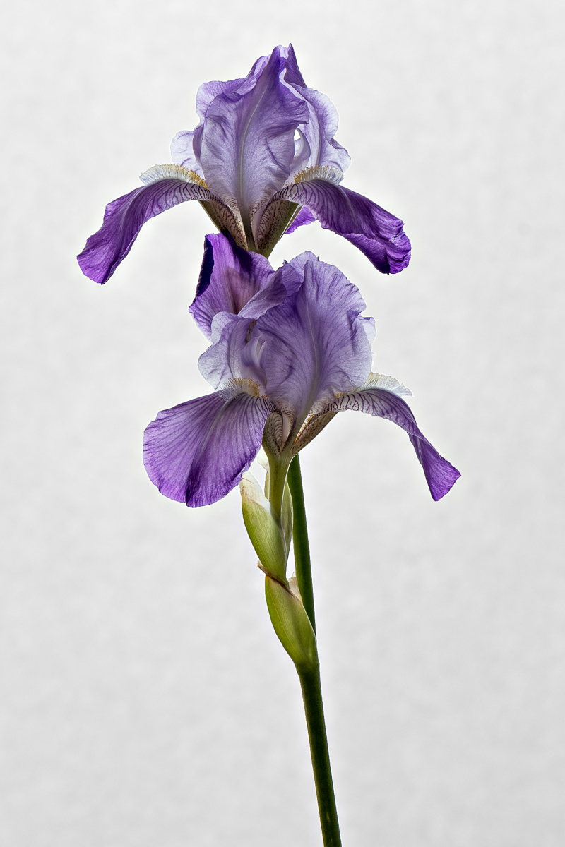
14th June 2020, 01:35 AM #8
-
14th June 2020, 04:15 AM #9
Re: Iris
Looks really good now, André.
If it were my image, I'd push the mid-point a touch more to unlock some of the delicate features of the petals a bit more, but that's just my personal taste.

 Helpful Posts:

 Reply With Quote


