Results 1 to 18 of 18
Thread: The Gardener
-
30th October 2020, 02:07 AM #1
-
30th October 2020, 07:26 AM #2
-
30th October 2020, 12:01 PM #3

- Join Date
- Aug 2014
- Location
- Melbourne, Australia
- Posts
- 3,023
- Real Name
- Ole
Re: The Gardener
That is a bit different and I like it because of that.
Cheers Ole
-
30th October 2020, 01:57 PM #4
Re: The Gardener
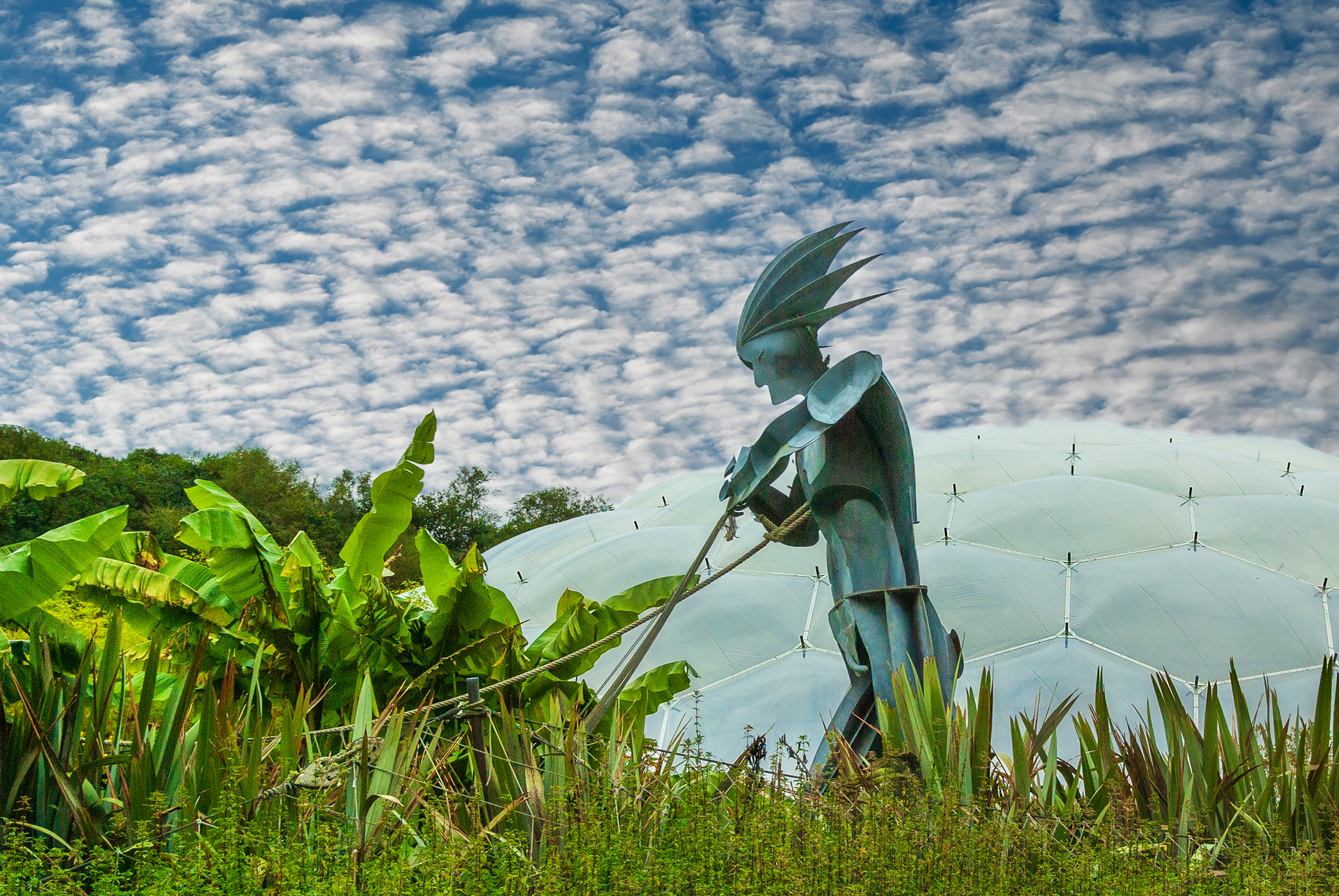
Intriguing image, Peter.
I've come back to look at it a number of times and am not quite sure why you left so much of the dome in the right hand side of the image?
-
30th October 2020, 03:00 PM #5
Re: The Gardener
Unique. Love it!
-
30th October 2020, 04:38 PM #6
Re: The Gardener
Not sure myself if I am honest. I am not usually one to go with a different aspect ratio but the panorama style just seemed to suit it. You mentioned before about what ratios make for a good letter box image. Can you remind me please.
This was my first attempt at a coloured sky replacement using the Photoshop new tool. I may have another go as I am not too sure about the halo effect round the sculpture
-
30th October 2020, 06:34 PM #7

- Join Date
- Jan 2009
- Location
- South Devon, UK
- Posts
- 14,627
Re: The Gardener
I am also concerned about the sky effect not looking totally natural in the central area and Manfred has already commented about the space on the right hand side, which was my first thought about this image. Maybe more like widescreen than panoramic ratio?
-
30th October 2020, 07:37 PM #8
Re: The Gardener
I tend to look at sizing / aspect ratio with a print maker's eye. In panoramas I will generally stick with a 2:1 or 3:1 aspect ratio. For a screen output, I find that 16:9 is quite effective.
I'm not sure if this image suits a pano; it's almost as if you have two image separated by the statue; The statue, plant on the camera left side and the bit of dome. On the right side, it's an image of the domes. I think I prefer the 2:3 ratio.
I agree about the haze around the statue, it doesn't really work as one might wish.

-
30th October 2020, 08:19 PM #9

- Join Date
- Apr 2019
- Location
- NYC / North Fl
- Posts
- 1,221
- Real Name
- Daniel
Re: The Gardener
I didnt know it was a statue. I thought it was some kind of graphics with a photo of grass added. Very interesting. I agree about the haze.
-
30th October 2020, 09:09 PM #10

- Join Date
- Feb 2012
- Location
- Texas
- Posts
- 6,956
- Real Name
- Ted
Re: The Gardener
Is the haze some kind of veiling effect from backlighting or summats?
-
30th October 2020, 10:05 PM #11
-
30th October 2020, 10:14 PM #12
-
30th October 2020, 11:58 PM #13

- Join Date
- Feb 2012
- Location
- Texas
- Posts
- 6,956
- Real Name
- Ted
-
31st October 2020, 12:46 AM #14
Re: The Gardener
An interesting image. However, I think this thread conflates two issues: aspect ratios, and placement of the statue. I find the amount of the dome a bit off, not because of any particular aspect ratio, but for the simple reason that most of it is behind the subject. I'd lop some of it off for that reason, which would substantially change the aspect ratio, but I'd let the image determine the precise ratio.
-
1st November 2020, 02:14 AM #15
-
1st November 2020, 02:41 AM #16
Re: The Gardener
The real strength of the first image has come out now in this crop!!!
-
1st November 2020, 03:03 AM #17
-
2nd November 2020, 10:35 PM #18

- Join Date
- Aug 2014
- Location
- Melbourne, Australia
- Posts
- 3,023
- Real Name
- Ole
Re: The Gardener
I prefer the first version. The sky is now dominating the scene.
Cheers Ole

 Helpful Posts:

 Reply With Quote


