 Helpful Posts: 0
Results 1 to 5 of 5
Thread: Candids for Critiquing
-
16th December 2010, 05:48 AM #1
Candids for Critiquing
-
16th December 2010, 10:25 AM #2
Re: Candids for Critiquing
Hi Jeff.
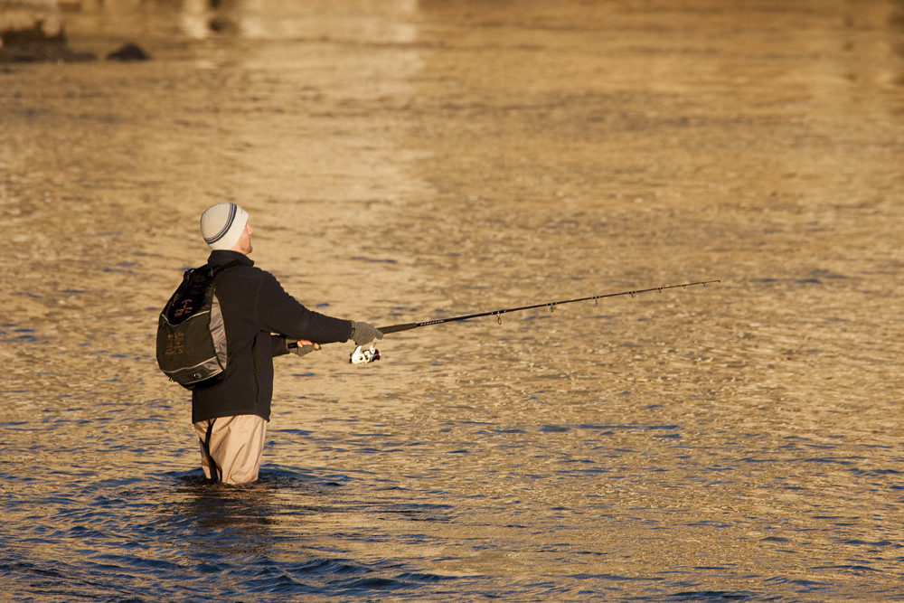
#1 - Nicely composed but a little under exposed for my taste. It has lost some of the detail that I think you were trying to convey.
#2- This is the one I like the most. I would have put the man more to the left and cropped the dead space out on the right. I do like the fact you left the bank on the upper left so we have a reference of how far into the river he is.
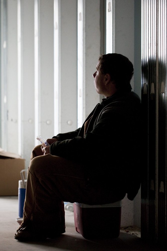
#3- I like the concept but it is under exposed and again loss of detail. I like how it was composed. I know it was hard to balance the composure as the light coming in the from left would have been blown out if the person was not under exposed. As I am learning how to PP my own work I am not any help there.
I think your on the right track with composition and developing your "eye".
-
16th December 2010, 11:04 AM #3Moderator


- Join Date
- Feb 2009
- Location
- Glenfarg, Scotland
- Posts
- 21,402
- Real Name
- Just add 'MacKenzie'
Re: Candids for Critiquing
I'm broadly in line with Sam's comments
Like you, Jeff, I want what he's got!
My first reaction was, 'Oh! that railing on the harbour wall'. But then I changed my mind. But, it feels as if the whole thing needs a counter-clockwise rotation. Just slightly, so that the person doesn't look as if they're about to fall over backwards?
My pick of the set as well.
What I thought was particularly good was how you've got the person lined up inside that reflection that comes all the way down from the top of the frame. Good positioning and composition. I know Sam suggested a bit of cropping, but I like it as it is. I think it's well balanced.
I also like this one.
Don't know if you've mastered dodging and burning yet, but some dodging on the person might have brought up just a bit more detail (but, you just want a little bit). The one thing that distracts me about it is his flask (Does everyone in the English-speaking world call it that? The thing he keeps his hot/cold drink in). It's neither in nor out of the picture. If it had been in full show, it would have helped tell the story; i.e. lunchtime. As it is, I'd be tempted to clone it out and rename the image something like 'Contemplating'. Also, I think the flask is too colourful for the rest of the image.
I like the set-up of it. You did an excellent job of spotting the opportunity that was there and I like how you've arranged it and exposed it just to pick up highlights on the face and clothing (which is why I'd go very lightly with any dodging brush)
-
16th December 2010, 01:49 PM #4
Re: Candids for Critiquing
1st image, the shadows beneath his feet could have a bit more tone to them, however, longer shadows would require more image to the left. You want to see what he is looking at, but perhaps he doesn't see anything.
-
16th December 2010, 08:50 PM #5

- Join Date
- Aug 2008
- Location
- le Mans France
- Posts
- 367
- Real Name
- Thierry
Re: Candids for Critiquing
I like your set of pictures and more particularly the 2 first ones


 Reply With Quote
