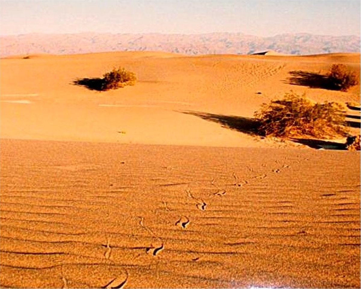
Continuing reviewing and processing 2013 images.
death valley mesquite dunes abstract by urbanflyer, on Flickr
Results 1 to 11 of 11
-
29th January 2021, 11:46 PM #1
Mequite Dunes abstract--Death Valley
-
30th January 2021, 02:11 PM #2
Re: Mequite Dunes abstract--Death Valley
Judith,
I'm afraid this one doesn't work for me, for several reasons.
The main subject, IMHO, is the swirls. However, they are very indistinct in this photo. One reason is that it is extremely low in contrast. Look at your histogram. You are using perhaps 1/3 of the total tonal range, which mirrors the low global contrast in the image. It's also lacking in midtone contrast. So the first thing I would do is use a levels or curves tool to bring the black point up and the white point down. then I would use a curve to increase midtone contrast.
Second, the large, almost empty spaces at the top and bottom just distract attention from the swirls, so I would crop.
The third issue is more complex. The color here is largely irrelevant. Moreover, if you just increase contrast using Lightroom/ACR or a normal blend mode, the saturation of that almost uniform color will become unnaturally saturated. There are more advanced techniques that allow you to increase contrast without increasing saturation--working in LAB mode or using the luminosity blend mode--but in this case, I think I would just get rid of the color and stick with simple black and white.
Just for illustration, here is a very quick and dirty edit using the steps I mentioned. I didn't do any local adjustments, and I didn't fine-tune these three. However, I think this is enough to illustrate what I am thinking.
Dan

-
30th January 2021, 03:14 PM #3
Re: Mequite Dunes abstract--Death Valley
onder if those swirls in the sand were caused from the passage of a rattlesnake...
-
30th January 2021, 05:10 PM #4

- Join Date
- Feb 2012
- Location
- Texas
- Posts
- 6,956
- Real Name
- Ted
Re: Mequite Dunes abstract--Death Valley
Likely so and more than one passage, I reckon. Some more tracks here:

https://en.wikipedia.org/wiki/Crotalus_cerastes
.Last edited by xpatUSA; 30th January 2021 at 05:35 PM. Reason: corrected image location
-
30th January 2021, 05:21 PM #5
Re: Mequite Dunes abstract--Death Valley
+1 to Dan's comments. I quite agree with his assessment.
As he has pointed out, B&W works well here and the contrast boost will be somewhat stronger that sticking with the colour original. It also makes the image look more abstract as colour gives the viewer a clue that it is desert sand. I personally like that aspect of colour and adjusting contrast and applying a slight vignette helps with the issues he has pointed out.

-
30th January 2021, 05:23 PM #6
Re: Mequite Dunes abstract--Death Valley
I liked it as such; looks like a modern art
-
30th January 2021, 08:26 PM #7
Re: Mequite Dunes abstract--Death Valley
I really appreciate the useful critiques you all are giving. Here is a black and white conversion that is from the same area, though not an abstraction. Have I used the information you gave me before to advantage? It is a shot lots of folks have done so I do not count it as very important, but might be good learning for me.

death valley mesquite dunes profile-2 b-w by urbanflyer, on Flickr
-
30th January 2021, 09:47 PM #8

- Join Date
- Feb 2012
- Location
- Texas
- Posts
- 6,956
- Real Name
- Ted
Re: Mequite Dunes abstract--Death Valley
Nice one! I see some Miksang influence in it.

Perhaps smooth out the 'background' to virtually no texture?
-
31st January 2021, 02:19 AM #9
Re: Mequite Dunes abstract--Death Valley
I too like this; more of an abstract nature
-
31st January 2021, 02:07 PM #10
Re: Mequite Dunes abstract--Death Valley
This one is much better, IMHO, because the processing highlights the lines and textures.
Sent from my iPad using Tapatalk
-
1st February 2021, 01:24 AM #11

 Helpful Posts:

 Reply With Quote


