Results 1 to 11 of 11
Thread: Smoky Mountains, TN, 2019
-
18th September 2021, 09:57 PM #1

- Join Date
- Nov 2017
- Location
- Ottawa, Canada
- Posts
- 383
- Real Name
- Catherine
Smoky Mountains, TN, 2019
-
19th September 2021, 12:44 AM #2
Re: Smoky Mountains, TN, 2019
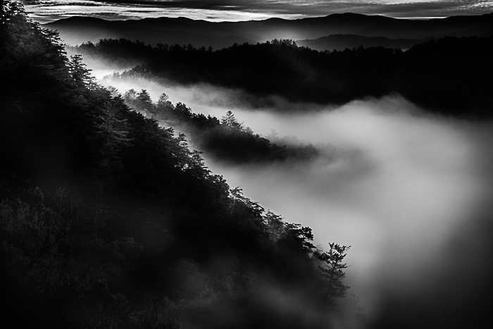
Catherine - the "classic" approach to B&W is to have a full tonal range from pure black (which you have) and pure white (which you are very close to) and all the tones between those two extremes. Wherever possible, we also want to see textures in both the deep shadows and highlights. The human visual system is most sensitive to the mid-tones and has some problems distinguishing the shadows and highlights, so work there to open up those areas is generally warranted.
I find the dark areas don't have enough textures, so I've opened them up a bit.

-
19th September 2021, 01:04 AM #3

- Join Date
- Nov 2017
- Location
- Ottawa, Canada
- Posts
- 383
- Real Name
- Catherine
-
19th September 2021, 06:38 PM #4

- Join Date
- Jan 2009
- Location
- South Devon, UK
- Posts
- 14,624
Re: Smoky Mountains, TN, 2019
I think I would also crop a little from the bottom and right side to reduce the amount of dark area slightly.
-
19th September 2021, 07:21 PM #5

- Join Date
- Nov 2017
- Location
- Ottawa, Canada
- Posts
- 383
- Real Name
- Catherine
-
19th September 2021, 07:25 PM #6

- Join Date
- Nov 2017
- Location
- Ottawa, Canada
- Posts
- 383
- Real Name
- Catherine
-
19th September 2021, 07:47 PM #7

- Join Date
- Feb 2012
- Location
- Texas
- Posts
- 6,956
- Real Name
- Ted
-
19th September 2021, 07:50 PM #8
Re: Smoky Mountains, TN, 2019
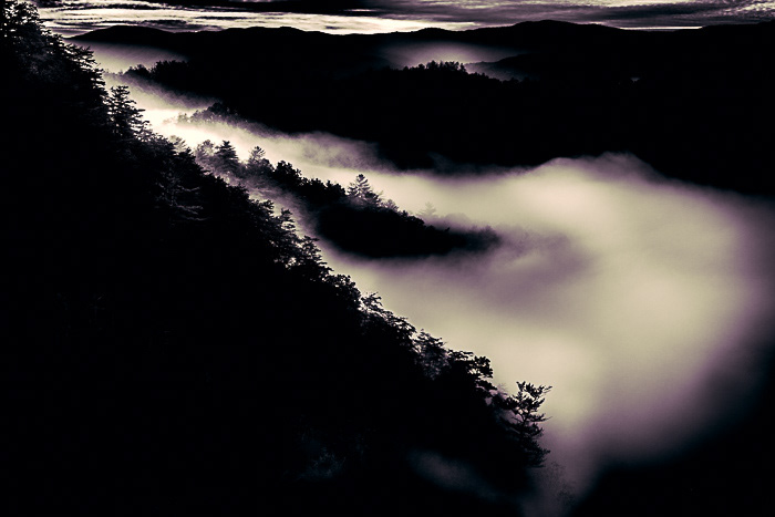
My own tastes run to what Manfred describes as the classic technique. The master of this was of course Ansel Adams, who developed the zone system to get a full range of tones in his prints. For example, for my taste, you have far too much pure black in the second print. It dominates the image.
However, that's not everyone's taste. I think the important thing is that you make a deliberate decision about the tones you want and then learn to produce them.
-
19th September 2021, 08:18 PM #9

- Join Date
- Feb 2012
- Location
- Texas
- Posts
- 6,956
- Real Name
- Ted
-
19th September 2021, 08:24 PM #10

- Join Date
- Nov 2017
- Location
- Ottawa, Canada
- Posts
- 383
- Real Name
- Catherine
-
19th September 2021, 08:32 PM #11

- Join Date
- Nov 2017
- Location
- Ottawa, Canada
- Posts
- 383
- Real Name
- Catherine
Re: Smoky Mountains, TN, 2019
Thank you very much Dan for commenting. I did do an edit that was closer to Manfred's before I posted here on cic but I didn't think that what I lightened in the lower left corner looked very nice. That effort is attached here. I did make a 8x10 print of this version, and I thought it was pretty, but somehow it didn't look very nice when I was about to post here, so I backed off.


 Helpful Posts:

 Reply With Quote


