Results 1 to 9 of 9
Thread: performer
-
25th September 2021, 09:02 PM #1

- Join Date
- Nov 2017
- Location
- Ottawa, Canada
- Posts
- 383
- Real Name
- Catherine
performer
-
26th September 2021, 02:37 PM #2
Re: performer
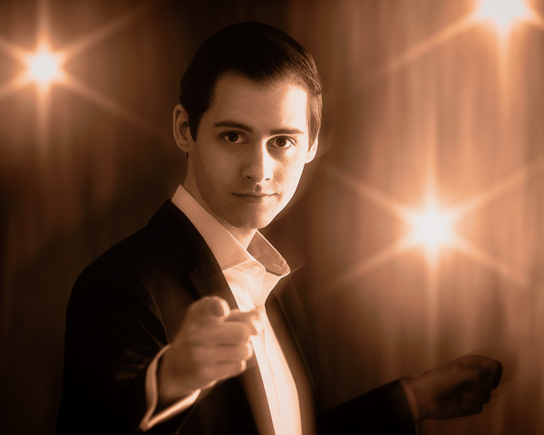
It's a nice image Catherine, but you will get criticized for a number of things happening in the shot:
1. Yes, the camera right side of the face is too hot. This means that you have lost texture there and that is generally not desirable. Losing them on the shadow side is less of an issue. It looks like the front of the shirt has the same issue.;
2. The camera left hand is soft and out out focus to the point where it has become a distraction. This is a depth of field issue;
3. The camera right hand is strange looking and very soft and not well lit to the point that it looks like it is not attached to the body and is definitely a distraction as well; and
4. The starburst, especially the one that is at the top right edge is distracting.
-
26th September 2021, 03:52 PM #3

- Join Date
- Nov 2017
- Location
- Ottawa, Canada
- Posts
- 383
- Real Name
- Catherine
Re: performer
Thank you very much Manfred. I can do something about points 1 (I have detail in the highlights it was during processing that I lost them) and 4, but those hands are troublesome. I tried adding some motion blur to see if that would help reasoning that maybe the mind would accept blurred hands if it seemed that there was movement in the subject. The back hand is strange looking and I tried different approaches to fix it but none were successful.
I will think a bit more about what I can do. Not quite willing to give up on it yet. I really appreciate getting your input!
-
26th September 2021, 08:04 PM #4

- Join Date
- Feb 2012
- Location
- Texas
- Posts
- 6,956
- Real Name
- Ted
Re: performer
Glad to hear that, Cath, because selecting the facial highlights (a simple rectangle) in the GIMP shows a very narrow peak in the selection histogram which does indicate a lack of texture, i.e. low local contrast.
I tried various fancy algorithms to fix that and also just plain curves but nothing helped enough to be worth posting, grump.
Re-processing based on comments might be a good idea - the composition is certainly worth it!Last edited by xpatUSA; 26th September 2021 at 11:36 PM.
-
27th September 2021, 12:16 AM #5

- Join Date
- Feb 2012
- Location
- Texas
- Posts
- 6,956
- Real Name
- Ted
Re: performer
Last edited by xpatUSA; 27th September 2021 at 12:26 AM.
-
27th September 2021, 12:27 AM #6

- Join Date
- Nov 2017
- Location
- Ottawa, Canada
- Posts
- 383
- Real Name
- Catherine
Re: performer
Thanks very much Ted! Yes, I just checked again and all the digital info is there in the original. I am more systematic now when I edit than when I worked on this photo a few months ago, so I dont know for sure anymore all the steps I took and in what order, but I think the problem arose when I played in Boris Optics to add the lights. I should have just imported a layer of the lights into PS but instead I imported a flattened image. Its those darn hands that cause me grief but Ive got a few more ideas.
Thanks for commenting and trying to help out! Maybe I should post the originals when I post photos here. Or maybe I should include the metadata. I didnt know if that would be helpful.
-
27th September 2021, 12:37 AM #7

- Join Date
- Feb 2012
- Location
- Texas
- Posts
- 6,956
- Real Name
- Ted
-
27th September 2021, 12:42 AM #8

- Join Date
- Nov 2017
- Location
- Ottawa, Canada
- Posts
- 383
- Real Name
- Catherine
Re: performer
Thanks very much Ted! Yes, I just checked again and all the digital info is there in the original. I am more systematic now when I edit than when I worked on this photo a few months ago, so I dont know for sure anymore all the steps I took and in what order, but I think the problem arose when I played in Boris Optics to add the lights. I should have just imported a layer of the lights into PS but instead I imported a flattened image. Its those darn hands that cause me grief but Ive got a few more ideas.
Thanks for commenting and trying to help out! Maybe I should post the originals when I post photos here. Or maybe I should include the metadata. I didnt know if that would be helpful.
-
27th September 2021, 12:46 AM #9

- Join Date
- Nov 2017
- Location
- Ottawa, Canada
- Posts
- 383
- Real Name
- Catherine
Re: performer
Thanks again Ted! I didnt see this second post of yours when I replied before. I really like what you did and I appreciate that you set out your method!

 Helpful Posts:

 Reply With Quote


