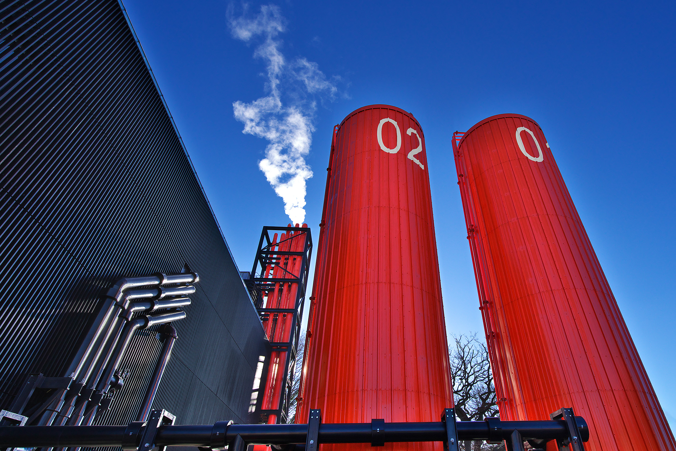
The first processed image of a visit to this colourful new structure in my home town.
IMGP5004 by Peter Schluter, on Flickr
Results 1 to 6 of 6
Thread: New Energy Centre in Woking, UK
-
13th January 2022, 04:40 PM #1
New Energy Centre in Woking, UK
-
13th January 2022, 09:15 PM #2
Re: New Energy Centre in Woking, UK
I like it, and in this case, I like that the perspective isn't corrected. The diagonals make it more interesting.
-
14th January 2022, 11:50 AM #3

- Join Date
- Apr 2019
- Location
- NYC / North Fl
- Posts
- 1,143
- Real Name
- Daniel
Re: New Energy Centre in Woking, UK
Hello Peter. I like the processing. When I look at it, I see shapes arranged on a canvas. The arrangement doesn't work for me. Yet oddly enough, if I turn the image 90 degrees, the relationship of the shapes falls into a more visually appealing arrangementjust my observation.
-
14th January 2022, 07:54 PM #4
Re: New Energy Centre in Woking, UK
This structure is interesting to me due to its shape and colour. But a "clean" image of it without any distortion is frankly quite boring. I aimed for an image where the orange tanks dominated the frame, so an ultra-wide angle lens of 15mm was my choice. I also realised that I would have to point the camera up. I knew this would give me a lot of distortion and accepted that. I realise it wont be everyone's cup of tea and that is fine.
Here is a "boring" version . Forgive the smaller picture.
-
15th January 2022, 06:08 AM #5
-
15th January 2022, 08:53 AM #6


- Join Date
- May 2013
- Location
- East Midlands, UK
- Posts
- 132
- Real Name
- Bo or Barbara - I'll answer to both!
Re: New Energy Centre in Woking, UK
The distorted version works for me, it gives an impression of size and power.
And the strong colours add to the image

 Helpful Posts:

 Reply With Quote

