C&C welcome
Silent cove by Dubravka Bacic, on Flickr
Results 1 to 10 of 10
Thread: Silent cove
-
16th March 2022, 10:18 AM #1

- Join Date
- Jan 2022
- Location
- Croatia
- Posts
- 74
- Real Name
- Dubravka
Silent cove
-
16th March 2022, 04:53 PM #2

- Join Date
- Nov 2021
- Location
- USA
- Posts
- 143
- Real Name
- Jack
Re: Silent cove
Spooky looking
-
16th March 2022, 06:19 PM #3

- Join Date
- Jan 2009
- Location
- South Devon, UK
- Posts
- 14,556
Re: Silent cove
Somewhat over exposed in the top left corner, so I wonder about cropping from the left side and top; which will also also simplify a rather complicated scene. Several alternative size ratios would be worth trying, such as 5 x 4 ratio or maybe also taking a little from the bottom and ending up with 3 x 2 ?
-
16th March 2022, 08:50 PM #4
Silent cove
I like this.
I too would crop, but not to get to a specific aspect ratio. I consider aspect ratios arbitrary, and unless I'm forced to use one (as I was last week for a charity auction), I let the image determine the aspect ratio and don't care if the result doesn't work out to some common ratio.
I'd crop from the top and right to remove some clutter on the right and uninteresting material on the top left. The reflection is more interesting. I'd then burn the top left and increase contrast in the bottom left. Maybe something like this as a start. Just a suggestion.

Last edited by DanK; 17th March 2022 at 12:58 PM.
-
16th March 2022, 10:28 PM #5

- Join Date
- Feb 2012
- Location
- Texas
- Posts
- 6,956
- Real Name
- Ted
Re: Silent cove
Since Dubravka's Windows Picture Viewer stripped out the camera/lens settings, I find it hard to judge what the original exposure was, as opposed to any subsequent brightening/darkening of the image.
Top left looks like this when opened with no adjustments in the GIMP:

I don't like the regular peaks in the Value histogram. I get a feeling that the original capture was not overexposed and could have been better developed in anything but Microsoft stuff ...
Last edited by xpatUSA; 17th March 2022 at 11:40 AM. Reason: added pic and comment
-
17th March 2022, 11:33 AM #6

- Join Date
- Jan 2022
- Location
- Croatia
- Posts
- 74
- Real Name
- Dubravka
Re: Silent cove
Instead of MS tools (with added highlights and warm up) I did minor adjustments in LR trying to preserve colours and general feeling of the cove. It is spooky as Jack mentions, now even spookier but very close to the actual scene. Nikon 3400, F/10 1/60 with basic 18-55 mm lens. Thanks for commenting.

Silent cove by Dubravka Bacic, on Flickr
-
17th March 2022, 12:03 PM #7

- Join Date
- Aug 2014
- Location
- Melbourne, Australia
- Posts
- 3,009
- Real Name
- Ole
Re: Silent cove
I prefer the original version. The last version is too subdued for my liking therefore I'd consider looking at Dan's version. Just my two cents worth.
Cheers Ole
-
17th March 2022, 01:09 PM #8

- Join Date
- Feb 2012
- Location
- Texas
- Posts
- 6,956
- Real Name
- Ted
-
18th March 2022, 02:41 PM #9

- Join Date
- Feb 2012
- Location
- Texas
- Posts
- 6,956
- Real Name
- Ted
Re: Silent cove
Thanks Dubravka for the camera settings which now make me think that the shot was a bit over-exposed, in spite of what I said in post no. 5.
Please allow me to explain:
Assuming 100 ISO was used, f/10 at 1/60 sec says that the exposure is for 12 and a half EV lighting value, see:
https://en.wikipedia.org/wiki/Exposu...xposure_values.
But sunlight is 16 EV.
If the sun was as bright as it looks in the posted image, I would say that a 1 or 2 EV higher shutter speed e.g. 1/120 or 1/250 sec would have been better for the brightly-lit foliage at top left thereby also making the cove itself darker i.e. more silent-looking.
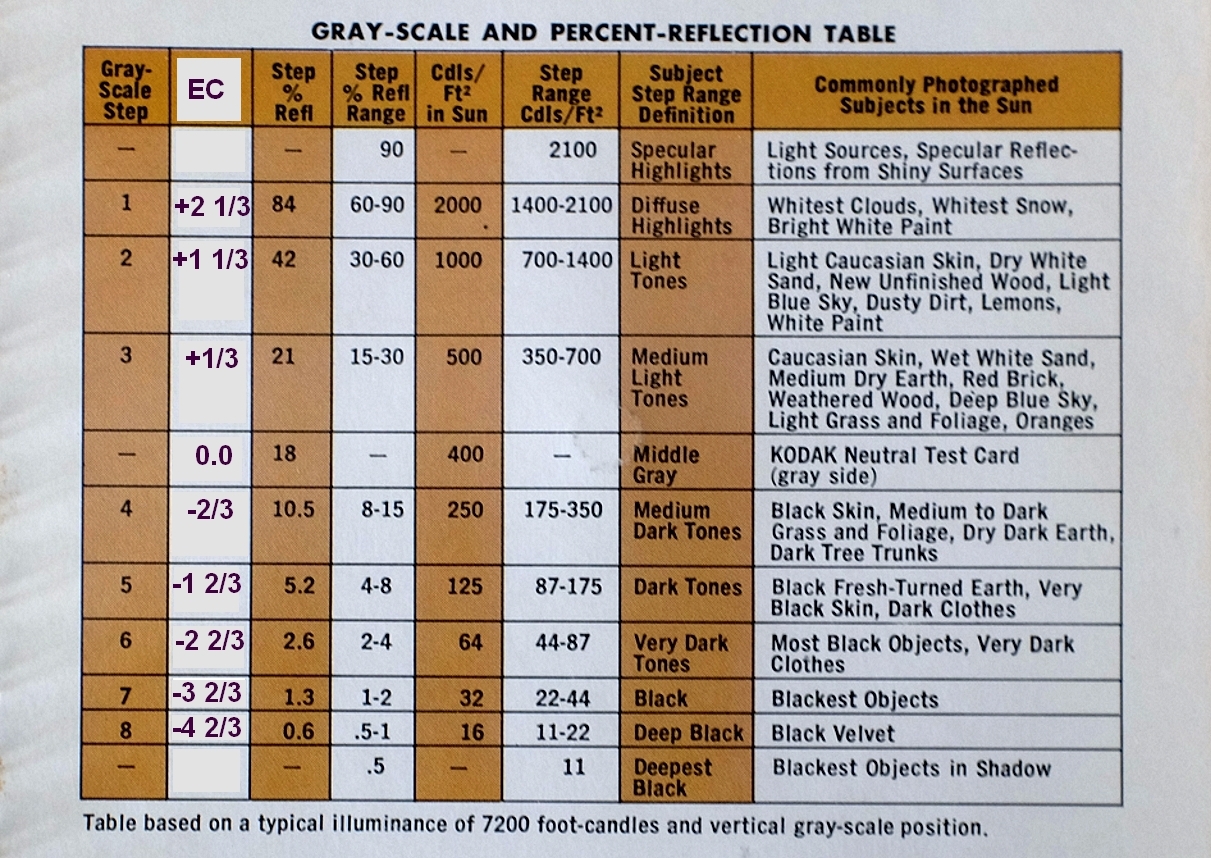
Personally I would have spot-metered that bright foliage and then added about 2EV positive exposure compensation (i.e. longer shutter time) per:

Table courtesy of Kodak. Hope this helps ...
P.S. I am "old school" as regards exposure setting. Evaluative or matrix metering is anathema to me. I spot-meter things and I decide what exposure compensation to use for those things, bearing in mind previous experience or the above table. The table is a bit different than the so-called Zone System but good enough for my purposes.
https://fstoppers.com/education/how-...l-world-417047
.Last edited by xpatUSA; 18th March 2022 at 05:35 PM. Reason: added P.S.
-
18th March 2022, 06:13 PM #10

- Join Date
- Jan 2022
- Location
- Croatia
- Posts
- 74
- Real Name
- Dubravka
Re: Silent cove
Hi Ted, this is really helpful, thank you for the effort. I did used spot metering but have, obviously wrongfully, chosen medium point somewhere below brightly lit foliage. Good lesson, will certainly think better next time. Thanks again


 Helpful Posts:

 Reply With Quote


