 Helpful Posts: 0
Results 1 to 15 of 15
-
20th December 2010, 08:02 PM #1
American Cemetery and Memorial Margraten
-
20th December 2010, 08:36 PM #2

- Join Date
- Mar 2009
- Posts
- 2,522
Re: American Cemetery and Memorial Margraten
Jeroen
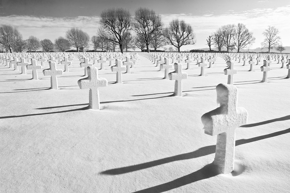
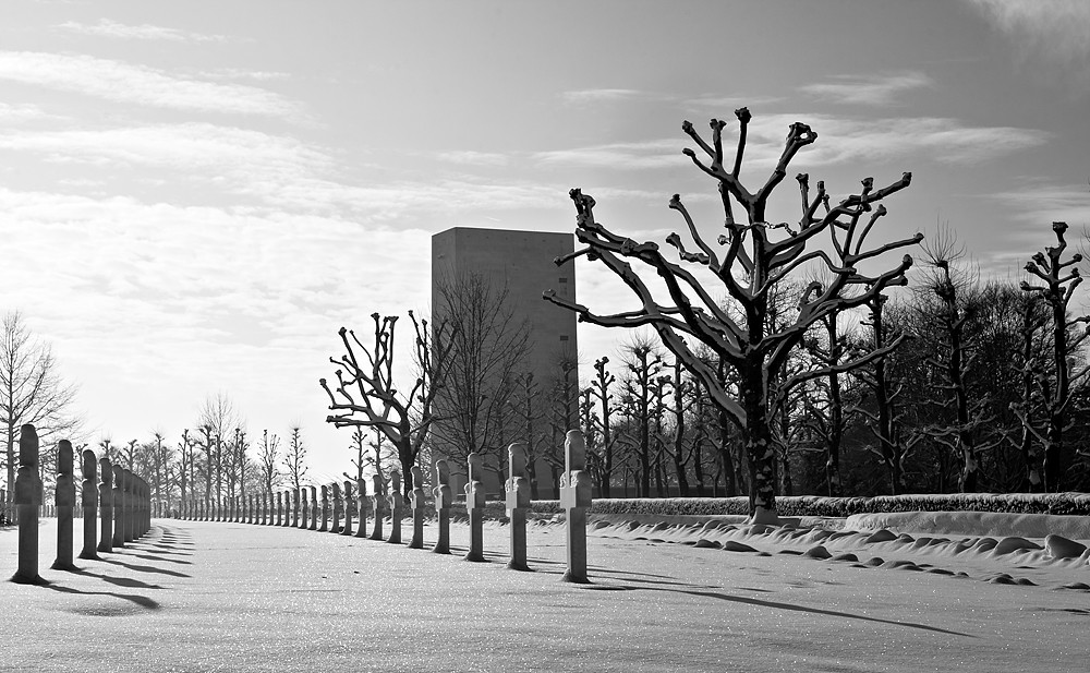
No 2 is beautifully composed and a very moving image. You say you have boosted the contrast. Did you over do it slightly on the brightness slider as well. With this image I would have processed the sky and trees separately from the foreground. There is some blowing out of the whites to the right and you may have been able to recover by processing a RAW file for the sky and a copy for the foreground. You can then dump them on top of each other as layers and paint out the sky or foreground.Whichever is on top.
Hope that makes sense. Still an excellent shot though
-
20th December 2010, 08:53 PM #3
-
20th December 2010, 09:55 PM #4
Re: American Cemetery and Memorial Margraten
I agree with Steve and Donald. I quiet like #1 but feel it is too bright with some blown highlights. I like being able to read just one name. The perspective in #2 is excellent.
-
20th December 2010, 10:35 PM #5

- Join Date
- Aug 2009
- Posts
- 4,049
Re: American Cemetery and Memorial Margraten
Brilliant, Jeroen, Really, a wonderful composition. The symmetry, the skeletal trees - menacing in the background, the unknown footsteps, the snow.
A couple of things on the processing. I thought the snow a little blown, especially in the top-right. I edited in CS5/ACR and reduced the blown-out areas using recovery. I also pushed the clarity slider across which defined the blacks a little more. And I thought that far right tree needs cropping out.
Minor things really, and they don't detract from a shot that I wish I had taken. Well done.

-
20th December 2010, 11:12 PM #6

- Join Date
- Nov 2010
- Location
- Panama City, FL
- Posts
- 3,540
- Real Name
- Chris
Re: American Cemetery and Memorial Margraten
Last edited by MiniChris; 20th December 2010 at 11:19 PM.
-
20th December 2010, 11:44 PM #7
Re: American Cemetery and Memorial Margraten
Like many others above; #2 is my favourite, although (sorry Rob), I prefer something closer to the original with a more high look to it and less darkened distant trees and first row of crosses - it lends more to the depth of the shot.
#1 is also very good though.
#3; I just can't reconcile the huge block with the rest of the scene
Nice work Jeroen, well done,
-
20th December 2010, 11:55 PM #8
Re: American Cemetery and Memorial Margraten
Very impressive Jeroen, particularly No: 2.
-
21st December 2010, 12:51 AM #9
Re: American Cemetery and Memorial Margraten
#2 is absolutely stunning - I agree with Dave that it looks best as the original; As it is it feels so surreal, and the adjustments to the brightness take the life out of the image for me.
-
21st December 2010, 02:07 AM #10
Re: American Cemetery and Memorial Margraten
Beautiful -- #2 is a really arresting image. Very moving, as others have said.
-
21st December 2010, 07:26 AM #11
Re: American Cemetery and Memorial Margraten
Thank you for the replies.
About the blown highlights: I'll think it over later today, but I think I'll stay (quite close) to the original.
Dave, the block is quite a distinctive part of the cemetery, but I agree it looks a bit like an outsider in this photo.
-
23rd December 2010, 07:01 AM #12
Re: American Cemetery and Memorial Margraten
I think the pictures are very good, though they conjure sadness within me.
People that have given their lives for others is overwhelmingly moving to me.
-
13th February 2011, 11:32 AM #13
Re: American Cemetery and Memorial Margraten
I went through the bunch I shot back than again today and picked some more photographs I found worthy.
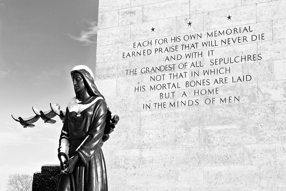
#4 The statue at the entrance of the cemetery. (The wall with the letters is the 'block' visible in #3 from my first post)
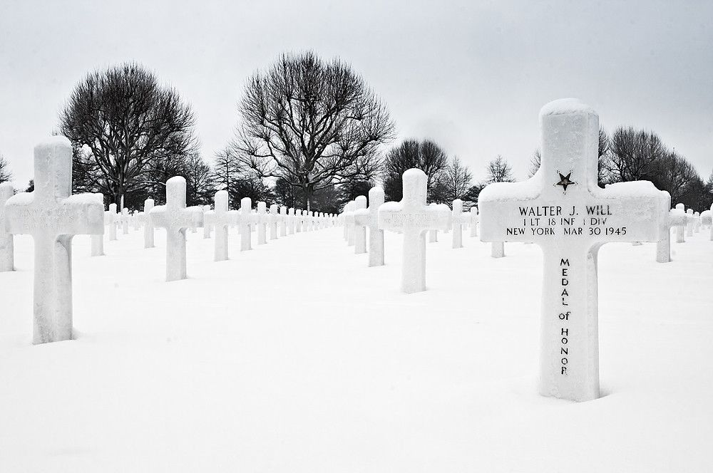
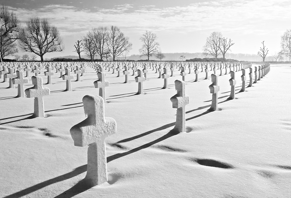
#5 Similar in approach as #2
I'm amazed by how much these photographs do to me. It was really a magical moment when I visited the cemetery. I've been there before and it's so impressive to enter the cemetery at the beautiful entrance. Then there is a little stairs to climb and when you approach the top you suddenly see all these thousands and thousands of white crosses in beautiful symmetry. The day day that I shot these series the whole cemetery was covered in snow. So nothing but white ground, white crosses and skeleton like trees.
After shooting for about an hour suddenly the cloudy sky broke open and the sunlight defined every single cross. It was truly overwhelming.
Especially now I have the #2 printed 90*60cm after winning a photo competition in the Netherlands. The result is stunning.Last edited by JK6065; 13th February 2011 at 11:38 AM.
-
13th February 2011, 02:24 PM #14

- Join Date
- Jan 2011
- Location
- Virginia Beach, VA USA
- Posts
- 1,382
- Real Name
- Mary... or Lucy... either is fine with me. ;)
Re: American Cemetery and Memorial Margraten
The composition of number 2 is great. I personally like how the upper right gives the feeling of it going on and on and on. The snow-covered crosses, the barren trees, the snow-filled footprints, the sun peeking through... they all are part of a story that you read in the picture.
-
13th February 2011, 02:47 PM #15
Re: American Cemetery and Memorial Margraten
I really like #4. Thanks for posting it.


 Reply With Quote

