Results 1 to 20 of 20
Thread: Pastel Carnations
-
24th June 2022, 01:55 PM #1
Pastel Carnations
Last edited by Round Tuit; 30th June 2022 at 07:51 PM.
-
25th June 2022, 11:53 AM #2
Re: Pastel Carnations
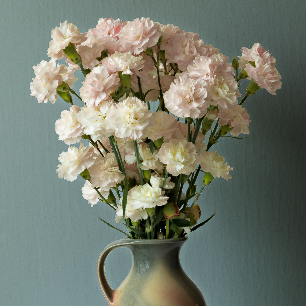
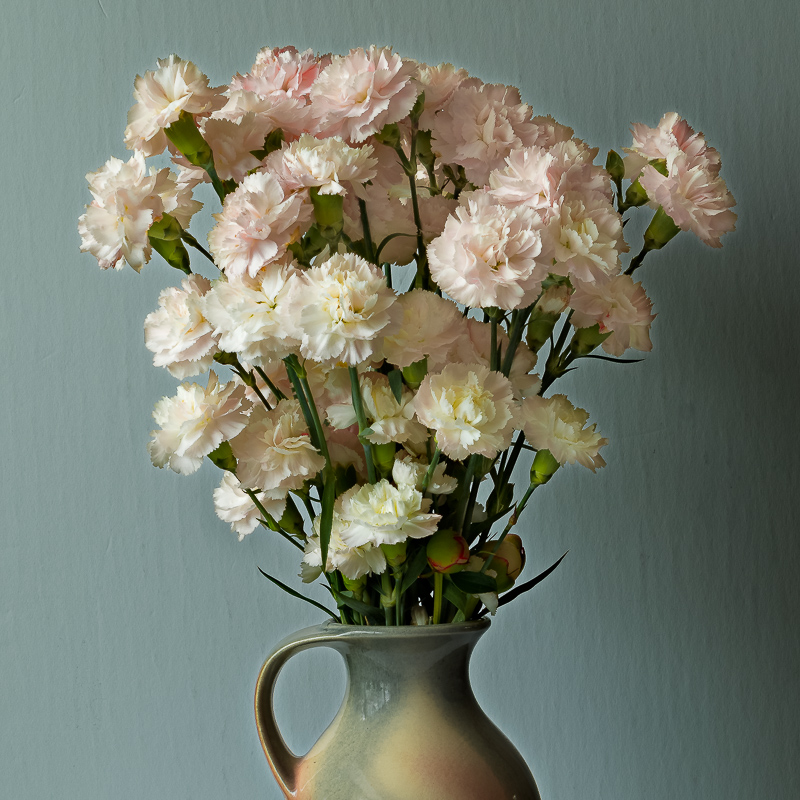
I like this, and I like the diffuse side lighting. I wonder whether it would be helpful to tone down the tonal difference between left and right just a little bit, maybe by burning the left, more the bottom left, rather than dodging the right. However, I'm on a lousy laptop monitor at the moment, so this suggestion may be off-base.
-
25th June 2022, 09:42 PM #3
Re: Pastel Carnations
+1 to what Dan said
-
26th June 2022, 07:43 PM #4
-
27th June 2022, 03:21 PM #5
Re: Pastel Carnations
I looked at this just after looking at Manfred's last posting. so there may be some residual influence on my thoughts. I wonder if you could try actually enhancing the shading at upper right and have it fall off at a 45 degree angle across the image? Exactly contrary to the prior suggestion I know.
-
27th June 2022, 05:26 PM #6
Re: Pastel Carnations
It looks to me as though what you did in the second round brought out more detail in the petals on the left, which was what i was hoping to see.
-
28th June 2022, 11:36 AM #7
Re: Pastel Carnations
That would bring it back closer to what I started with. The reason that I originally dodged the right side of the bouquet was to bring out more details in the blooms. Burning the left completed the process. Your suggestion however would work well to create a moodier picture.
-
28th June 2022, 02:59 PM #8
Re: Pastel Carnations
In my experience, this is particularly difficult to do well with white or nearly white flowers, particularly the burning. I think the revised version does very well in that regard.The reason that I originally dodged the right side of the bouquet was to bring out more details in the blooms.
-
28th June 2022, 06:15 PM #9
-
28th June 2022, 08:21 PM #10
Re: Pastel Carnations
True, particularly for white flowers, one doesn't imply the other. Why not do an 8 x 10 /A4 to get a better idea?
-
28th June 2022, 09:45 PM #11
-
29th June 2022, 01:17 AM #12
Re: Pastel Carnations
Thats a good paper to use for this,
IMHOvery good for showing fine detail
Sent from my iPhone using Tapatalk
-
29th June 2022, 07:06 PM #13
-
29th June 2022, 09:07 PM #14
Re: Pastel Carnations
Indeed. The original Canson Baryta was my most-used paper for serious printing. When they discontinued it, i found that the Baryta II is essentially identical in terms of color rendition, but I dislike the very flat surface. I spent an unreasonable amount of time and ink trying a variety of papers looking for a replacement.
For the moment, I've settled on two papers to replace it. One is Breathing Color River Stone Rag, which is a baryta style paper on a 100% rag base. They call it "baryta style" because they use a proprietary chemical rather than barium sulfate in the coating. It's a very stiff paper because it's coated on both sides. It's OBA-free an a little warmer than the Canson as a result. It has a very nice texture and produces vivid colors. Marc Segal's review showed that it is capable of producing very accurate colors (as is the Canson). However, when I recently printed the photo below for an exhibit, I had the impression that the Canson paper showed very slightly more detail. Maybe that's my imagination. But for the moment, I may use the Baryta II for images that call for a colder paper or very fine detail and River Stone for others. Then again, keeping a stock of two premium papers in multiple sizes is a very big expense, so maybe I'll reconsider.
The first is the photo I decided to leave on Canson. The second is one I decided to print on River Stone. I've posted both here before but am reposting just to illustrate.


-
29th June 2022, 11:04 PM #15
Re: Pastel Carnations
Andre - I had very much the same comments as Dan concerning both Canson Baryta Photographique and its replacement paper Photographique II. I have switched to Hahnemühle Photo Rag Baryta as my new "go to" Baryta paper. It is a touch whiter than the Canson papers and has a slightly higher OBA content. I'm not quite as negative on OBAs as Dan; as someone pointed out to me that Ansel Adams printed on papers that had OBAs in them.
That being said, the two large prints of mine that you saw at SPAO were on Photographique II; the images just printed up better on that paper than any of the other papers that we tried.
-
30th June 2022, 12:11 AM #16
Re: Pastel Carnations
Manfred,
I'm confused. The Hahnemuehle site lists Photo Rag Baryta as OBA-free. See https://www.hahnemuehle.com/en/digit...how/5/298.html and the associated data sheet. I've seen ir reviewed as slightly warm, and the manufacturer says it has a whiteness of 91.0, compared to 96.3 for the Canson paper. Are you referring to a different Hahnemuhle baryta?
I just checked, and the tech sheet for the Breathing Color paper doesn't include whiteness, but it's noticeably warmer than the Canson. I just wrote them to ask if they have that value.
-
30th June 2022, 12:36 AM #17
-
30th June 2022, 02:15 AM #18
Re: Pastel Carnations
Thanks. I havent tried any of them yet.
Sent from my iPad using Tapatalk
-
6th July 2022, 11:53 AM #19
Re: Pastel Carnations
I have finally managed to print the second version on the Canson and on the Harman papers. Neither one turned out very good; mostly because the edges of my selections left a lot to be desired. I might start over from the raw file as a learning experience.
As for the papers, I definitely prefer the more prominent texture and glossier finish of the Harmon over the more subtil texture and silkier finish of the Canson but I can see that the Canson can have a more refined look. I have been paying a lot more attention to the texture of the papers since I removed the glass from my framed pictures.
A few weeks ago, I purchased a sample pack of Hahnemuhle glossy fine art papers. It includes 2 sheets each of 8 different papers. I am slowly working my way through printing the same "Test Picture" on all of them to compare the results. So far, I find that the Photo Rag Baryta is the closest match for the old Harmon although the Baryta FB is also very close second with a slightly coarser texture. The Fine Art Pearl is almost a dead ringer for the Canson except that is has what Hahnemuhle calls a moderate amount of OBAs.
The Hahnemuhle glossy fine art papers can be seen HERE but the texture shown in the pictures is not a good representation of the actual paper.
-
6th July 2022, 05:23 PM #20
Re: Pastel Carnations
Last edited by Manfred M; 6th July 2022 at 11:37 PM. Reason: Paper is Harman not Harmon - corrected this

 Helpful Posts:

 Reply With Quote


