 Helpful Posts: 0
Results 1 to 3 of 3
Thread: The Barn
-
21st August 2022, 12:40 AM #1
-
21st August 2022, 11:50 AM #2
-
21st August 2022, 01:21 PM #3
Re: The Barn
I somewhat agree with Philip, but I wouldn't go as far as grunge.
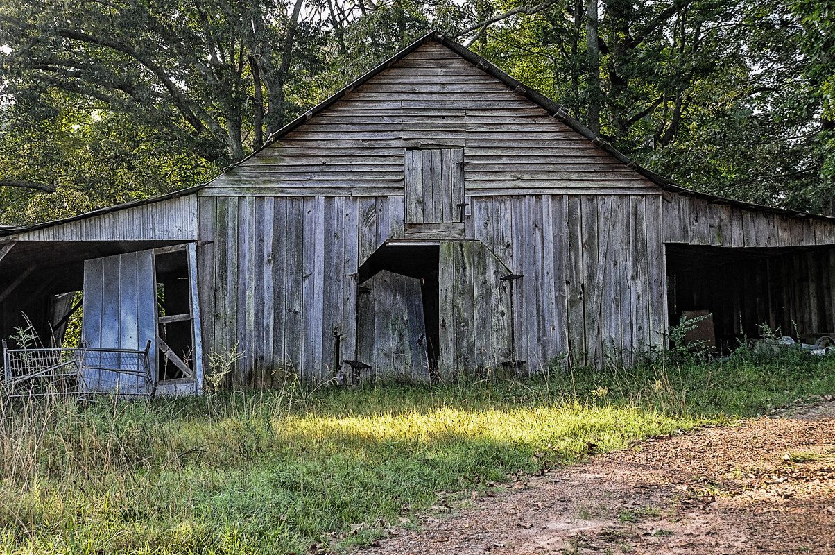
As Ansel Adams said, the negative is the score, while the print is the performance. The question is: what can be done to the digital capture to make it a more interesting image? I am really drawn to old structures like this and photograph them fairly often--usually not very successfully--so I've thought a lot about what makes images like this more interesting for me. Straight out the camera, most of mine aren't all that interesting.
This is one type of photography where I allow myself substantial exaggeration.
In old weathered wood, the textures are often subtle, and the variations in color and tone are often even more subtle. However, that's part of what's interesting, so I boost those attributes.
Here are some directions I would go in. Your preferences could be entirely different, of course.
-- I would increase midtone contrast with a curve.
--I would use a number of tools to boost texture. I started with a very big boost of the Lightroom texture slider and a little boost of clarity, but I added more texture to that in photoshop.
--I burned the bright areas in the foreground (darkened them) because they were distracting. I cropped from the bottom for the same reason.
--I boosted vibrance substantially, but using a mask and brush to limit this change to the building because I didn't want to exaggerate the greenery.
--I sharpened a little bit more.
This is just a quick and dirty edit, but it shows one possible direction to take this. There are others.

Unfortunately, I'm not at the computer that has most of my raw files, so I can't show many examples of photos of this sort that I've worked on. However, I do have one pair with me on my laptop. I'm not 100% satisfied with this one yet, but it shows a more extreme set of edits of the same type.
Raw rendered by Lightroom with no edits:

Working edited version:

Some people on this forum disliked the edited version because it doesn't show the context, but that wasn't my intent. What I find interesting is the interplay of shapes, textures, and tones, and my edits were intended to highlight those.Last edited by DanK; 21st August 2022 at 01:28 PM.

_1163_1a-1163.jpg?width=1920&height=1080&fit=bounds)

 Reply With Quote

