Results 1 to 7 of 7
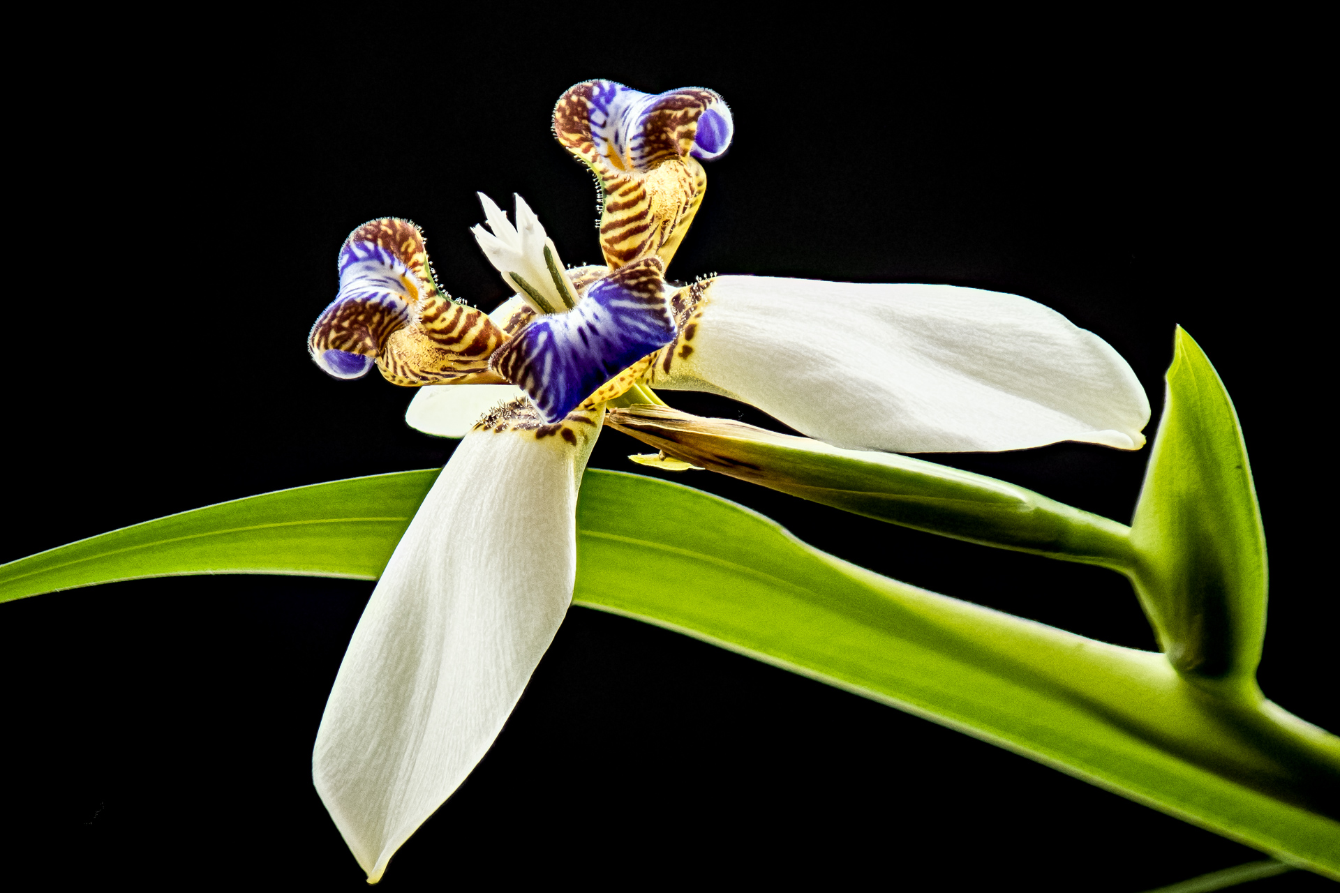
Thread: Neomerica
-
22nd March 2023, 01:46 AM #1
-
22nd March 2023, 02:55 PM #2
Re: Neomerica
Nice.
We are nowhere close to having flowers yet, despite an extremely warm winter.
The image seems hot to me. There are a lot of areas with luminosity between 95 and 99--not technically clipped, but bright enough that the image looks hot and some detail is harder to see. Were it mine, I'd back off the overall contrast a bit and perhaps add a bit of 'local contrast', that is, to bring out textures more in the white petals.
That said, I find white petals very hard to do for this reason. I have a 17 x 22 of a white rhododendron on my wall that I'm leaning toward replacing to this reason. From close up, the textures are apparent, but from across the room, they aren't.
-
22nd March 2023, 06:30 PM #3

- Join Date
- Jan 2009
- Location
- South Devon, UK
- Posts
- 14,638
Re: Neomerica
I find flower portraits to be as difficult as portraits of people.
As Dan mentioned, there are a few slightly over exposed areas on the white petals; but white areas are so difficult. Maybe the bottom petal is fractionally close to the image edge
-
23rd March 2023, 11:03 AM #4
Re: Neomerica
Thank you Dan and Geoff.
I agree with your suggestions. I will also get rid of the small green line at the bottom right corner and clean up a small halo from the stacking process.
Dan, I still have close to two feet of snow in my back yard. We have had a mild but very snowy winter with a total accumulation of over 3 metres (10 ft) and we are expecting more this week-end. The neomerica lives inside in a flower pot
-
23rd March 2023, 02:19 PM #5
Re: Neomerica
3 meters! That's out of our league, although we did have a winter a few years back when the bank on the side of my driveway was taller than me.
For several years, I purchased cut flowers to do inside photography, but I fell out of the habit. I need to give myself a kick in the rear to start again.
I've lately done a bit of experimenting with ways of adding texture. I've largely stopped using LR/ACR clarity, except at very low levels. It includes a midtone contrast adjustment, and it's a fairly coarse and heavy handed effect. I've found that the texture adjustment, which supposedly works at a higher frequency (somewhere between clarity and sharpening) and appears not to much around with midtone contrast, is very subtle and can be increased to very high levels without looking artificial.
The third tool I use is unsharp mask in photoshop. The standard advice is radius 50, threshold 0, amount to taste, but I've just started systematically varying the radius, ranging from 35 to 65 px. My tentative conclusion is that the best result depends on the frequency of detail in the image--coarser detail calls for a larger radius. However, I've done so little experimenting so far that I don't have confidence in that conclusion. What I'm going to do for now is to try a few different settings for a given image.
USM has another advantage, which doesn't matter for white petals: you can boost texture without increasing saturation by using a luminosity blend mode. I typically do that, although I sometimes replicate the layer, setting one for a normal blend and one for luminosity, and then reducing opacity to avoid overkill.Last edited by DanK; 23rd March 2023 at 02:25 PM.
-
24th March 2023, 01:59 AM #6
Re: Neomerica
The USM is my goto tool for local contrast editing and I too use a wide range of radius. I have found that the larger the radius, the smaller the amount need to be. I must confess that I have not done a systematic study to relate the parameters to the frequency of the image. The idea appeals to me. The one thing that I find useful is to selectively blend multiple layers with differing radius and amount.
-
24th March 2023, 01:03 PM #7
Re: Neomerica
That's an excellent suggestion. I've masked a single USM layer but somehow never thought to blend more than one. Now on my to-do list. Thanks.The one thing that I find useful is to selectively blend multiple layers with differing radius and amount.

 Helpful Posts:

 Reply With Quote

