Results 1 to 7 of 7
Thread: Daffodils
-
2nd May 2023, 07:19 PM #1
-
3rd May 2023, 12:04 PM #2

- Join Date
- Jul 2011
- Posts
- 2,645
-
3rd May 2023, 01:40 PM #3
-
3rd May 2023, 01:55 PM #4

- Join Date
- Jul 2011
- Posts
- 2,645
Re: Daffodils
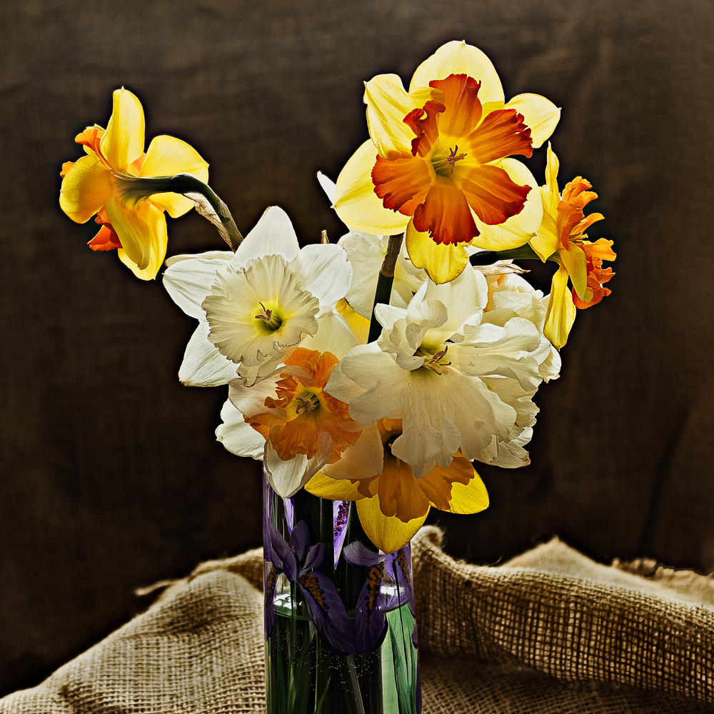
all of the flowers are nicely grouped together except for the one on the left, which is turned away from the camera and a bit removed from the group...shy. In fact that one flower kinda makes the image because of its placement and position.
with the complete vase in the image I think the image would have been perfect, it's wonderfully backlit, the burlap and dark background all work together and it would be a definite wall hanger for me
plus, the purple and green showing through the vase add a perfect splash of unrelated color
-
4th May 2023, 01:02 AM #5
Re: Daffodils
What an imaginative way to refer to a flower! I will have to remember that.
Keeping in mind that we are talking about personal preferences, I tried removing the flower but found that it left the picture unbalanced. I also found that the bouquet looked better with it facing backward. I don't think that I could explain why.
As for the setup, the background is a piece of burlap draped over an opaque board. It is dark because it too is lit from the back so the side facing the camera did not get much light. The blur is a result of using an opening of f/4 with the bouquet much closer to the camera than the background. I focus stacked several shots to get the depth of field to encompass the whole bouquet.
-
4th May 2023, 01:39 PM #6
Re: Daffodils
I like this, and I am not bothered by the flower on the left. I don't think the image is unbalanced as it stands.
I might tone down the brightest areas just a wee amount--maybe just drop the output white point a little bit. I would play with only a very small amount, since the backlighting contrast is part of the point of the image.
-
4th May 2023, 03:06 PM #7

- Join Date
- Jul 2011
- Posts
- 2,645
Re: Daffodils

 Helpful Posts:

 Reply With Quote
 . I don't understand what you mean by " the shy flower image left". Could you elaborate?

