 Helpful Posts: 0
Results 1 to 12 of 12
Thread: A Couple Flowers
-
28th December 2010, 06:15 AM #1
A Couple Flowers -- with Re-Crops
Last edited by mythlady; 29th December 2010 at 03:03 AM.
-
28th December 2010, 06:41 AM #2
Re: A Couple Flowers
Hi Elise
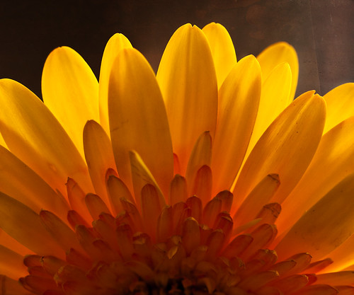
# 1 is just gorgeous I love it - so have no constructive feedback for you other than as Rob would say ....very lush
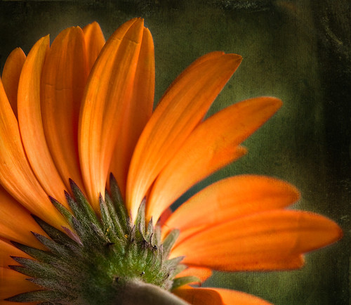
# 2 I wonder what it would look like as a similar crop to #1 - just the top half?
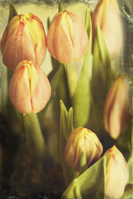
# 3 is lovely for it's subtlety in colour tone and background - but I find myself looking at the flowers in the bottom corner and wanting to move them up into the gap...for some reason.
A lovely series and I'm suspecting the club members will be certainly looking to you for advice on their macro work very shortly.
-
28th December 2010, 07:10 AM #3
-
28th December 2010, 07:46 AM #4Moderator


- Join Date
- Feb 2009
- Location
- Glenfarg, Scotland
- Posts
- 21,402
- Real Name
- Just add 'MacKenzie'
Re: A Couple Flowers
I note what Kay says and, of course, would never disagree 'cause she's a woman and I'm frightened of her! But .......
My preferences would go the opposite way. I feel that #1 is too tight. There's no air/space around the flower and it's constrained. Whereas I love the treatment you've given #2 and #3. But, notwithstanding your excellent post-processing work in terms of this genre - (and that is a compliment for the avoidance of doubt!), I just think the arrangement/composition works wonderfully well.
-
28th December 2010, 09:10 AM #5
-
28th December 2010, 09:19 AM #6
Re: A Couple Flowers
Hi Elise
I love the lighting on #1. Did you use any particular set up for the back lighting? This composition makes me think of the sun. A bit like the art deco rising sun design.
Your use of textures is just perfect.
Great work!
-
28th December 2010, 04:46 PM #7
Re: A Couple Flowers
Thanks very much, everyone. Raylee, I'm not much for set-ups (though I should be, I know), so the back lighting on the first one is . . . the sun. What I did with the texture on that one is to erase it completely from the brightest petals, and then erase less and less as I went down toward the center, leaving each a little bit darker/more textured.
Donald, I was trying to get something to put into the "nature abstracts" challenge, which is why I shot the first one the way I did.
Kay, you're absolutely right about the tulips in the corner -- I saw that as I was processing it, by by then it was dark outside, where I'd been shooting. I'll try again today, with them a little more open, I hope.
I also got what seems to be an absolutely perfect, gorgeous rosebud, but I can't seem to get the right angle on it to do it justice. Will work on it more today.
Naseem, that's a beautiful flower you did, but it puzzles me, because somehow it looks inside-out! It's a lovely shot.
-
28th December 2010, 05:19 PM #8
Re: A Couple Flowers
Hi Elise!
Here's my take on them (but again, it's just my take and I'm not an educated fellow) I like #1 but the blossom strikes me as being ever so slightly off center to the left giving the right side more background length on the right side.
#2 is stunning! I love your use of texture and could easily see this shot selling in a major way at an art show. The only thing I noticed is that the feather on the texture is a little harsh on the stem. A bit too abrupt of a line I think. I do love the use of texture though, and think the shot would make a fabulous wall hanging.
#3... doesn't really strike me in any particular way. It's a fine photograph but not really my personal taste... but that's the wonderful thing about photography, we all have a different style and a different expression.
To summarize... very well done
-
29th December 2010, 12:56 AM #9

- Join Date
- Nov 2010
- Location
- Panama City, FL
- Posts
- 3,540
- Real Name
- Chris
Re: A Couple Flowers
Elise:
Notice in the first image how each of the petals touch at least three sides of the frame and how this framing helps to pull the eye toward the center. In image 2, you ground to each side of the frame but the right side, leaving the farthermost right side petal "dangling" in space and it is terribly bothersome to my eye. Love the angle, the bend, the color...but oh how I want that petal to touch that edge, ever so slightly.
-
29th December 2010, 02:54 AM #10
-
29th December 2010, 03:33 AM #11

- Join Date
- Nov 2010
- Location
- Panama City, FL
- Posts
- 3,540
- Real Name
- Chris
Re: A Couple Flowers with Re-Crops
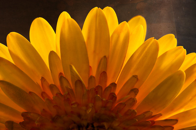
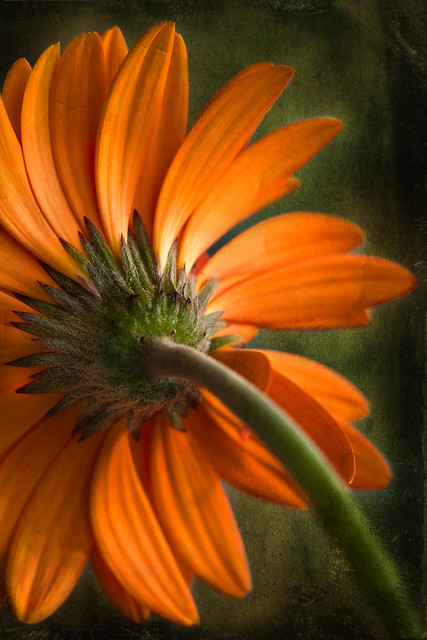
Hmmmmmmmmm...I liked the original framing, just not the crop...In the end though, it is what you like best.
-
29th December 2010, 04:11 AM #12
Re: A Couple Flowers
Kay had suggested a different crop --


 Reply With Quote


