Results 1 to 20 of 21
Thread: Orange Hibiscus
-
8th April 2024, 02:20 AM #1
-
8th April 2024, 01:05 PM #2
-
8th April 2024, 05:00 PM #3
-
8th April 2024, 05:34 PM #4

- Join Date
- Jan 2009
- Location
- South Devon, UK
- Posts
- 14,588
Re: Orange Hibiscus
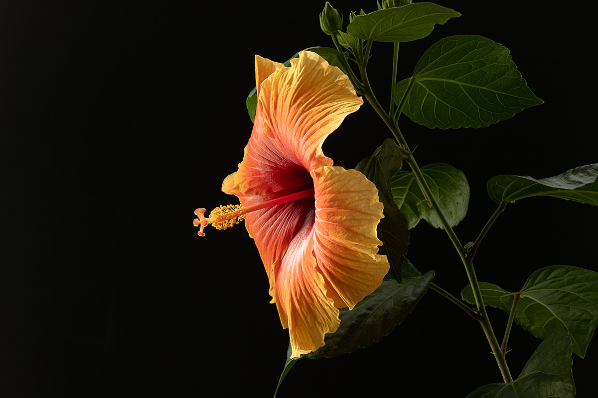
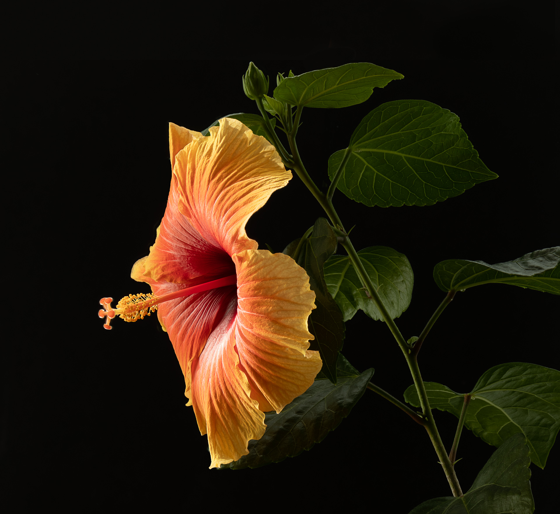
Looks good to me. Maybe you could crop a fraction from the right side and bottom, but only a little.
-
8th April 2024, 05:42 PM #5
Re: Orange Hibiscus
There are always opportunities for improvement in any photograph but this one stood out as is for me. But since you ask (sort of) some judges do not like black backgrounds (I disagree here) and some may like to see the greenery lifted (maybe just a tad?).
-
9th April 2024, 11:44 AM #6
Re: Orange Hibiscus
Geoff and Bill.
My first inclination would be to crop the left side but you might have a point that the right should be cropped. I will cleanup the leaf tip that juts down from the bottom petal and the bit of leaf that protrude from the upper part of the flower before I decide on the cropping.
I don't follow competition rules when I process my pictures. I attempt to create pictures that appeal to me and hope that others will also enjoy them. Most of my flower shots have a true black background. I will take a second look at the brightness of the greenery but will probably stay very close to the current shade.
Thank you both,I appreciate your comments.
-
10th April 2024, 10:32 PM #7
Re: Orange Hibiscus
André, I like the photo, but there seems to be something a bit unnatural about the outline of the leaves and the flower itself.
Maybe the outlines are too sharp, which makes me suspect that the background was selected and replaced with black. According to André, the photo was taken in the morning, right ?
Nevertheless, it is still enjoyable to look at such a beautiful flower.
-
10th April 2024, 10:47 PM #8

- Join Date
- May 2013
- Location
- South Suburbs of Chicago
- Posts
- 78
- Real Name
- Robert
Re: Orange Hibiscus
Gorgeous photo!
-
10th April 2024, 10:49 PM #9
Re: Orange Hibiscus
Bill - this is not a black background, it is quite dark gray. Where judges start criticizing is when too much of the background has crushed blacks. This works for me.
Andre:
I agree with the people that suggest a crop on the left. I find that the crop on the right is too tight and it is too bad that some of the leaves have been cut off.Last edited by Manfred M; 11th April 2024 at 12:47 AM.
-
11th April 2024, 09:30 AM #10
-
11th April 2024, 11:42 AM #11
Re: Orange Hibiscus
You have a sharp eye Antonio. I did select the flower to brighten it slightly. The photo is a focus stack of about 25 shots using Zerene stacker Dmax algorithm. I used a black foam board for the background and it came out this dark from the stacking process. I use this process regularly and most of the time I have to push the blacks down to zero.
-
11th April 2024, 11:43 AM #12
-
11th April 2024, 11:50 AM #13
Re: Orange Hibiscus
I agree 100% that I should not have cut the leaves on the right. This is what I call a rookie mistake of not checking the edges of the frame before releasing the shutter. You are right that the background is not true black but that is not by design. As I mentioned to Antonio, the foam boards don't normally come out this dark and I almost always push then to true black. This one was dark enough so I left it as is.
-
11th April 2024, 01:08 PM #14
-
12th April 2024, 02:12 AM #15
Re: Orange Hibiscus
For this type of work, I almost always use a tripod. It slows the process down and I can check the framing in my viewfinder, screen on the back of the camera and when I shoot indoors, I almost always shoot tethered so I see what I have in the image on my laptop.
In terms of black, that refers to areas that have a value of (0,0,0) in RGB. This does not occur in nature and what comes close are some of the deepest shadow areas, and that does not appear to be the case here. The whole background can't be in deepest shadow. Given the bright highlights on the flower, the dark areas don't look right (i.e. don't make visual sense).
Part of the issue may be that your computer screen and work space may not be set up the same way as mine. My screen output is set to 80 candela per square meter (recommended is 80 - 120 candela/ square meter). The light falling on my work area is 27 lux (recommended for photo editing is generally below 30 lux). As I do a lot of printing, this setup works for me, but might seem dark for a lot of people.
-
12th April 2024, 09:20 AM #16
Re: Orange Hibiscus
The breathing room at the top works for me, but perhaps some of the same at the left? Also for me there's a bit too much uninteresting greenery on the right now, maybe try a radial or gradient mask and reduce the exposure a little?
I wouldn't get too hung up on "black" and "nature". It's a delightful photograph of an attractive flower that stands out against the dark background, and thank you for sharing it with us.Last edited by billtils; 12th April 2024 at 09:27 AM.
-
12th April 2024, 12:57 PM #17
Re: Orange Hibiscus
Speed was indeed the cause of the cropping mistake. The light source was the early morning sunlight and I had to work quickly to set up the tripod and latop and fired up a stack of 25 to 30 shots before the light moved off the flower. Not that I couldn't have taken an extra 10 seconds to check the framing!
As for the black background, I can't see the difference between a background at 0 or at 10. So I find it convenient to just crush it to 0. It has nothing to do with my setup which is very similar to yours. My screen is set up at 120 candela/square metre because, for some reason that I don't understand, the size of the gamut peaks at that brightness level. Although it exceed the Adobe RGB in the entire range of 80 to 140. I work in a windowless room which is too dimly lit to be able to read. I have never measured the illumination level.
You have probably noticed that the extra breathing room at the top is slightly brighter that the rest of the background. It is quite obvious yet, if I simply blurr the demarcation line, I find it difficult to notice the difference. That is why it does not matter to me whether the background is crushed or not.
-
12th April 2024, 01:02 PM #18
-
13th April 2024, 08:00 PM #19
-
14th May 2024, 08:04 AM #20

- Join Date
- Sep 2023
- Posts
- 8
Re: Orange Hibiscus
Wow, it is so beautiful.
Last edited by JamesMarley; 7th June 2024 at 07:48 AM.

 Helpful Posts:

 Reply With Quote


