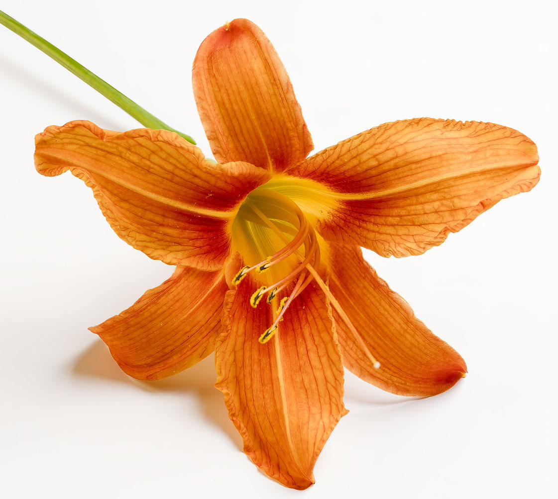
This is not a subject that I normally work with, as I tend to stick with man-made subjects.
The tiger lilies are blooming in our garden and I have threatened to photograph one over the past few years and have gotten around to doing so.
I cut one and placed it on a white background. I lit it with a single, small soft box from the camera right side. I added a white reflector, just out of view on the camera left side.
Retouching - I pulled down the centre point and sharpened the shot and that's all. None of my usual dodging and burning as the shot didn't really need it.
Focus was on the stamen with an f/11 aperture, so there is a bit of sharpness drop off along the stem.
Results 1 to 11 of 11
Thread: Tiger Lily
-
3rd July 2024, 06:10 PM #1
Tiger Lily
-
3rd July 2024, 07:30 PM #2
Re: Tiger Lily
Nice shot, but I find the intense white background harsh and distracting. I started playing with colorizing it, maybe with a complementary color, but nothing was working, and then I realized that most of the background is virtually blown out. Eyes go to brightness, so I find harsh white backgrounds problematic, but fully black ones often OK. In this case, I wondered about something like a light teal, or maybe even just gray.
-
3rd July 2024, 11:36 PM #3
Re: Tiger Lily
Thanks for you thoughts Dan. Let's agree to disagree on this. You like crushed blacks in some of your flower work, whereas I find it doesn't work for me.
None of the whites are clipped (I do check) and there is a drop off of about 20 units on the left edge of the image when compared to the right, i.e. places closer to the light. I have lost a touch of the red channel in a few places, but that is something we do see in flower shots. With my screen set to 80 cd/ sq meter, the highlights are not overly bright.
I had an interesting discussion with one of my instructors about this a few months ago. A lot of people that come from a film background don't like a lot of crushed blacks, but a lot of my fellow students who started off with digital cameras seem to like crushed blacks, even when working in the traditional darkroom. I (and the instructors) didn't like it, but they did.
Most computer screens don't reproduce blacks all that well (not truly black) and silver-gelatin prints have very intense blacks. That might be the appeal for them.
-
4th July 2024, 12:20 AM #4
Re: Tiger Lily
No, not clipped, but nearly so. Photoshop gives me L values of 99 along most of the right hand side, with 98 in the bottom right, and 94-96 on the left hand side. I found values above 96 almost everywhere. That makes darkening or adding color detail impractical, at least with my level of photoshop skills.
Crushed blacks aren't relevant here. We and Ted had long discussions about that in the context of both some classic B&W portraits and some of my flowers, and we won't agree. Ce la vie.
The issue here is brightness and contrast. You have L values as low as the 20s in the flower, and with the exception of the ends of the petals, most of it is <50. So this gives the image two things: high contrast between the subject and the background, and a much brighter background than the subject all the way to the edges. You have often suggested that this rarely works because the eye is drawn to the bright areas and that folks should therefore tone down bright edges, and in fact, I've edited some of my images in response. That's fairly similar to what I'm suggesting here, although in this case, what I find is not my eyes being drawn to the edges, but rather to the around the edge of the flower. But more of a factor for me is that having almost pure white as a background comprising most of the frame just feels harsh to me. It's technically well done, but I don't find it appealing.
It's all taste, of course.
-
4th July 2024, 01:15 AM #5
-
4th July 2024, 09:06 AM #6
Re: Tiger Lily
Manfred, I'm with Dan and Andre on this one, unless you wanted to use the shadows to lend a more 3-D appearance.
As far as the harshness goes why not just make a composite with a suitable choice?
-
4th July 2024, 10:58 PM #7
Re: Tiger Lily
Poppy "Barr's White", Irving Penn, New York, 1968

When I look at this image in the book, "Irving Penn Centennial", put out by The Metropolitan Museum of Art, the image is a touch darker. Penn worked on these in the 1960s and his series on poppies appeared in Vogue Magazine.
Penn has had a significant influence on my own work.Last edited by Manfred M; 5th July 2024 at 03:13 AM. Reason: Typo
-
5th July 2024, 12:02 PM #8
Re: Tiger Lily
Penn's poppy is a beautiful photograph.
A dark background would have made the grayish colour of the petals appear brighter and detracted from the effect that he was looking for. Note also that he mitigated the effect of the white background by allocating most of the real estate to the bloom.
The background on your tiger lily is not quite as jarring if you zoom in on the flower.

Last edited by Round Tuit; 5th July 2024 at 08:15 PM. Reason: replaced mediated with mitigated!!!
-
5th July 2024, 01:41 PM #9
Re: Tiger Lily
I think a more telling comparison would be to one of Penn's mid-tone or darker poppies. In the case of Barr's White, you could make the argument that a darker background would contrast too much with the off-white petals. The darker poppies are more analogous to yours, with petals that strongly contrast with the background.
I agree with Andre: one of the big differences is that Penn's poppies are presented so that they take up most of the frame. I think Andre's crop is a big improvement. In addition, Penn's images have no shadows on the background, which lessens the appearance of contrast.
I know very little about Penn, but it appears that he wanted the entire series to be presented in much the same format, so all that I have seen have very bright white or off-white backgrounds (I can't tell which, having only online sources to look at). Even so, I find the approach progressively less appealing as the petals become darker. For a good contrast, compare the Barr's White posted above with Arab Chief:

Although for full disclosure, I dislike the Arab Chief image also because of the white speckles and splotches on the flowers, which appear to be some combination of tears in the petals and lighting.Last edited by DanK; 5th July 2024 at 01:57 PM.
-
7th July 2024, 12:39 AM #10
Re: Tiger Lily
Thanks for your comments Andre and Dan.
When I started, I had a shot that was framed like Andre's that just did not quite work for me. I also don't particularly like the tight crop that Penn used, especially for the darker poppies. There simply isn't enough negative space, in my view.
I also wanted some very light shadows. I played with another small soft box on the camera left side as well as a highly reflective silver reflector on the camera left side (I even tried a gold reflector). The image I posted is the one that "speaks" to me. I used a white reflector. I am debating cropping a touch off the bottom and camera right side.
-
7th July 2024, 12:40 PM #11

 Helpful Posts:

 Reply With Quote


