Results 1 to 11 of 11
Thread: Potatoes
-
4th November 2024, 03:11 AM #1
-
4th November 2024, 01:34 PM #2
Re: Potatoes
Well done!
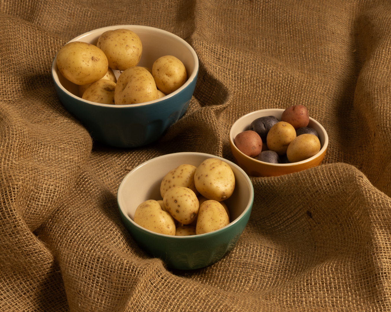
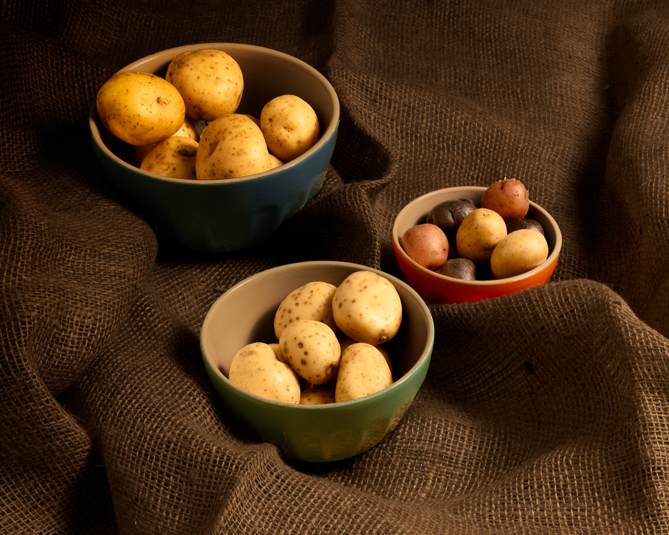
Nice to see you wandering into new areas. This is quite nice for you working outside of your comfort zone. The subject matter is effective and works well against the background. There are interesting shadows and waves in material that add interest.
A few things to try next time. Shoot from a bit lower down to give a different perspective and scatter a few potatoes o the cloth to add a bit less formality to the scene.
-
4th November 2024, 05:16 PM #3
-
4th November 2024, 07:04 PM #4
Re: Potatoes
Nice. I've been tempted to start trying this, and perhaps this will give me a kick in the rear.
I agree with both of Manfred's comments. I think the lighting is also a little hot, particularly on the front bunch.
-
5th November 2024, 09:52 AM #5
Re: Potatoes
I like the choice of sacking material for the backcloth. Very apt.
-
5th November 2024, 12:07 PM #6
-
5th November 2024, 12:13 PM #7
-
5th November 2024, 01:17 PM #8
Re: Potatoes
Interesting image, I like the arrangement of the objects, though I would have been tempted to close them up a bit, less space between objects.
Regarding lighting, this was clearly lit from front right using a source reasonably close to the subject. That means that the light is much closer to the objects front right than to the objects back left and square law fall off means a significant change in light level between the two. I would have used a reflector or second light source to balance things up a bit. You could also use a linear gradient in LR to the same end of course. It may also be that you wanted this effect, there is no right way, it's a matter of taste.
Second point on lighting, your chosen position for the light is almost portrait lighting, quite flattering for a person but perhaps a bit dull for objects where the shape and textures are important. I would have lit mainly from back right, say 135° to the camera so as to get a bit of rim light on the objects and to accentuate the textures, then filled in with a second light or reflector.
An interesting branch of our art n'est ce pas ? Unlike most photography where you capture a subject "as it is", in studio work, and especially still life the process of selecting and arranging the objects is the same for painter or photographer - with the caveat that the photographer has less flexibility than the painter, he cant leave out the bits he does not like.
-
5th November 2024, 01:39 PM #9
Re: Potatoes
That is both the beauty and the challenge of still life photography. The photographer is responsible for everything; set design, setup, lighting, photographing the scene and post-processing. Doing this well takes time and practice.
The advantages of this genre is that it can be done pretty well anywhere, including at home and takes up a lot less space than virtually any other form of photography. You don't have to haul around a lot of equipment, so it is well suited to those of us who are getting a bit older and might have mobility issues.
-
5th November 2024, 06:10 PM #10
Re: Potatoes
Thank you David for your very pertinent comments.
The pronounced front right to rear left drop off was done on purpose in post. For the shoot, I used two softboxes. One on the right and a lower intensity one on the left. Both were close to the scene. I used a gradient mask on a curve layer in photoshop to amplify the drop off effect that I wanted.
This is the SOOC image except for cropping:

I am looking forward to explore this aspect of photography. In the mean time, I am grateful for all the help that comes my way.
-
16th November 2024, 12:51 PM #11

 Helpful Posts:

 Reply With Quote

