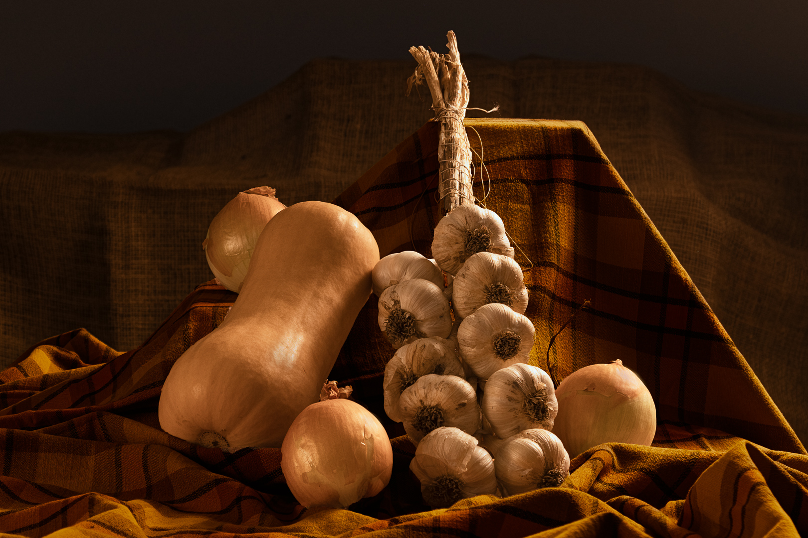
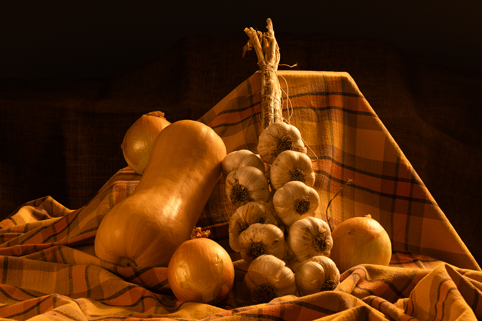
This is my second attempt at creating a still life. My first attempt can be seen here.
I have tried to incorporate the recommendations made previously. I am reasonably pleased with the result even though the colour temperature might be somewhat too warm.
Comments and critiques will be most welcomed.
Results 1 to 14 of 14
Thread: Fall Vegetables
-
10th November 2024, 01:13 PM #1
Fall Vegetables
-
10th November 2024, 01:55 PM #2
Re: Fall Vegetables
I think this is less successful than the first, although you can improve it. I agree that the WB is off. Garlic isn't yellow. When I do studio shots, I always do one shot under the same lighting with a neutral card to give me a reasonable starting point for WB. Sometimes I tinker with that, but then I synch it to the intended images. In this case, I used the garlic, which overdid the correction somewhat but put it closer to what I would consider desirable.
Simply fixing the white balance helps with what I see as the second issue: very little color contrast between the vegies and the background cloth. This gets a little better if you cool the image down.
The third issue is shared with the first: hot spots. You have them in 5 areas in the image. I got luminosity values in the 90s there, but I didn't enlarge it enough to check whether any areas are blown out. If not, you may be able to partially address this in post. I see them on the butternut squash, the onions, the garlic, and especially the garlic stalk.
I am certainly no expert in studio lighting, so I will defer to the folks here who are. However, I do have a lot of experience with studio macro and flower close-ups. In doing that, I depend partly on reflected light. I aim a hair light into a reflective umbrella and then move that around to get a good general illumination. Then I use highly diffused direct lighting to create shadows, etc. I do this with only two or occasionally three lights, so it's a primitive setup, but it usually avoids hot spots.
-
10th November 2024, 06:46 PM #3
Re: Fall Vegetables
André - Dan very much makes the same points I would also make.
The warm colour cast is so strong that it is the first thing that the viewer notices. The background cloth is very busy and detracts from the other materials in the image; something that is more plain would likely work better.
I personally don't mind the hot spots as they add depth the vegetables, but I do agree with Dan that the highlights should not be chipped.
I also find that the dark background is not working for me in this image. That's not a general comment about dark background, but just specifically with this image.
-
11th November 2024, 01:28 PM #4
Re: Fall Vegetables
Again thank you both for your observations.
The strong colour cast is the result of using 2800K lights and leaving the camera white balance set at daylight. I liked the warming effect so I went with it. Every once in a while, I grossly over do an effect, usually clarity or vibrance, only to wonder "what the h... was I thinking" a day or two latter. The morale of the story is that I should not post right after editing!
As for the highlights, I took my queue from David (Chataignier) from this post "https://www.cambridgeincolour.com/forums/thread68845.htm#post776583"
I might have left mine a bit hot but none were clipped. I don't know how one would control the light to avoid them completely. I do think that they add "dimension" to the image.
I picked the cloth for its warm fall like colours. I agree that they are a bit too close to the vegetables. Darkening it seemed to help. The one thing that I regret is not breaking up the strong diagonal on the right side. That and the flat top of the cloth really detract from the setting in my opinion.
Here is a second version that I consider a big improvement. See what you think.

-
11th November 2024, 09:42 PM #5
Re: Fall Vegetables
I think its much improved.
Sent from my iPhone using Tapatalk
-
11th November 2024, 09:52 PM #6
Re: Fall Vegetables
I agree it is much improved. Some of the bright areas near the edges still bother me, as does the hard edge that supports the backdrop. I still find the garlic to be too yellow / red. I like the pop of the highlights on the onions and the squash more in the original, they are a touch too dull for my taste. A touch more contrast would not hurt either as the image is a bit flat for my personal taste.
My thoughts are seen here:

-
12th November 2024, 10:33 AM #7
Re: Fall Vegetables
Yes there are some processing issues and I'm not a huge fan of the rather rigid support behind the yellow fabric, but the lighting moved round to partly rim light the subject is a vast improvement. It brings out the shape of the objects very well. Like Manfred I dont mind the hot spots, they exist in real life... but they must not be blown out.
Manfred's last edit is not bad I feel, perhaps a tad more saturation on the onions and squash ?
-
12th November 2024, 10:39 AM #8
Re: Fall Vegetables
Regarding hot spots, a processing trick that has worked well for me is to use the object remove tool in LR with the opacity adjusted to tone down the hot spot to taste. Works less well when the hot spot is on an edge, tends to blur the edge too much, but otherwise very effective.
-
12th November 2024, 01:02 PM #9
Re: Fall Vegetables
You have nailed the colour of the vegetables under daylight illumination and I like the resulting picture except maybe for the heavily desaturated cloth. Doing so though has resulted in a significant change in the mood of the scene. I was aiming for a warm and cozy atmosphere as if illuminated by a late afternoon sun shining through a window. Yours is cooler and more 'clinical'. Not necessarily better nor worse simply a different interpretation.
This exercise is proving to be very fruitful. I will go through another round of edits and hopefully come up with a final version.
-
12th November 2024, 01:09 PM #10
Re: Fall Vegetables
Thank you David,
I am not a fan of that support either. Fixing it would require a new shoot and we already ate the squash!
I have not kept up with the localised adjustments tools in LR. I use LR for the Library and Print modules and do all localised adjustments in Photoshop.
-
12th November 2024, 01:27 PM #11
Re: Fall Vegetables
David,
Thanks for posting about that LR technique. It makes perfect sense, but it never occurred to me. I'll try it.
Andre--it should be feasible to replicate David's suggestion in Photoshop.
Not to hijack the thread, but the most recent releases have made it even easier for me to do a lot of touching up in LR. I just got a JPEG my wife took in Berlin that had a huge, curved streetlight pole in the foreground. I was able to remove it completely in LR using its AI-based removal tool, although I had to do it in 3 or 4 segments to get good results.
Dan
-
12th November 2024, 02:42 PM #12
Re: Fall Vegetables
André - I find that I tend to iterate when I photograph and retouch, going back and forth, unusually over several days before I am satisfied with the image.
What I was trying to do with this retouch was to reduce distracting elements, which was primarily some of the hot spots on the background cloth along the bottom and along the left hand side of the image, as well as with the bright frame. I don't mind the frame as it helps delineate the right edge of the image. In those areas, I spent a bit of time burning them down.
As Dan pointed out, the garlic did not look quite right with that orange colour cast. I locally removed yellow and a bit of red, but often garlic does have a bit of reds in it, and I wanted to preserve that a bit. It did a bit of global desaturation as well. I also brightened the specular highlights, without blowing them out as I find that the reflections help define the shape of the vegetables and they would look less interesting without them.
Finally, I wanted the vegetables to stand out from the background a bit more and all I did there was increase the contrast (which darkened the shadows and increased the highlights). This has downplayed the cloth, so that the veg stands our more (perhaps a touch too much).
If you want to have a cozier overall look, you might look at using the colour grading functionality in Lightroom, rather than applying a colour cast. The classic approach here tends to be to increase the warm tones in the highlights (yellow / red) and increase the cool tones in the shadows (blues and cyans). That often gives strong results than using an overall warm colour cast.
Cooler and clinical, perhaps, but it does give a different take on your subject. I find that clicking on your first image and then using the Lightbox tool to go through the three iterations of the image to be very informative.
-
12th November 2024, 02:44 PM #13
-
21st November 2024, 01:50 PM #14New Member

- Join Date
- Nov 2024
- Posts
- 1
Re: Fall Vegetables
Nice, I appreciate it.

 Helpful Posts:

 Reply With Quote

