
 Helpful Posts:
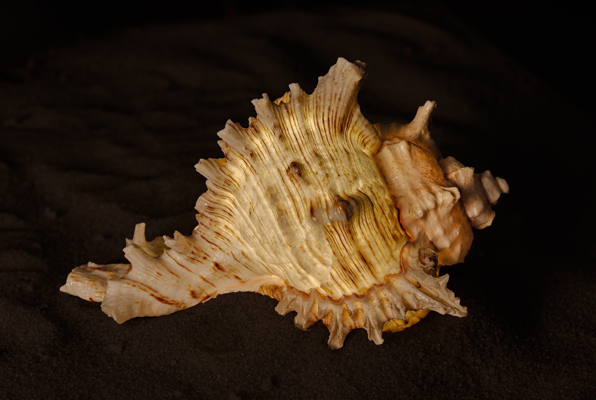
 Another experiment in still life. The shell is approximately 100 mm (4 inch) long.
C & C Welcomed as usual
Results 1 to 9 of 9
Thread: Glowing sea shell
-
27th January 2025, 08:22 PM #1


- Join Date
- Apr 2015
- Location
- Ottawa, Ontario, Canada
- Posts
- 1,367
- Real Name
- André
Glowing sea shell
-
28th January 2025, 10:23 AM #2

- Join Date
- Aug 2015
- Location
- Scotland
- Posts
- 3,010
- Real Name
- Bill
Re: Glowing sea shell
André, I like the treatment of the shell, and can understand why you placed it on sand, but while that adds to the story telling I find it detracts from the impact of the image.
-
28th January 2025, 11:06 PM #3

- Join Date
- Jan 2023
- Location
- Setúbal - Portugal
- Posts
- 299
- Real Name
- Antonio Correia
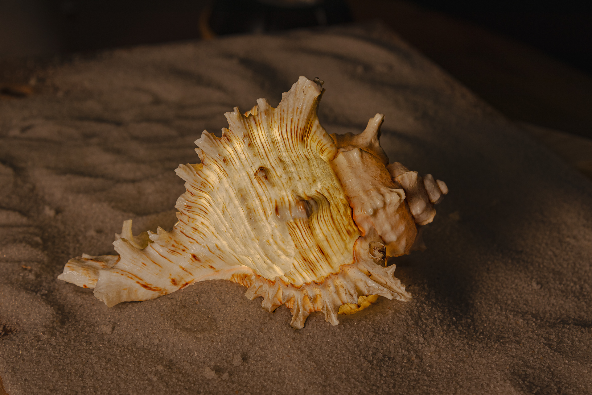
Glowing sea shell edited
While trying to edit this photo, I couldn't achieve satisfactory results in terms of color, perhaps because the color temperaturewhich I adjusted but didn't get satisfactory resultswasn't right.
However, it's true that this is nothing more than a lame excuse...
In LightRoom, I looked for a preset that I liked, tweaked it to my taste, and then adjusted the usual parameters.
There might be some spots or areas in the photo where the light appears too harsh (specular lights), possibly due to strong lighting conditions. However, I dont have much experience dealing with that...
Perhaps a small reflector (a simple paper) behind the shell could bring out some detail in it's back, which might add an interesting touch.

-
29th January 2025, 12:05 PM #4
- Join Date
- Apr 2015
- Location
- Ottawa, Ontario, Canada
- Posts
- 1,367
- Real Name
- André
Re: Glowing sea shell
Thank you Bill, Could you please elaborate as to why you find that the sand negatively affects the impact of the image. Is it too dark? Wrong colour? Or something else? Originally Posted by billtils

-
29th January 2025, 12:19 PM #5
- Join Date
- Apr 2015
- Location
- Ottawa, Ontario, Canada
- Posts
- 1,367
- Real Name
- André
Re: Glowing sea shell edited
Thank you Antonio. Originally Posted by The amateur
I like the tighter crop.
The mixed lighting probably caused your difficulty with the colours. I used a dim and slightly warm softbox on the left of the scene. I also used a cooler light inside the shell to make it glow of its own. Perhaps the softbox needed to be both dimmer still and cooler even though the shell warmed up to cool inside light considerably. The colour of the sand in the picture is actually quite close to the colour of the sand that I used; which is not to say that it couldn't be changed.Last edited by Round Tuit; 29th January 2025 at 12:34 PM.
-
29th January 2025, 01:51 PM #6
- Join Date
- Jan 2023
- Location
- Setúbal - Portugal
- Posts
- 299
- Real Name
- Antonio Correia
Re: Glowing sea shell edited
I was completely unaware of the light inside the maritime structure until now, but it's quite obvious.
I wonder if it might be the cause of the specular highlights. It could be tricky to work with two differently coloured light sources.
I'd suggest experimenting with a single light source, perhaps dimming the exterior light to give you more control when processing the image. I'm not sure if it will work, but it's worth a try. Sometimes we have to rely on experimentation when we're unsure of the technical details.
As for the sand, I think it works well as a base for the image, but pay close attention to the framing to make sure it's completely included.
One more thought: a white background ( simple white paper) may help to isolate the object and make it stand out.
-
31st January 2025, 01:15 AM #7
- Join Date
- Apr 2015
- Location
- Ottawa, Ontario, Canada
- Posts
- 1,367
- Real Name
- André
Re: Glowing sea shell edited
Glowing sea shell take 2.
This is most likely the end of this experiment.
-
31st January 2025, 12:50 PM #8
- Join Date
- Aug 2015
- Location
- Scotland
- Posts
- 3,010
- Real Name
- Bill
Re: Glowing sea shell edited
I like that version a lot (with the caveat that this is an immediate response that reflects my taste rather than any critical appraisal)
-
31st January 2025, 05:55 PM #9
- Join Date
- Jan 2009
- Location
- South Devon, UK
- Posts
- 14,588
Re: Glowing sea shell edited
I also prefer that version.

 Reply With Quote