
 Helpful Posts:
 I am working on a challenging project to create a body of work consisting of five separate but related pictures. Each picture must stand on its own yet the group of five must present a unified whole. An added challenge for me is that the pictures must be monochrome and printed.
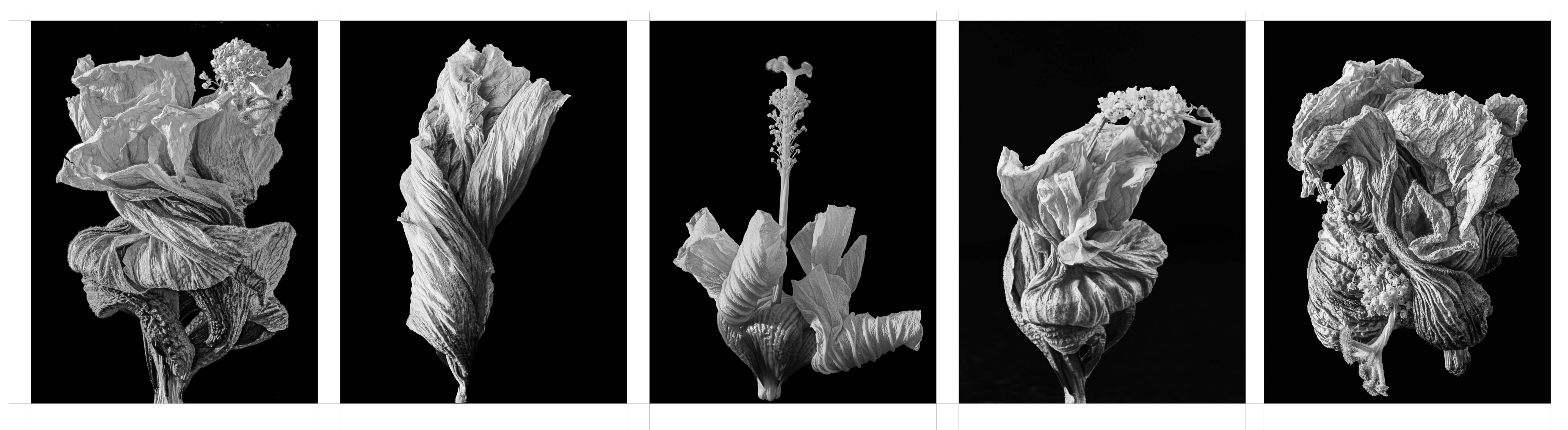
I have chosen wilting hibiscus flower as my subjects because I have a hibiscus plant that has been flowering continuously for the past few months. As the flower wilt and fall off the plant, the petals twist into various shapes creating interesting lines and textures.
To further unify the group, I have shot all the pictures using the same lighting set up; a semi hard light coming from the left side. I have also used a common frame size and filled each frame as much as possible. I have tried a few different layouts and find that this symmetrical seem to be the best.
Here is my first cut at the project.
All comments and suggestions will be most welcomed.
Results 1 to 12 of 12
Thread: Body of Work
-
10th April 2025, 12:24 PM #1


- Join Date
- Apr 2015
- Location
- Ottawa, Ontario, Canada
- Posts
- 1,395
- Real Name
- André
Body of Work
-
10th April 2025, 12:39 PM #2Moderator

- Join Date
- May 2008
- Location
- Windsor, Berks, UK
- Posts
- 16,755
- Real Name
- Dave Humphries :)
Re: Body of Work
Hi André,
I think you have met the challenge rather well.
Dave
-
10th April 2025, 01:18 PM #3
- Join Date
- Apr 2015
- Location
- Ottawa, Ontario, Canada
- Posts
- 1,395
- Real Name
- André
Re: Body of Work
Thank you Dave, that is encouraging. Originally Posted by Dave Humphries

-
10th April 2025, 04:12 PM #4

- Join Date
- Aug 2015
- Location
- Scotland
- Posts
- 3,067
- Real Name
- Bill
Re: Body of Work
Works for me André. I did something similar for my camera club last year and the judge suggested that image in the 4th frame should be rotated so that it and the 2nd frame "held" the centre one. I didn't agree
")
-
10th April 2025, 04:16 PM #5
- Join Date
- Apr 2015
- Location
- Ottawa, Ontario, Canada
- Posts
- 1,395
- Real Name
- André
Re: Body of Work
I did consider that. The problem is then the fourth one would be lit from the opposite side than the other four; breaking the unity. Originally Posted by billtils
Last edited by Round Tuit; 10th April 2025 at 06:24 PM.
-
10th April 2025, 10:52 PM #6

- Join Date
- Mar 2025
- Location
- Setúbal - Portugal
- Posts
- 86
Re: Body of Work
André, this set of images reveals a charming visual coherence.
Each photograph, while possessing an individual and distinct aesthetic, establishes a harmonious dialogue with the others, enriching the project.
All the images maintain a remarkable visual coherence, weaving a strong and genuinely inviting aesthetic narrative, but I would love to see them separately and larger.
The predominance of organic forms in the presented compositions captures the attention with their delicately twisted contours, suggesting a sense of graceful tranquility.
Regarding the second image, I observe that the elegantly inclined flower occupies a central place and a more modest portion of the framing which I do not like very much.
The third image chosen to the central position, presents a more vertical orientation, introduces an interesting visual contrast that adds dynamism to the set, but it's not my favourite.
Perhaps an even softer light could accentuate the inherent delicacy of the flowers, but that would need to be experimented with and played around with the software. And what about a sepia tone ?
-
11th April 2025, 01:42 AM #7
- Join Date
- Apr 2015
- Location
- Ottawa, Ontario, Canada
- Posts
- 1,395
- Real Name
- André
Re: Body of Work
Thank you for your constructive comments. I agree with you that the set would be more coherent if the second and third flowers were closer in shape to the first and last one. Unfortunately, nature did not provide! Originally Posted by AntonioCorreia
The wilted flowers are not very delicate but do offer a strong texture which I emphasized with the lighting.
I have experimented with colouring with both cool colours like blues or mauve/violet and warm ones like yellow, orange,red and sepia. Pure Black & White is the most effective for my purpose.
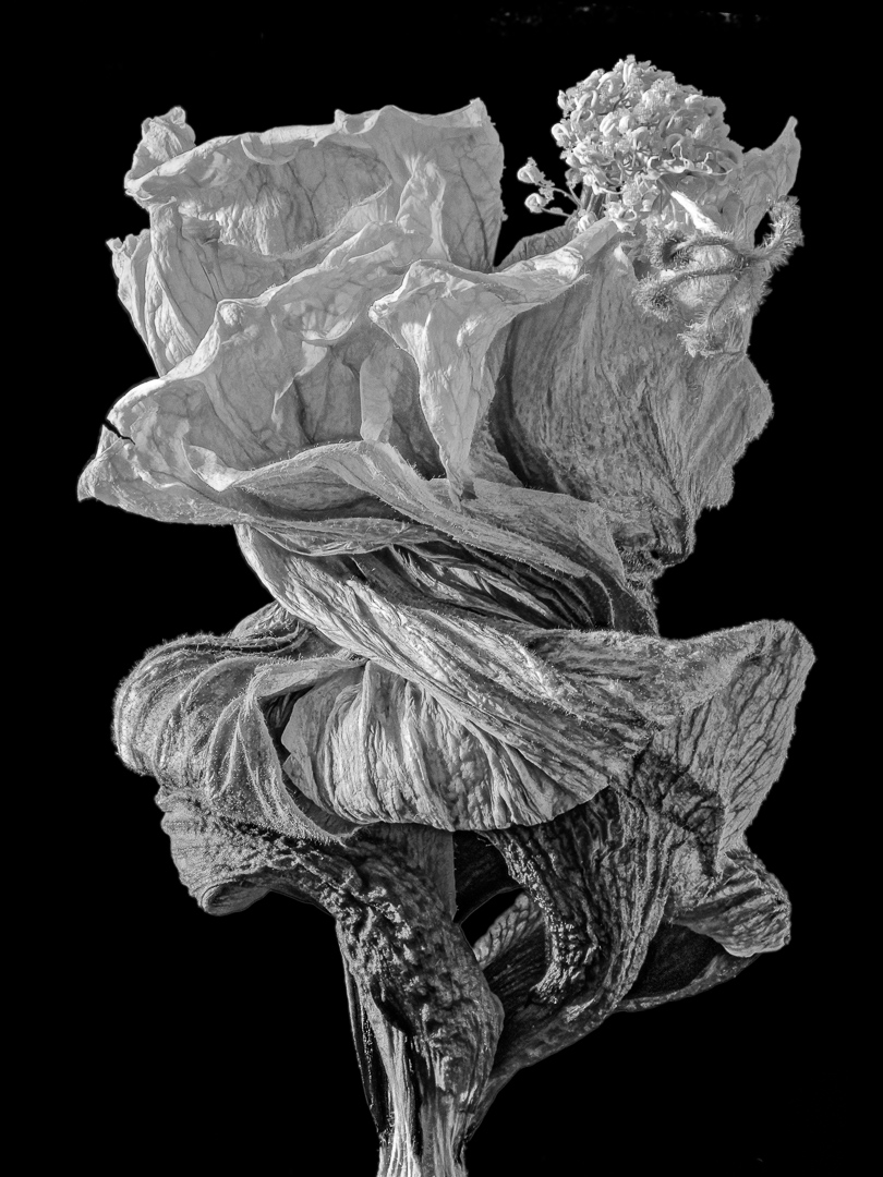
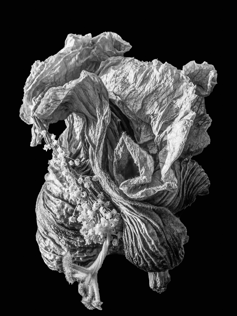
I have posted the individual flower below:
#1
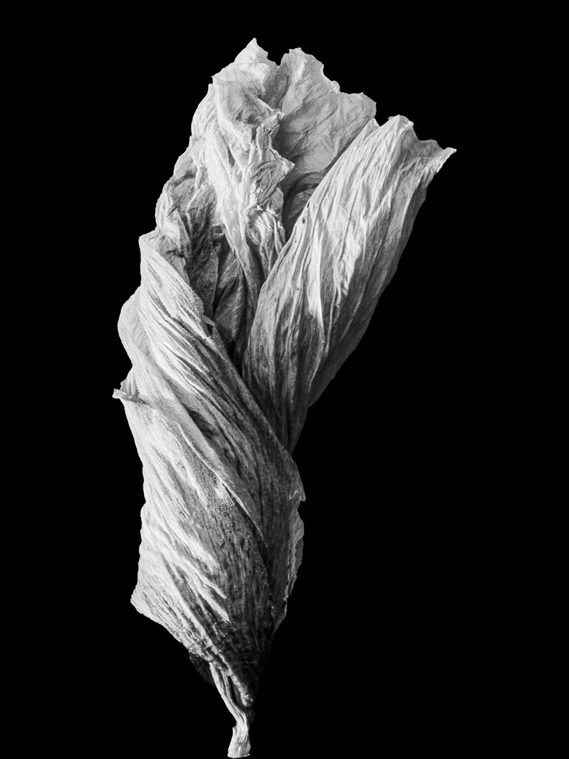
#2
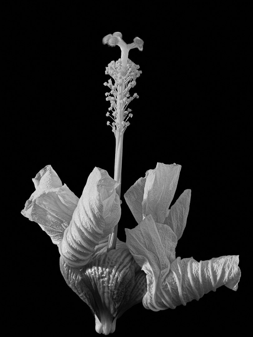
#3
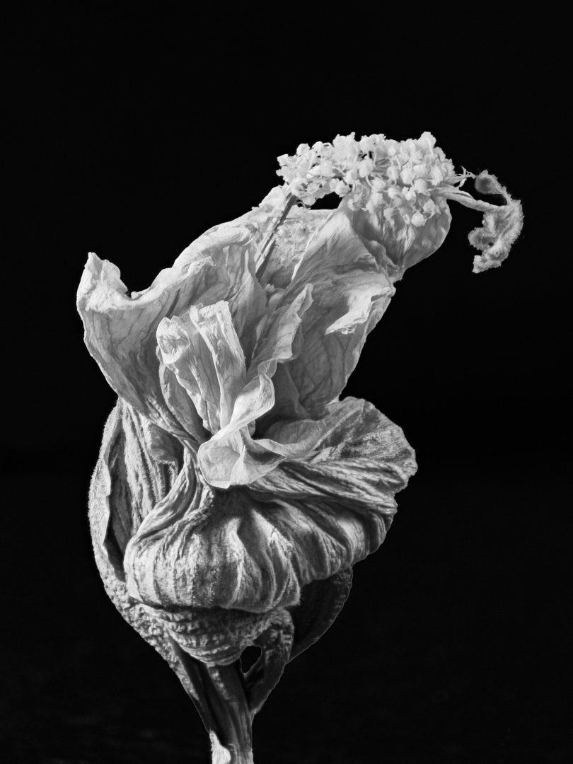
#4
#5
-
11th April 2025, 09:23 AM #8
- Join Date
- Mar 2025
- Location
- Setúbal - Portugal
- Posts
- 86
Re: Body of Work
Looking at this image, I feel that I sought to create a particular atmosphere through the adjustments I made. Applying Negative Clarity envelops the scene in a kind of soft haze, removing some sharpness and defining a perhaps more dreamlike or mysterious, attractive, appealing environment in some way...
However, I realise that in trying to highlight certain details or create a specific contrast, the outlines ended up becoming a little harsh. This excessive sharpness in the contours of some elements of the image may, perhaps, distract attention from the overall atmosphere that the Negative Clarity sought to establish and which should be avoided.
The chromatic duality present, or your decision to deliberately remove and/or manipulate the colour through HSL, when the image was still in its initial state, that is, in colour, is a key element in the visual message to consider, in my point of view. Removing or deliberately manipulating the colour will emphasise the shapes and textures, directing the eye to other aspects of the composition, seeking, if you'll allow me the expression, to be something different, a pebble thrown into a pond.
I did not Color Graded for you but I do have done it here. I like it even better !
You turn to tell me about all this ! Cheers !

-
11th April 2025, 12:31 PM #9
- Join Date
- Apr 2015
- Location
- Ottawa, Ontario, Canada
- Posts
- 1,395
- Real Name
- André
Re: Body of Work
Antonio, Originally Posted by AntonioCorreia
Thank you for taking the time to reinterpret my photo into a beautiful, ethereal and dreamlike version. While I can appreciate the beauty of your interpretation, it is not mine. This is a picture of a dead flower. I try to capture the beauty that I find in the harsh reality of the dead flower. It is not my intention to turn it into a soft and comforting feeling but rather emphasize, as well as I can, the inherent beauty that is there.
-
11th April 2025, 01:08 PM #10
- Join Date
- Mar 2025
- Location
- Setúbal - Portugal
- Posts
- 86
Re: Body of Work
André,
Absolutely, if thats your interpretation, then its certainly valid and Id even say your perspective is a truly commendable one.
I believe that point of view is clearly present in the initial proposals, which I in a way, subverted.
All I can do is wish you good work and much success with the group youre part of and contribute to.
In the meantime, do keep us posted
-
12th April 2025, 04:04 AM #11Moderator

- Join Date
- Mar 2012
- Location
- Ottawa, Canada
- Posts
- 22,283
- Real Name
- Manfred Mueller
Re: Body of Work
Nice set of images, Andre. These should do well.
Overall, I find the crops just a bit too tight and the orientation of #2 does not fit with the rest of the series. That image is on a diagonal, where the others appear to be vertical.
-
12th April 2025, 03:29 PM #12
- Join Date
- Apr 2015
- Location
- Ottawa, Ontario, Canada
- Posts
- 1,395
- Real Name
- André
Re: Body of Work
Thank you Manfred. That is very useful. Originally Posted by Manfred M

 Reply With Quote