 Helpful Posts: 0
Results 1 to 5 of 5
Thread: Flamingo - Camargue
-
6th January 2011, 06:17 PM #1New Member

- Join Date
- Jan 2011
- Location
- LE MANS, FRANCE
- Posts
- 5
Flamingo - Camargue
-
6th January 2011, 07:51 PM #2

- Join Date
- Nov 2010
- Location
- Panama City, FL
- Posts
- 3,540
- Real Name
- Chris
Re: Flamingo - Camargue
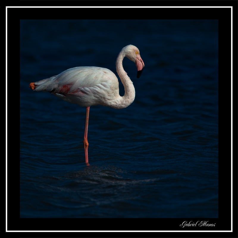
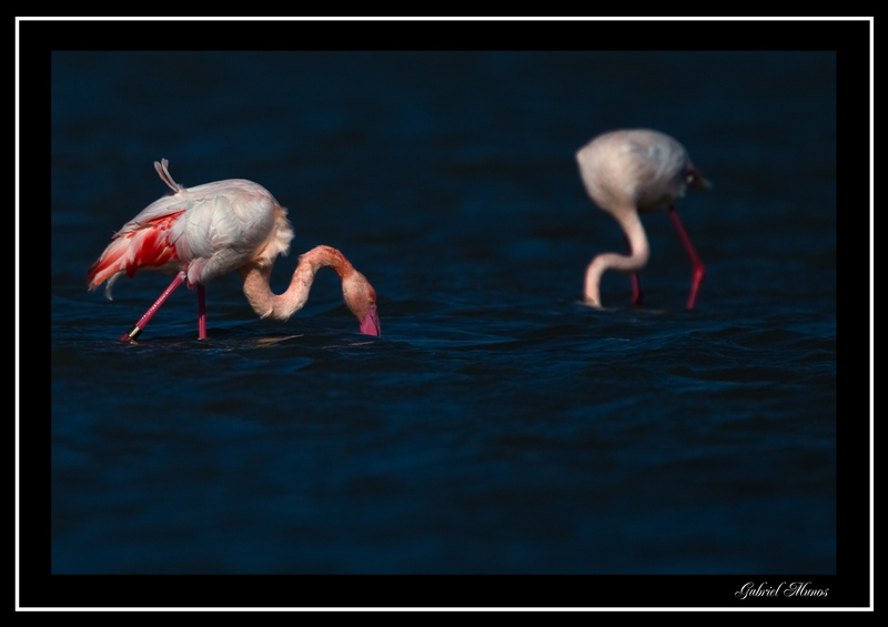
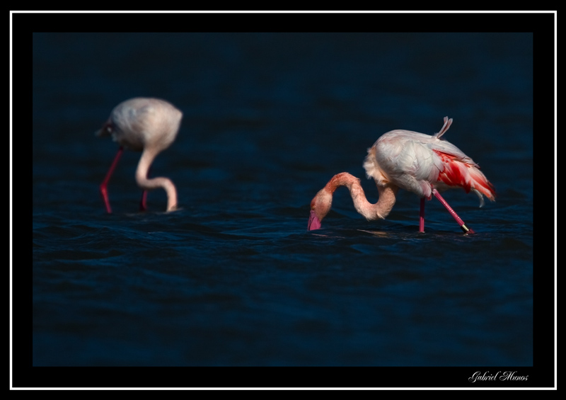
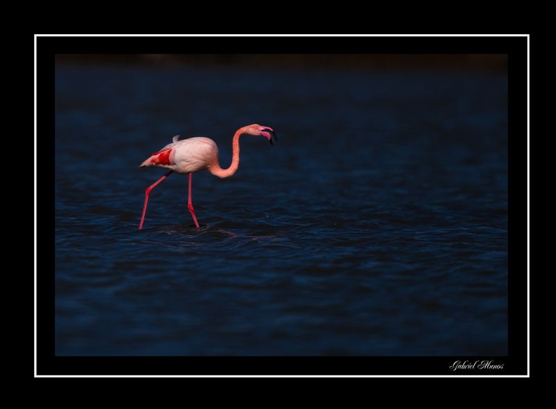
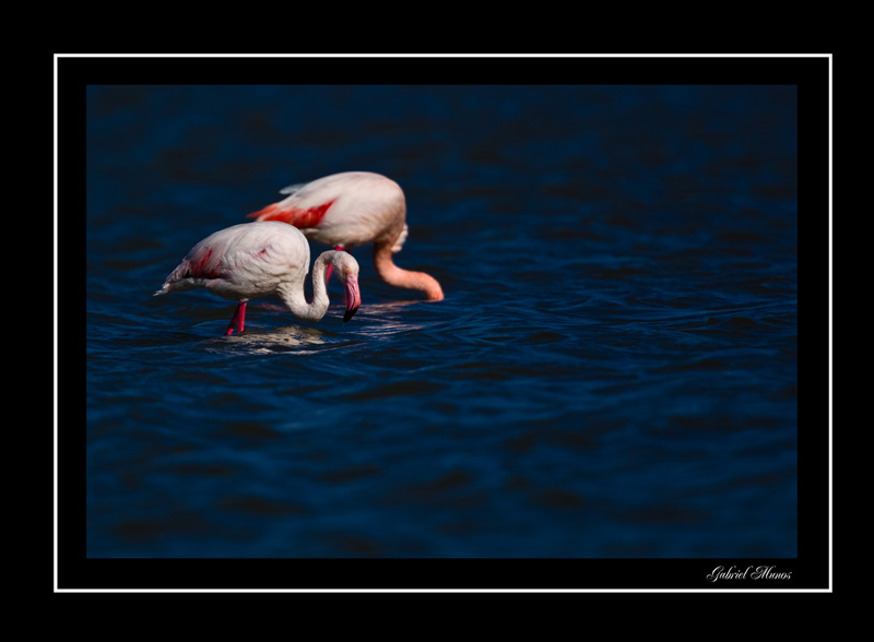
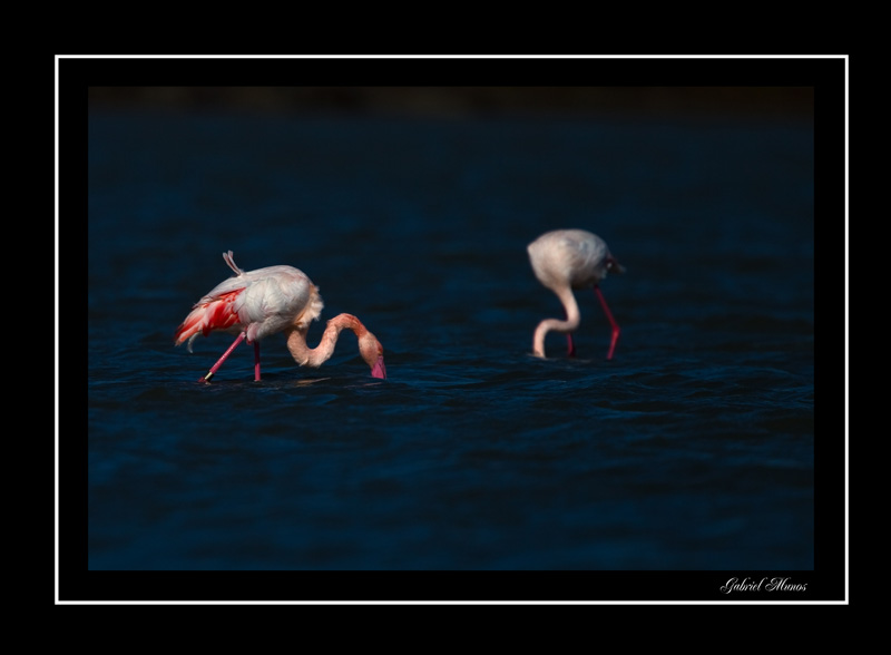
I like the color and DoF usage but I think they could be cropped much tighter. I find that dark band at the top of each print somewhat annoying because I can't make out what it is, might be or should be...it's just a random dark line that doesn't fit the rest of the scene.
I like #1 and #2 better than three but as I said earlier, there is way too much dead space to suit my tastes. (I am suspecting you were quite a ways from these guys, given the image compression.)
-
6th January 2011, 08:13 PM #3

- Join Date
- Jan 2009
- Location
- South Devon, UK
- Posts
- 14,553
Re: Flamingo - Camargue
I suspect that, with care, you could manage a little more in the way of brightness here.
Like you, Chris, I would have cropped a bit tighter; although having a plain 'border' of background does seem to be something of the modern style.
-
7th January 2011, 03:42 PM #4New Member

- Join Date
- Jan 2011
- Location
- LE MANS, FRANCE
- Posts
- 5
-
7th January 2011, 04:46 PM #5


 Reply With Quote