 Helpful Posts: 0
Results 1 to 12 of 12
Thread: 3 pictures, 1 flower
-
8th January 2011, 10:00 AM #1
-
8th January 2011, 11:18 AM #2
Re: 3 pictures, 1 flower
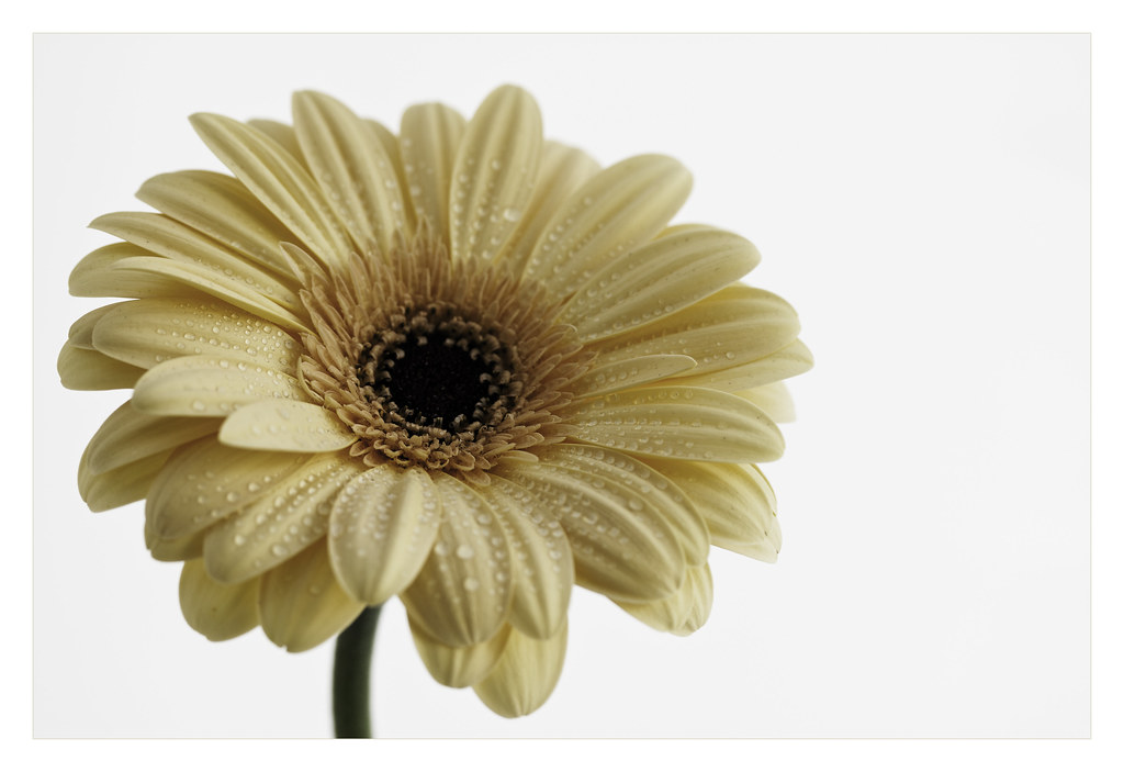
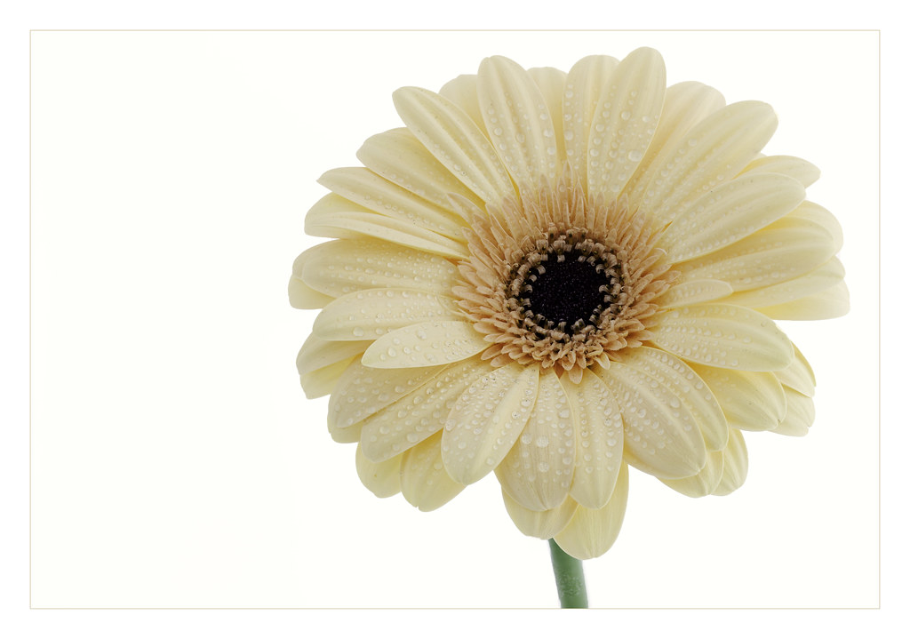
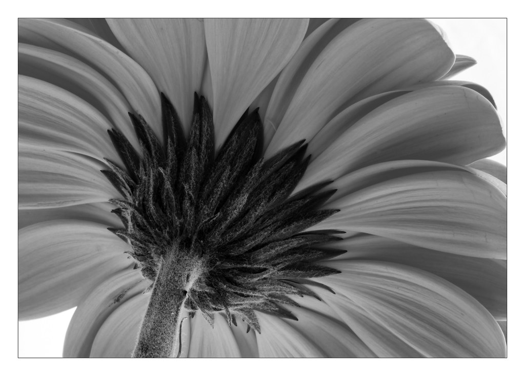
I prefer 1 to 2, due to the higher contrast, but I think my favourite is 3. It shows a beautiful part of the flower that we rarely get to see!

-
8th January 2011, 12:22 PM #3rob marshall
Re: 3 pictures, 1 flower
Raylee
I think the first two would have been better with a dark backdrop. The exposure on the flower is Ok, but the backdrop is just too bright and takes my eye off the flower.
#3 is a good composition but it looks rather flat. I think it needs some directional lighting to get some variation in tone. The gerbera is a good flower for that close up as you should be able to get more shadow/light areas from the petals. I did a quick edit to show what I mean. I just used the contrast layer and dodge/burn. If you don't have colour then you have to use light more to give shape, depth, and definition.
How was this lit?

-
8th January 2011, 02:36 PM #4

- Join Date
- Aug 2009
- Location
- Canada
- Posts
- 3,113
- Real Name
- Wendy
Re: 3 pictures, 1 flower
Hi Raylee: First of all I must say that as usual the flowers are beautiful. Rob and yourself produce some of the best florals I've seen, so I feel a little silly commenting, but comment I must.
I think 1 and 2 would both benefit from a different colour background and perhaps a bit more space around the flower. I have a tendency to like tone on tone and wonder how the first 2 would look with a very pale yellow background and the same colour border with a light drop shadow and thin contrasting stroke - or no stroke at all.
I love the B&W treatment in #3 and also love the composition. I like Rob's version also, but I think either or works with this shot. I might try what Rob did on the sepal and keep the softer look for the petals. It's great as is though, the tones are marvellous.
Wendy
-
8th January 2011, 02:56 PM #5

- Join Date
- Feb 2009
- Location
- Bucharest,Romania
- Posts
- 1,367
Re: 3 pictures, 1 flower
Hi,
I might say that idea came me when I saw the three flower shots.I took the second because it seems to be more sharp.I should name this pseudo 3 D effect "Camellia Effect".So:magic wand tool on the flower,ctrl j,transform-free transform then with the left hand pushed on the Ctrl move with the mouse the small squares of the selection to the wished shape.Then,in this case, desaturate this layer to obtain a "lifted cover" feel.

(worked for You in Adobe PSE)
In such way You might transform a shot in a story.
Don't be upset You ask the opinions.Of course I gave You more so take that as a New Year gift

-
8th January 2011, 03:19 PM #6
Re: 3 pictures, 1 flower
I am impressed Raylee; #1.
-
8th January 2011, 05:23 PM #7
Re: 3 pictures, 1 flower
I'm with Steve on favoring #1 -- it's very delicate and I love the water on the petals. I do think Rob's edit brings out a little more of the depth on #3, but they're both very good. I also agree about the over-brightness of #2 and think Wendy's suggestion is a good one.
Beautiful work.
-
8th January 2011, 05:54 PM #8
Re: 3 pictures, 1 flower
I like #1, yes it is a little bright and the petals might benefit from a similar treatment to what Rob has done with #3 that gives it a nice lit look underneath somehow.
#2 has just come out too bright (after the stacking) and if you have the stacked result saved as psd, you can probably fix it and re-publish a new jpg.
Cheers,
-
8th January 2011, 07:41 PM #9

- Join Date
- Mar 2009
- Posts
- 2,522
Re: 3 pictures, 1 flower
I should be wowed by images no1 and No2 but they leave me feeling a little underwhelmed. I cannot quite figure what it is...lack of vibrancy maybe? They just seem a little dull yet when you look closely they are very well photographed. I don't know maybe Robs suggestion of a dark background is the key.
Number 3 is a different matter entirely. Looks gorgeous in black and white giving us a very 'structural' photograph. Again a little more contrast (as the Master has illustrated)
-
8th January 2011, 08:17 PM #10
Re: 3 pictures, 1 flower
I am writing my response before reading the others.....

and I love #1 and #3 - #2 does not grab me, but I am in general not a 'high key look' fan....now I get to go back and see what others think and learn from their comments, which is half the fun
p.s #3 actually really wins if I had to choose between the siblings
-
8th January 2011, 09:25 PM #11

- Join Date
- Nov 2010
- Location
- Surrey
- Posts
- 32
- Real Name
- Sara
Re: 3 pictures, 1 flower
I like #1 best

-
8th January 2011, 10:26 PM #12
Re: 3 pictures, 1 flower
Thanks everyone! Your feedback is much appreciated.
I'll try against a black background today so stay tuned.
Thanks again
R


 Reply With Quote
