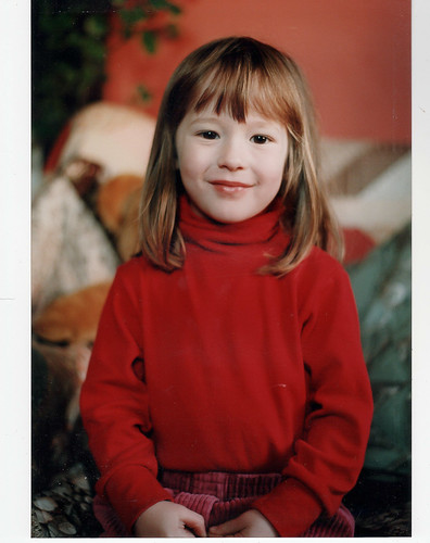
Hi,
I've been reading Colin Southern's School of Portraiture series - I took the attached portrait of my granddaughter - I positioned her in front of a dark hardwood display cabinet, with the right side of her face nearest a glass window ( which provided open-shade lighting), backfilled the left side of her face with a black/gold checkered reflector disk. I did some minor post processing to remove dried milk from near her lips, pop the eyes a bit, a little burning to tone down highlights on bridge of nose and under right eye and hair near lower-right corner, added vignette to promote looking inward from the frame edges.
Would appreciate any review/feedback folks would care to share.
Thanks!
Charlie Jones
 Helpful Posts: 0
Results 1 to 9 of 9
-
12th January 2011, 09:07 PM #1New Member

- Join Date
- Jan 2011
- Posts
- 5
Portrait Review/Feedback Request.
Last edited by Dave Humphries; 12th January 2011 at 09:27 PM.
-
13th January 2011, 04:30 AM #2

- Join Date
- Dec 2008
- Location
- New Zealand
- Posts
- 17,660
- Real Name
- Have a guess :)
Re: Portrait Review/Feedback Request.
Hi Charlie,
Just a quick note to let you know I've seen this, and I'll reply more soon (just on an iPad at the moment).
-
13th January 2011, 07:29 AM #3

- Join Date
- Jan 2011
- Location
- Winkleigh, Devon, UK.
- Posts
- 45
- Real Name
- Peter
Re: Portrait Review/Feedback Request.
A pretty girl. I wish my daughter was as cooperative.

To me, the photograph seems to be cropped too tightly. Also, the depth of field seems too shallow - her hair on the right hand side, and her collar are out of focus. There is a hint of too much processing of her skin.
Peter.
-
13th January 2011, 08:24 AM #4

- Join Date
- Dec 2008
- Location
- New Zealand
- Posts
- 17,660
- Real Name
- Have a guess :)
Re: Portrait Review/Feedback Request.
Hi Charlie,
Just a collection of random thoughts ...
1. Lighting: Looks good, as does white balance. So from a capture point of view no real issues, although it might have been better to stop down to F5.6 or F8 and/or ensure you get the ideal focus point as the DoF seems a bit marginal. Do you know where your focus point was?
2. Composition wise, I think it kinda "lacks any direction" if you know what I mean - probably because the composition/crop is so tight. Personally, I'd like to at least see the shoulders in the shot.
3. Personally - especially with the ladies - I've been adding more fill light in post-processing recently. It makes the image a little less contrasty, and reveals more shadow detail which seems to give a better result (or I think so anyway)
4. One area that does need a bit of fixing is sharpening. What sharpening have you applied so far, and how heavily was the original image cropped? If nothing else, this image would probably benefit from output sharpening of around 100% @ 0.3 pixels.
Hope this helps for starters!
-
13th January 2011, 08:43 AM #5

- Join Date
- Jan 2011
- Location
- Winkleigh, Devon, UK.
- Posts
- 45
- Real Name
- Peter
-
13th January 2011, 05:45 PM #6New Member

- Join Date
- Jan 2011
- Posts
- 5
Re: Portrait Review/Feedback Request.
Hi Colin,
Thank you (and others) for you review/suggestions, I very much appreciate it :-)
In response to your comments/questions:
1) The F/stop I used was F/4.5, with shutter at 1/125 and ISO=800. I used single-point auto focus aimed at the line demarking the iris/white of the left (from my perspective) eye (the eye closest to me).
2) I've attached the non-cropped image. From comments regarding crop being too tight, I suspect I should have backed up a bit and/or reduced my focal length. I took the image from 0.8m using 24-70mm zoom - set at 70mm.
3) I had similar thoughts regarding the lighting ratio - I'll experiment with adding some fill in camera RAW.
4) I applied two levels of sharpening. One in camera RAW (amount = 65, radius = 1.5, detail = 25, masking = 0) and in Photoshop (amount = 150, radius = 2, threshold = 3). Some of the sharpening has likely become obscured as I did apply gaussian blur to the cheek area of left side face and the bridge of nose - the attached non-cropped image includes the camera RAW sharpening, but no photoshop post processing - dried milk is evident ;-)
Any follow up comments would be welcome/appreciated - Thanks again!
Charlie
-
13th January 2011, 06:45 PM #7New Member

- Join Date
- Jan 2011
- Posts
- 5
Re: Portrait Review/Feedback Request.
Hi Peter - Thank you for your review and comments/suggestions - I appreciate it! See my reply to Colin for additional details and follow up.
Cheers!
Charlie
-
14th January 2011, 02:53 PM #8

- Join Date
- Jan 2011
- Location
- Shanghai
- Posts
- 98
- Real Name
- neil
Re: Portrait Review/Feedback Request.
Charlie,
Although others may think the framing it is a little tight I really like it. She has some character and that comes across very well in this tightly framed composition. Also lighting is nice.
However in a portrait I think that you need to nail the eyes and get them sharp, particularly if the subject is looking at you. To me this is the main issue..
neil
-
16th January 2011, 06:10 AM #9New Member

- Join Date
- Jan 2011
- Posts
- 5
Re: Portrait Review/Feedback Request.
Thank you Neil - I appreciate your review and comments/suggestions!


 Reply With Quote
