 Helpful Posts: 0
Results 1 to 8 of 8
Thread: 2010+1
-
13th January 2011, 07:49 PM #1
-
13th January 2011, 08:02 PM #2
Re: 2010+1
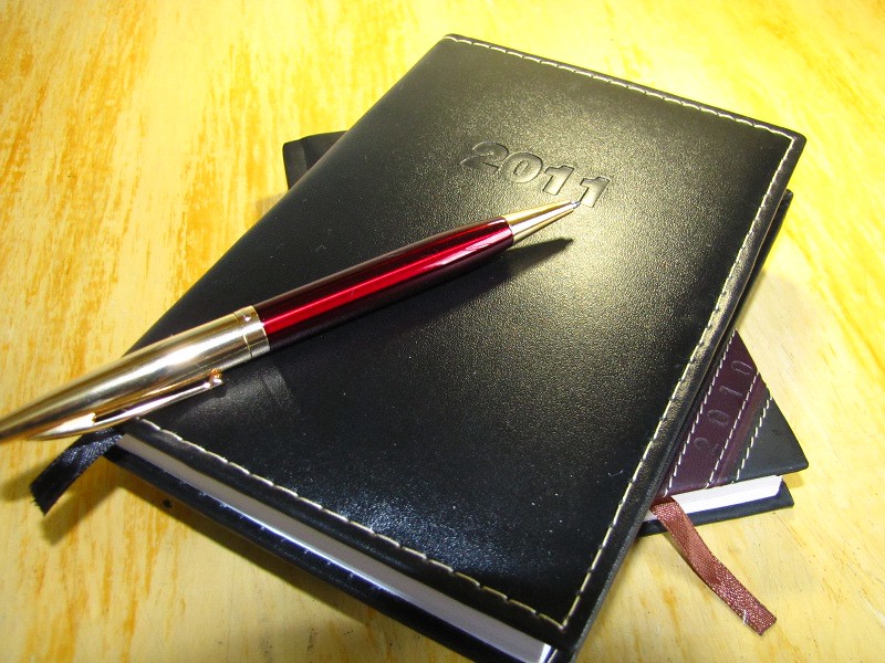
Jonathan, I believe you can take a reshoot of this still-life, yeah? Keep the composition but try not to cut the pen and the diary and it will come out nice. Cover your movable lamp with a thin white cloth and it will allow you to control the table reflections better. You did good on this shot. I believe you can do better. Great start!
-
13th January 2011, 10:03 PM #3
Re: 2010+1
Agreed, and look out for the shadow at the front edge too.
When I saw the thread title, I was expecting this to be a reminder to set one's camera and/or PP software copyright message to "2011" - I think I got to July before I changed from 2009 last year - this year I did it on 2nd January
-
14th January 2011, 02:48 PM #4
Re: 2010+1
Hello,
Thank you for the feedkback, Jiro and Dave. Hum, this cloth thing sounds nice, but I think that I'll need an assistent - hope that my father is willing to help me.
O, Dave, you actually reminded me to change the time, since here in Brazil we're in dayligh saving time and the clock of the camera is one hour in delay. But the date is correct, it goes automatically.
-
14th January 2011, 04:13 PM #5
Re: 2010+1
The highlights are still too 'hot', or should I say 'too bright' compared to the midtone and shadows. You could probably use a -1 exposure adjustment either in the aperture setting or to the shutter speed. The cloth will somehow soften the shadows and probably lessen the exposure by about 1/2 to 2/3 value. Either way, I'd say a lesser exposure would add more drama to the image. It doesn't hurt to experiment on your camera settings and learn something along the way, Jon.

I'd like to add something Jon, Crimson red background compliments anything that is black. You could probably consider changing the background color to something red (like a velvet or felt fabric) to really make the image strong. Notice how nice the red color on the pen reacts nicely to the black texture of the planner? Just an idea.
Last edited by jiro; 14th January 2011 at 04:25 PM.
-
14th January 2011, 11:31 PM #6rob marshall
Re: 2010+1
Hi Jonathan
The highlights are a little blown, probably because your metering picked up the central area of black (diary) and turned up the exposure (I couldn't see your EXIF). I think it looks better in BW as the bright areas look less dominant. I like the shot idea. I've been thinking a lot over the past few days about 2010/2011...

-
14th January 2011, 11:31 PM #7
-
15th January 2011, 12:12 AM #8
Re: 2010+1
How close is the colors in the photo to the actual color of the desk?


 Reply With Quote
