 Helpful Posts: 0
Results 1 to 9 of 9
Thread: Abandoned Train
-
16th January 2011, 07:43 PM #1

- Join Date
- Jan 2011
- Location
- Santa Rosa CA.
- Posts
- 89
Abandoned Train
-
16th January 2011, 09:44 PM #2
Re: Abandoned Train
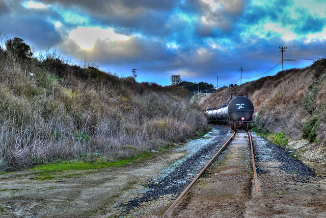
I like everything, except for the sky. The white spot too irritates eyes. And rails all in sand.... All also goes?

-
17th January 2011, 02:08 AM #3
Re: Abandoned Train
I like. The colors in the sky are great, but I agree with yegor about the bright spots. A little too much, but everything else is great. Great shot!
-
17th January 2011, 02:30 AM #4

- Join Date
- Nov 2010
- Location
- Panama City, FL
- Posts
- 3,540
- Real Name
- Chris
Re: Abandoned Train
One of the nice things about Post Production editing is ...if your camera gives you lemons, make lemonade.

Clone and healing brush as well as some cropping. I did do two layer adjustments to brighten the highlights and saturate the darker values to match waht was already there..and a little burning and dodging.
-
17th January 2011, 03:14 AM #5

- Join Date
- Jan 2011
- Location
- Santa Rosa CA.
- Posts
- 89
Re: Abandoned Train
thats a great edit! well done man
-
17th January 2011, 03:22 AM #6

- Join Date
- Jan 2011
- Posts
- 17
-
17th January 2011, 04:21 AM #7
Re: Abandoned Train
Hi Brad and welcome to CiC. (I hope this is your name. If you have a look in Your Profile you can include your first name and it will show up on the left here. We tend to address each other by first name here).
I did like Chris’s comment about lemons – I must remember that one.
I also agree with Yegor about the bright spot. The viewer’s eye is attracted to two things – the brightest and the sharpest spot of the image and if the either is not the main centre of interest by design they will be by accident.
Regarding the image – I do like Chris’s crop (or is that Criscrop) but I do not like the colour in the image. I am not sure if you have done any post production but it is terrible blue. This may have been your intention to give the image a cool feel but it is a bit over cooked for me. If it is unintentional you might check what white balance setting you have your camera set on.
I do like the overall composition thought suggesting a good eye for a photo. I hope to see more.
-
17th January 2011, 08:21 AM #8

- Join Date
- Jan 2011
- Location
- Santa Rosa CA.
- Posts
- 89
Re: Abandoned Train
hey guys thanks for the criticism. i used photomatix 4 using 5 exposures to make it into HDR. other than that there has been no editing. i will adjust the image later today or tomorrow and post it up here to see if you guys like it any better
-
17th January 2011, 12:38 PM #9

- Join Date
- Nov 2010
- Location
- Panama City, FL
- Posts
- 3,540
- Real Name
- Chris
Re: Abandoned Train
I thought it had that edgy HDR look to it but each to his own in that department. I don't like it because it sets everything up as almost surreal. Reminds me of some recreational things I did in the 60's - not many, mind you exactly because of this edgyness.
That aside, other than my crop and cloning exercise, I think Yegor's point about the sky hits this image dead-on. It's just too.....TOO much. Another area which irritates my eye is the patch of very green grass at the left leading in edge. It's as bright as the sky and in the reality of our natural world, while you show good linear perspective, you exhibit almost no aerial perspective. Think of the Great Smoky Mountains and how the distant hilltops get lighter as they recede into the distance. This is the problem with HDR as it gives everything the same atmospheric look.You seem to have a good photographic eye..were I you, I'd ditch the HDR stuff and go real.Last edited by MiniChris; 17th January 2011 at 04:37 PM.


 Reply With Quote

