 Helpful Posts: 0
Results 1,401 to 1,420 of 1707
Thread: Landscapes - Archive
-
23rd April 2011, 04:47 PM #1401

- Join Date
- Apr 2011
- Location
- Toronto
- Posts
- 57
- Real Name
- Chris
Re: Landscapes
-
24th April 2011, 10:16 PM #1402
-
24th April 2011, 10:19 PM #1403
-
24th April 2011, 10:21 PM #1404

- Join Date
- Nov 2010
- Location
- Panama City, FL
- Posts
- 3,540
- Real Name
- Chris
Re: Landscapes
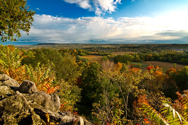
It is not lacking, it is overing...my word. It lacks a sense of aerial perspective - the background has too much depth. If you would take the brightest tree in the back and drop its tonal value by half, and the tree in the front right down by 1/3, I think you would see a dramatic difference in this scene..
-
24th April 2011, 10:26 PM #1405
-
24th April 2011, 10:59 PM #1406

- Join Date
- Nov 2010
- Location
- Panama City, FL
- Posts
- 3,540
- Real Name
- Chris
-
25th April 2011, 12:10 PM #1407
-
28th April 2011, 04:29 AM #1408
-
28th April 2011, 04:27 PM #1409
-
28th April 2011, 07:45 PM #1410
Re: Landscapes
very colourful panorama, I like it

at first sight i would cut a bit the sky, in order to leave it in the upper third of the frame.
Perhaps including something closer to the camera in the foreground would increase the "feeling of depth" coming from the perspective (also the blueish UV haze on the mountain improves the depth of the picture).
nice shot
Nicola
-
28th April 2011, 07:52 PM #1411
Re: Landscapes
very nice shot Vandenberg, as usual,
but I don't understand the focus.. why half bike is out of focus and the door and the step on the right side is in focus?
why don't you blurr the step and the door? my eyes are rebounding from left to right (what is the subject?)
sorry if I don't understand...
N
-
28th April 2011, 08:28 PM #1412
-
29th April 2011, 08:31 AM #1413
Re: Landscapes
I know how narrow is DOF at 1.4, and how it changes in relation with the distance from the focus point, i mean if you were closer to the bike, the step/door will be out of focus, but I think you use a 50mm prime lens, so if you get closer to the bike the point of view change...
you need a 24mm 1.4


-
29th April 2011, 02:47 PM #1414
Re: Landscapes
i wanna have a Carl Zeiss 35mm f/1.4 ZF.2 Planar T*

-
29th April 2011, 06:03 PM #1415
Re: Landscapes
Thank you for the feedback Nicola! I hope to return to this location with a real DSLR sometime this summer. I will keep your composition suggestions in mind. I also hope to attempt my own version of Ansel Adam's iconic photo:

Found here.
Ansel Adam's sons were kind enough to provide GPS coordinates for the shot.
-
29th April 2011, 07:29 PM #1416
-
29th April 2011, 09:32 PM #1417
-
30th April 2011, 10:12 AM #1418
Re: Landscapes
an other nice one! I will try to emulate your shots during my next walk with my camera(unluckly I haven't shot since the last month...


 ) It will be not easy!!
... watching again your picture, perhaps I would tone down the red chain.. it is a bit distracting since is more colourfull than the rest
-
30th April 2011, 10:18 AM #1419
-
30th April 2011, 10:24 AM #1420


 Reply With Quote


