 Helpful Posts: 0
Results 141 to 160 of 1707
Thread: Landscapes - Archive
-
2nd June 2010, 07:28 AM #141
Re: Another post card from the Republic of Ireland
-
2nd June 2010, 08:02 AM #142

- Join Date
- Aug 2009
- Location
- Canada
- Posts
- 3,113
- Real Name
- Wendy
-
2nd June 2010, 05:20 PM #143
-
2nd June 2010, 05:21 PM #144
-
3rd June 2010, 05:43 AM #145

- Join Date
- Aug 2009
- Location
- Canada
- Posts
- 3,113
- Real Name
- Wendy
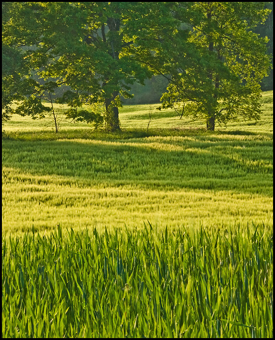
Re: Green Fields
Last edited by ScoutR; 3rd June 2010 at 05:44 AM. Reason: typo
-
3rd June 2010, 01:26 PM #146
-
3rd June 2010, 01:53 PM #147
-
3rd June 2010, 01:56 PM #148
-
3rd June 2010, 06:26 PM #149

- Join Date
- Mar 2009
- Posts
- 2,522
Re: Landscapes - Please post them here
Super shot Wendy. A real 'courting field'. [They]Those were the daysGreen Fields . A good sense of depth and the one colour landscape works wonderfully well.
SteveLast edited by Wirefox; 3rd June 2010 at 06:28 PM. Reason: Northern vernacular used
-
3rd June 2010, 08:32 PM #150

- Join Date
- Aug 2009
- Location
- Canada
- Posts
- 3,113
- Real Name
- Wendy
-
3rd June 2010, 09:27 PM #151Moderator


- Join Date
- Feb 2009
- Location
- Glenfarg, Scotland
- Posts
- 21,402
- Real Name
- Just add 'MacKenzie'
Re: Landscapes - Please post them here
Wendy
And ... 'getting the feel of it' is what is should, primarily, be about. Steve has said the same thing in other threads (including today here in post #34) - that technical 'excellence' is not what turns him on. I think he's just so right. And, in this one, you have indeed conveyed a 'feeling' an 'emotion'. And you have stimulated emotion in others - Is there anything else that matters?
-
4th June 2010, 05:44 PM #152
-
4th June 2010, 06:17 PM #153
-
4th June 2010, 07:16 PM #154
-
5th June 2010, 02:08 PM #155
-
9th June 2010, 07:05 AM #156
-
9th June 2010, 07:30 AM #157Moderator


- Join Date
- Feb 2009
- Location
- Glenfarg, Scotland
- Posts
- 21,402
- Real Name
- Just add 'MacKenzie'
Re: Stapenhill from the Washlands
Steve
That is a beauty.
My only question would be whether going further than f6.3 with the aperture would have given you enough DoF to get those leaves at the top left into focus as well - or is that motion blur?
But - composition is superb and control of light across the image is excellent.
-
9th June 2010, 07:41 AM #158
Re: Stapenhill from the Washlands
Cheers Donald; I think you are right. I did a batch using the Canon software and now reworking them with photoshop elements and ACR, I like the light in this but thought it could do with being a little sharper, I've got another but not so good light so I'll stick with this. cheers

-
11th June 2010, 05:27 PM #159
Re: By the river; at 6am and earlier.
May be next time


Well, this is an improved already. I think the tree is important in the composition as you have done here
where I think the composition is very good and the light is gold. I do like this one
This is also a good work.
The trees are important in the composition. However, more detail in the shadows would be interesting.
Unlike Donald I would like to have the branches in the foreground at our left, more blurred, more out of focus.
And why do I like things this way ? Because - IMHO - what enhance the depth in a picture is the difference in sharpness along the various planes in it.
I hope to make myself understand.
I would also apply that concept on the second picture of yours, the one with the bridge.
-
11th June 2010, 05:41 PM #160
Re: The Parthenon in Nashville Tennessee
When I just saw these pictures I thought they were from the original monument "repaired" in CS5 so powerful is this software.

The original monument is in fact, in a more rocky place...
The point where you took the shot of the replica is very low and this is returning a less flattering perspective. Maybe you could correct it...
The second shot is interesting with a strong perspective, but I can't understand why the third image is tilted
Thank you for posting


 Reply With Quote

 No one is perfect.

 . The World is very large is Life too short


