 Helpful Posts: 0
Results 681 to 700 of 1707
Thread: Landscapes - Archive
-
7th November 2010, 08:52 AM #681
Re: Landscapes - Please post them here
-
7th November 2010, 09:16 AM #682Moderator


- Join Date
- Feb 2009
- Location
- Glenfarg, Scotland
- Posts
- 21,402
- Real Name
- Just add 'MacKenzie'
Re: Landscapes - Please post them here
I, too, don't come in to this thread often enough to see what's being posted.
There are so many that are excellent. The above is one example. It really is magnificent. But I could pick any number of those posted in teh last few days and highlight them as high quality images.
I'm not sure if I'm the only one who doesn't check this thread as often as I should. But I'm concerned that a lot of people might be missing what's going on in here - it's so good. Perhaps people could also put them into some of the competition threads
-
7th November 2010, 09:43 AM #683
-
7th November 2010, 01:58 PM #684

- Join Date
- Oct 2010
- Location
- Leeds
- Posts
- 15
Does this count?
-
7th November 2010, 02:53 PM #685
-
7th November 2010, 03:28 PM #686
Re: Landscapes - Please post them here
Steve I would consider you image as a little bit too flat. Flat in terms of composition. There is no clear point of interest.
OK mines - or at least some - have the same - shall I call it - ... problem ?
It looks like the weather is not agreeable and you pass that info here emphasized by the colors you used.
Thank you for posting
-
Fred, please don't complain about the weather. Instead, use it taking advantages of the fog, showing it to us. Showing the trees, landscape, water, whatever, but... with the fog.
I am sure you can do very nice images using it. Give a try, will you ?
And thank you for posting Fred
-
What ??? Donald, I can't believe what you are saying... You don't come here often !!!???
Well you should, you should ... (just kidding as you may have understood)

-
7th November 2010, 06:19 PM #687
-
7th November 2010, 07:54 PM #688
-
7th November 2010, 11:21 PM #689
Re: Burning Cobweb Silhouette
-
8th November 2010, 11:28 AM #690

- Join Date
- Oct 2009
- Location
- Rainford, Merseyside, UK
- Posts
- 51
-
8th November 2010, 12:03 PM #691
Re: Burning Cobweb Silhouette
I didn't notice that until you said; I do so many at once that some don't interest me as much as others. The frame is hiding a bit of cloning which in turn with the help of paper size hides a shade or 'French Flag'.
-10 barrel distortion, -31 horizontal perspective, -22 vertical perspective, -1 rotate and I find this part of PP the hardest to get right. cheers

-
8th November 2010, 12:43 PM #692
-
8th November 2010, 12:56 PM #693

- Join Date
- Nov 2010
- Posts
- 83
-
8th November 2010, 01:13 PM #694
-
8th November 2010, 08:33 PM #695
-
8th November 2010, 11:05 PM #696
Re: Ullswater Cumbria
Nice image david

-
Thank you Steve A little washed out perhaps
-
Fantastic formation It doesn't look very sharp does it ? ... Is it because of the HDR ?
Do you have more picture on the bottom ? I think you could give the formation a little more space in the frame and also make a perspective correction.
-
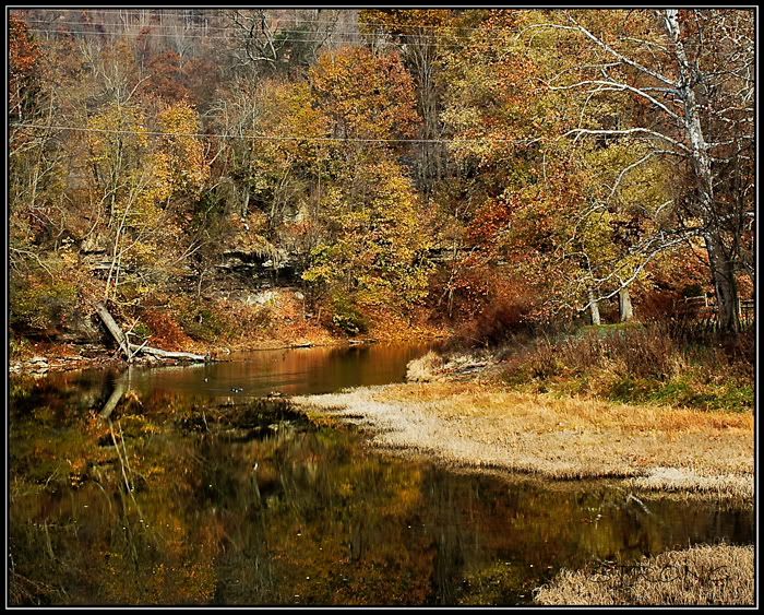
@*Steve. The first thing I see are the wires. Perhaps you can clone them ...
It is a very nice place with wonderful colors indeed. In terms of composition I would suggest you to place something in the foreground to give depth to the scene.
-
Always the same trend. Goood. Colors, DoF...
  Goood
Goood 
-
Thank you all. Sorry to be so telegraphic but I also need some time to myself as you may understand
-
9th November 2010, 10:39 AM #697

- Join Date
- Oct 2009
- Location
- Rainford, Merseyside, UK
- Posts
- 51
-
9th November 2010, 11:56 AM #698
-
9th November 2010, 06:45 PM #699
-
9th November 2010, 06:53 PM #700


 Reply With Quote


