 Helpful Posts: 0
Results 1 to 9 of 9
Thread: Mixed Reactions
-
6th February 2011, 06:51 PM #1
-
6th February 2011, 06:58 PM #2

- Join Date
- Mar 2009
- Posts
- 2,522
Re: Mixed Reactions
Al
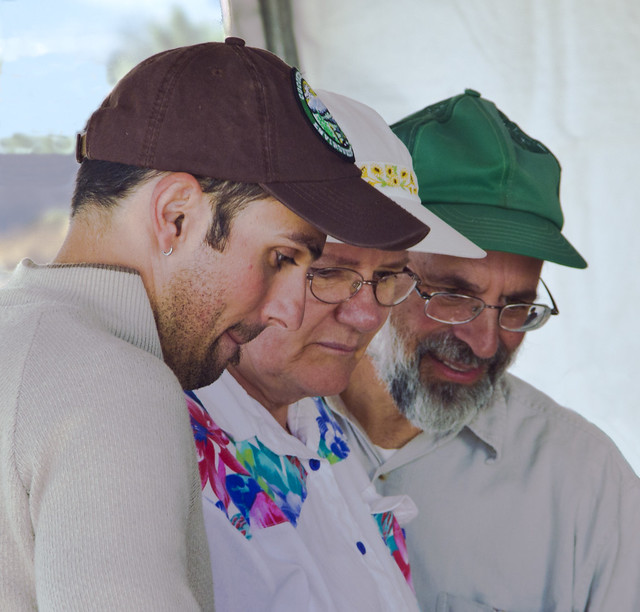
A very nice study and a true candid shot. The focus is spot on. The only thing I would say is that I think it needs a little more contrast. It looks ever so slightly washed.
-
7th February 2011, 12:21 AM #3
Re: Mixed Reactions
Hi Al,
A good capture and a good crop.
It could be improved in PP in several ways, well I think so

As Steve says, it is lacking contrast, but I would also;
Clone out pen of chap with green cap
Clone the outside background to remove the distracting angle of buildings (because I like the angle of the people)
White balance it by trial and error, it just looks a bit odd at the moment
Clone out the big dark shoulder on right background
It sounds bad with so many, but it isn't bad
just helping a little
Cheers,
-
7th February 2011, 01:31 AM #4
Re: Mixed Reactions
Thanks Steve and Dave.
I noticed the pen after I posted the shot, and it should definitely be erased (forehead slap; How did I miss that?). I agree the shoulder in the background should go too. Oddly enough, I remembered to use a gray card (in the tent shade), and the white balance is correct according to the gray card. I thought it had a slight greenish tint to it, but decided it was just me (or my monitor), but I'll tweak it a bit by eyeball... who cares what the gray card says if it just looks odd? Some more contrast certainly can't hurt. I never even looked at the angle of the building, but it's obviously not level. I oriented the camera with the people when I took the shot, so another lesson learned - people don't always stand up straight. As Dave mentioned, the most satisfactory solution is to clone out the building instead of tilting the people.
All good feedback, thanks again.
-
7th February 2011, 06:52 AM #5
Re: Mixed Reactions
I cloned out the distracting objects and increased the contrast a bit. As for color balance, it seems there was a bit of green tint to the image that I removed. Possibly this was due to the fact that I photographed the gray card while it was laying flat on a table top, so it didn't pick up any color cast from brightly colored objects outside the tent. Any objects standing upright could have a slight color cast from light scattered sideways from a nearby object, but that light wouldn't color the gray card. Another lesson learned: prop up the gray card in the direction from which you'll be shooting. In this case, I would have needed to shoot the gray card after the candid shot, since there's no way of knowing when/where such shots will happen.
Maybe I should have removed the tent pole while I was at it, but it's not too bad... and tent poles are never exactly vertical, anyway.
Here's the updated version:

-
7th February 2011, 11:30 AM #6

- Join Date
- Feb 2010
- Location
- Cambridge UK
- Posts
- 91
- Real Name
- John
Re: Mixed Reactions
I always like candid shots. I like trying them as well, there is is an element of uncertainty about the outcome, not to mention a risk of confrontation, which adds a certain frisson to the taking. Obviously one has to be much more careful than in the past and much more sensitive to a person's possible reaction but there is still a lot of enjoyment in it. I hope you keep keep it up.
In your shot the green cast you mentioned yourself spoils the effect for me. However, in Photoshop you can go a long way to eliminating it by hitting the Auto button in levels or curves so that should work in Elements also. I don't know about other programs but most must surely have a similar function. In Photoshop you can delve into curves a bit more and perhaps get an better result, but you can also get a worse one, so the auto button provides you with a useful target to beat. That's the way I like to use it and I have to say it can be quite humbling when you find it does as good (or better) job in a second as you can in an hour.
John
-
7th February 2011, 11:45 AM #7

- Join Date
- Feb 2010
- Location
- Cambridge UK
- Posts
- 91
- Real Name
- John
Re: Mixed Reactions
That has made a huge difference. That makes my post pretty superfluous. Very nice image nowAs for color balance, it seems there was a bit of green tint to the image that I removed.
JohnLast edited by Dave Humphries; 7th February 2011 at 10:02 PM.
-
7th February 2011, 02:39 PM #8
-
7th February 2011, 10:04 PM #9
Re: Mixed Reactions
Hi AL,
Yes, that's much better, well done,


 Reply With Quote
