 Helpful Posts: 0
Results 1 to 14 of 14
Thread: Death Becomes Her
-
13th February 2011, 08:17 AM #1
-
13th February 2011, 09:05 AM #2
Re: Death Becomes Her
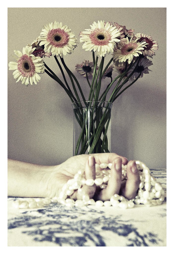
Raylee, I like the second one best. The processing suits it best. It gives it a older film look and the flowers look better on that one I think.
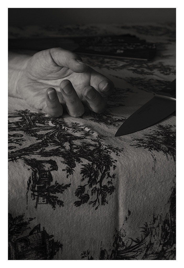
Normally I prefer black and white, but on these I think the softer light doesn't suit the macabre subject.
I like the third the least. I don't know if that's due to the (too) soft light I mentioned above, the fold in the tablecloth which draws too much attention or some bad memories from the past.
-
13th February 2011, 09:05 AM #3
Re: Death Becomes Her
Those are not self-portraits, they're suicide notes


-
13th February 2011, 09:26 AM #4
-
13th February 2011, 12:17 PM #5

- Join Date
- Mar 2009
- Posts
- 2,522
Re: Death Becomes Her
Raylee
I really like where you are going with your photography of late. You perfected your still life work but instead of resting on your laurels you have forged forward with vigour. I think the second image suits the subject matter best. The PP is spot on.
I am also very impressed with your work in the 'textures' thread. I will try and get round to commenting but I have left a bit of a backlog. I have been sniffing around Deviant Art. Apart from a very intellectual argument about art with the excellently minded Spanish gent I am not sure I like it. A bit of an artists Facebook really. There is some really inspiring stuff in there but it seems you have to wade through acres of adolescent American art students to get to it. I am reserving judgement for the time being
-
13th February 2011, 12:41 PM #6
Re: Death Becomes Her
Not been dead long then; the flowers are fresh, can't see any blood and it wasn't a robbery. She obviously stopped in or doesn't use nail polish, it is probably where she lived.
#1 is my favourite, I like pearls.
-
13th February 2011, 02:42 PM #7
-
13th February 2011, 08:31 PM #8

- Join Date
- Sep 2010
- Posts
- 2,064
Re: Death Becomes Her
Hi, Raylee! Now, this is very fun!!!
 I thought that it must, somehow, be an Agatha Christie that I had missed but....Ah, NO! Stay away from those potions! yech!
 (I'm still in an Agatha Christie mood, now, though, and am off to the library, tomorrow!!!
 )
)
When I saw these, earlier, I couldn't decide, really, which one that I liked best and had to think about it. I like it with the pearls, best - it's so feminine. Then, I thought that I like the classic idea of the B&W but, again, the femininity of the color. Is there such a thing as a colorized B&W photo? These are just the thoughts that came....
John, you're so funny and right! I think that Arith IS a detective and we never knew....
-
13th February 2011, 09:35 PM #9
Re: Death Becomes Her
Thanks everyone. I do like my crime novels. You may see more like this.
R
-
14th February 2011, 08:27 AM #10
Re: Death Becomes Her
Raylee, I definitely prefer the second image. It is easily one of those creep up on you jobs.
"Oh, look - pretty flowers, very well presented....But what's this here - looks like a dead hand, erk!!"
With that clever soft focus on the main event, you subvert our thinking in a very subtle way.
P.S. You like Iris, too!
-
14th February 2011, 08:45 AM #11
-
14th February 2011, 09:32 PM #12Moderator


- Join Date
- Feb 2009
- Location
- Glenfarg, Scotland
- Posts
- 21,402
- Real Name
- Just add 'MacKenzie'
Re: Death Becomes Her
Yep, with a knife in the picture, #3 needed blood. In #1 and #2 it could easily have been an overdose. But, for my money, in #2 that flower head on the extreme left looks mighty suspicious! But then again, the third from the left looks too innocent. Mmm?
Clever, clever idea. Well conceived and executed.
-
15th February 2011, 12:48 AM #13
-
15th February 2011, 04:22 AM #14
Re: Death Becomes Her
# 2 is showing the results of the poor summer we have had but otherwise your looking well.


 Reply With Quote
