This tutorial isn't yet public on the main site, but I'm sharing it here first:
Introduction to Portrait Lighting
This article covers the basics of using one light source for portraits, including topics such as hard vs. soft light, lighting direction and the Rembrandt style, distance, lighting styles, etc.
The style and diagrams are very different than other articles I've done in the past, so I'm curious what you all think of this look.
As usual, please let me know if you feel anything is unclear, if you notice any typos, or just want to add something from your own experience.
Many thanks!
PS: for more on this topic, you should also visit Colin's excellent school of portraiture.
 Helpful Posts: 0
Results 1 to 15 of 15
-
28th February 2011, 08:52 PM #1Administrator

- Join Date
- Apr 2008
- Location
- California, USA
- Posts
- 1,473
- Real Name
- Sean
New Tutorial: Introduction to Portrait Lighting
Last edited by McQ; 2nd March 2011 at 04:27 AM.
-
1st March 2011, 05:11 AM #2

- Join Date
- Nov 2010
- Location
- Panama City, FL
- Posts
- 3,540
- Real Name
- Chris
Re: New Tutorial: Introduction to Portrait Lighting
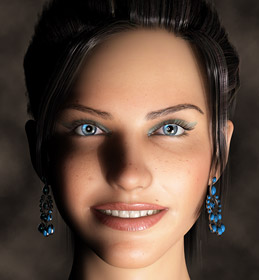
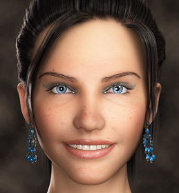
I would have preferred the use of a live model - or, at least one that looked alive and the same in each shot. Your before and after shots in the first setup are too much like those..."eat these pills and lose 100 lbs in three days," shots: Frown, drooped eyebrow and wrinkles, to smile and smooth.
Overall, it is good information and at least allows the average photographer the opportunity to understand the dynamics of how light affects an image from specific viewpoints, and the effects as per diffusion, etc. As always, it is another one of those great tutorials you always manage to put out. Good job, overall!
-
1st March 2011, 05:18 AM #3Administrator

- Join Date
- Apr 2008
- Location
- California, USA
- Posts
- 1,473
- Real Name
- Sean
Re: New Tutorial: Introduction to Portrait Lighting
Thanks for the feedback. Yes, I can see what you're saying with the two intro images and them reminding you of a before and after makeover advert. On the other hand, I wanted to give her more personality. I've been torn it though, and may yet still switch it so that they both have the same expression (but different lighting). We'll see if others concur.
Last edited by McQ; 1st March 2011 at 10:58 PM.
-
1st March 2011, 07:16 AM #4
Re: New Tutorial: Introduction to Portrait Lighting
Just curious, did you use a real person, or is she digitally created?
She looks kinda freeky .
.
-
1st March 2011, 07:26 AM #5rob marshall
Re: New Tutorial: Introduction to Portrait Lighting
Sorry, Sean, but I think the lighting and general appearance of the shot on the right looks no better than the one on the left. Different, but no better. Her face is ringed by a shadow. There is too much reflection on her lip-gloss which looks very unrealistic. That white/dark vertical band down the left side of her face is most intrusive. I prefer the eyes of the one on the left.
-
1st March 2011, 08:56 AM #6

- Join Date
- Dec 2008
- Location
- New Zealand
- Posts
- 17,660
- Real Name
- Have a guess :)
Re: New Tutorial: Introduction to Portrait Lighting
Hi Sean,
Not sure if this is a regional thing or not, but the "key triangle" lighting you describe is what we call "Rembrant lighting" (basically a more severe loop lighting when the shadow from the nose extends down to the corner of the mouth).
Other than that, all looks good to me. I think one of the classic paradoxes though is that in order for people to be able to see the lighting patterns one has to run high contrast ratios (perhaps 5:1 or more), whereas in real world classic portraiture (well the flattering type rather than the "artistic" type anyway) we typically run far more subtle contrast ratios.
-
1st March 2011, 09:23 AM #7Administrator

- Join Date
- Apr 2008
- Location
- California, USA
- Posts
- 1,473
- Real Name
- Sean
Re: New Tutorial: Introduction to Portrait Lighting
Yes, this should certainly be mentioned. Will work on it more tomorrow. My concern was that the lower tip of the triangle varies quite a bit with what many sources still call Rembrandt lighting. Some have the tip only going down to the nose (or not even that far), whereas the key triangle I showed (and the Rembrandt style which is just a more side-lit "loop lighting" that you mention) extends down to about the side of the mouth. I guess this also depends on how full the person's cheeks are though, and the classical Rembrandt style paintings tended to use people who were more voluptuous
 . The rationale is that having the tip extend all the way down to the mouth errs on the side of avoiding any chance of darkening under the eyes or within the eye socket.
-
1st March 2011, 03:43 PM #8
Re: New Tutorial: Introduction to Portrait Lighting
I liked it.
 Could do with a model though.
-
1st March 2011, 05:41 PM #9
Re: New Tutorial: Introduction to Portrait Lighting
I like the interactiveness of the different lighting positions. Very imformative. Like most others, I would have liked a real person better. Thanks!
-
1st March 2011, 06:56 PM #10

- Join Date
- Dec 2008
- Location
- New Zealand
- Posts
- 17,660
- Real Name
- Have a guess :)
Re: New Tutorial: Introduction to Portrait Lighting
Perhaps the other question is "how much emphasis is needed on Rembrant lighting anyway", given that - on "average/normal" size people, loop lighting is used probably 90% of the time for classic lighting. And as you mentioned, Rembrant lighting is trickier than many might first think because (a) it looks aweful unless you get a decent amount of fil light, and (b) the range of angles is quite restricted if one wants to avoid "dead eye" on the far side.
I think personally I probably use it the least of all the lighting patterns.

-
1st March 2011, 07:20 PM #11Administrator

- Join Date
- Apr 2008
- Location
- California, USA
- Posts
- 1,473
- Real Name
- Sean
Re: New Tutorial: Introduction to Portrait Lighting
With regards to physical model vs digital simulations: I agree that there are certainly lots of advantages to the former. However, for an article about lighting I wanted to be able to separate out any subtle differences due to the light from those due to the expression or person, etc. Many other places that have attempted something similar ended up using a manikin so that the person/expression is kept constant, which I thought was much more objectionable (and less accurate texture-wise) than a rendering.
With regards to Rembrandt vs loop lighting: these and others will all be mentioned in an article which compares the most common styles, and loop will certainly receive the most prominent position. This is also why it was mentioned with an asterisk whenever the key triangle was first mentioned, and the width of the key triangle was discussed as being the least adhered to. For the introductory article though, I felt that (i) starting off with creating a triangle of illumination was a little more well-defined and easier than creating a loop and (ii) this is the oldest and most classical/traditional style so it was a good place to start.
-
1st March 2011, 10:58 PM #12Administrator

- Join Date
- Apr 2008
- Location
- California, USA
- Posts
- 1,473
- Real Name
- Sean
-
1st March 2011, 11:17 PM #13

- Join Date
- Nov 2010
- Location
- Panama City, FL
- Posts
- 3,540
- Real Name
- Chris
Re: New Tutorial: Introduction to Portrait Lighting
Much better...and it does make a difference to the better side of how light works as opposed to how a model may be made to look badly under disparaging lighting conditions. As always, a good tutorial.
-
3rd March 2011, 01:01 AM #14Administrator

- Join Date
- Apr 2008
- Location
- California, USA
- Posts
- 1,473
- Real Name
- Sean
-
3rd March 2011, 04:35 AM #15
Re: New Tutorial: Introduction to Portrait Lighting
Thanks Sean,
I do not use a lot of set lighting but I still like reading about it as aspects relate to use of light generally.


 Reply With Quote

