Results 101 to 120 of 1372
Thread: Macro flower photographs
-
23rd April 2011, 12:29 PM #101

- Join Date
- Aug 2009
- Location
- Canada
- Posts
- 3,113
- Real Name
- Wendy
More from last year
Last edited by ScoutR; 23rd April 2011 at 10:39 PM. Reason: Replaced #4
-
23rd April 2011, 04:24 PM #102
Re: Macro flower photographs
Wendy, can I get away with saying that I can see that these are last year's photos? I think it would be most interesting to 'hear' your own comments because your work has progressed so far in such a short space of time, that I don't think you need anyone at CiC to offer C&C.
All are potentially cracking shots but need that final tweak to bring them to their best.
I await your own honest assessment which will be far more informed than mine.
-
23rd April 2011, 06:09 PM #103
-
23rd April 2011, 07:34 PM #104

- Join Date
- Aug 2009
- Location
- Canada
- Posts
- 3,113
- Real Name
- Wendy
Re: Macro flower photographs
Mike, the thing is I seem to be stuck. I know I got better last year than I was the year before, I want to get better this year too, but It's harder now - of course time will tell when I get a few more flowers to practise on.
I can and always will appreciate feedback. There is always more to learn and sometimes it's hard to see what's missing or how to improve ones own shots. Besides that most of the members here are far more experienced, talented and creative than I am.
OK so my honest evaluation on these shots
#1.
I like the composition, and colour, but perhaps better light to make it pop a bit. I don't think it can be done in PP without overcooking, but needs to be done in the camera. After taking a second look, better focus and detail on the flower would have made a huge difference on this shot - what do you think
#2.
Same as above, except perhaps this one could benefit from more saturation in PP without toasting it, and again better focus detail and texture on the flowers
#3.
I kind of like this one, perhaps a bit more DOF so the centre of the front dandelion was all in focus.
#4.
I don't know??? I really love this shot, but again it's not quite there. I don't know what to do with it though except of course the same old same old - better focus, detail and texture in the flower.
Well that's what I think - what do you think (Mike or anyone else)
Wendy
#3.Last edited by ScoutR; 23rd April 2011 at 07:48 PM. Reason: added photos
-
23rd April 2011, 08:57 PM #105
Re: Macro flower photographs
i like No4 wendy, but i don't like the borders

-
23rd April 2011, 10:42 PM #106

- Join Date
- Aug 2009
- Location
- Canada
- Posts
- 3,113
- Real Name
- Wendy
Re: Macro flower photographs
Thanks for the honesty Vandenberg, no need for the embarassed smiley. Borders were my thing last year. I still like to see how different borders work with different shots, but I don't use them so much for posting anymore.
Wendy
-
23rd April 2011, 11:14 PM #107

- Join Date
- Apr 2011
- Location
- Toronto
- Posts
- 57
- Real Name
- Chris
Re: Macro flower photographs
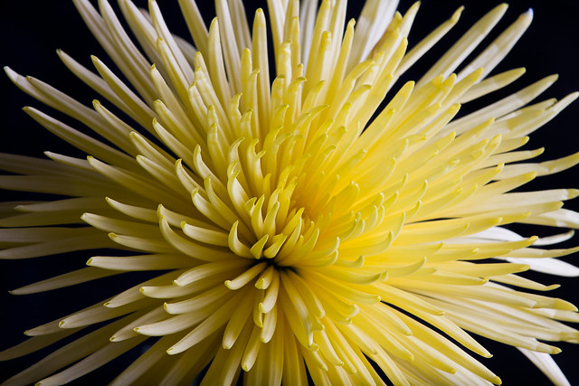
I still have a bit of the blue between the petals to remove.

Yellow Spider Mum Flower by Christopher Brian's Photography, on Flickr
-
24th April 2011, 02:46 AM #108
-
24th April 2011, 03:35 AM #109

- Join Date
- Aug 2009
- Location
- Canada
- Posts
- 3,113
- Real Name
- Wendy
Re: Macro flower photographs
Last edited by ScoutR; 24th April 2011 at 03:37 AM. Reason: add EXIF
-
24th April 2011, 06:52 AM #110
-
24th April 2011, 07:36 AM #111
Re: Macro flower photographs
Forgetting any focusing issues, which are far too hard to see clearly at this resolution, and with the preface that these are all lovely flower shots ....
#1 I would have been inclined to crop a little tighter to lose some of the green foliage, which although nicely out of focus is quite distracting. Have you thought of desaturating the green a touch to help emphasise the purple and maybe rotate the image slightly to get the stalk vertical.
#2 Your image is quite flat. A touch of unsharp mask will make this pop.
3# Similar to #2, although you have a different problem than before, given that the background flower has more luminance. You would have to selectively treat the foreground head to get the balance right. I like it.
#4 Do you like the green leaf? I wonder if the image would be more powerful if you cloned it out, and then rotated the head so that it is on a true diagonal. I do like your pp on this one.
So there, I'm being honest but probably ill-informed as I'm no flower photographer. I wish my skills (photographic!!) would develop at a similar rate to yours. Keep 'em coming they're a joy to view.
M
-
24th April 2011, 05:39 PM #112

- Join Date
- Apr 2011
- Location
- Toronto
- Posts
- 57
- Real Name
- Chris
Re: Macro flower photographs
-
25th April 2011, 03:54 AM #113

- Join Date
- Aug 2009
- Location
- Canada
- Posts
- 3,113
- Real Name
- Wendy
Re: Macro flower photographs
Thanks Mike for taking the time. I've followed up on your suggestions and you have proven a point made in my previous post.
See below for the results. Just a few minor tweaks and I think they are much better.I can and always will appreciate feedback. There is always more to learn and sometimes it's hard to see what's missing or how to improve ones own shots. Besides that most of the members here are far more experienced, talented and creative than I am. Thank you CiC has and I hope will continue to be the best school for me.
#1 Original
#1 With suggested changes done to the best of my ability. Long story, but I had to work on the jpg for this one. The changes will be better when I find the RAW file
#2 Original
#2 with suggested changes.
#3 Original
#3 with suggested changes
#4 Original
#4 with suggested changes. Not sure about the frame on this one, Kind of undecided on whether or not the leaf should stay or go.
Sorry about the long post, but I think these are all big improvements, and I would not have thought to do any of them on my own. So, Thank you Mike. I'm glad you think I'm improving but I'll never get to the point where CiC members can't help out.
Wendy
-
25th April 2011, 08:46 AM #114
Re: Macro flower photographs
Oh Wendy ........ I can feel a lesson coming up from somebody on file management !!!
As for your edits, the important thing is whether or not you are happy with any alterations. Sitting at a computer screen criticising other peoples work is easy, but it is your interpretation of what you photographed that counts. If suggested alterations can help you achieve your aims ... great, but don't let us interfere with your vision.
-
26th April 2011, 01:35 AM #115
-
26th April 2011, 07:58 AM #116
-
26th April 2011, 08:02 AM #117
-
26th April 2011, 04:07 PM #118
-
26th April 2011, 04:58 PM #119

- Join Date
- Apr 2011
- Location
- Washington D.C.
- Posts
- 23
- Real Name
- James
-
27th April 2011, 07:33 AM #120

 Helpful Posts:
 Reply With Quote


