Results 321 to 340 of 1372
Thread: Macro flower photographs
-
6th July 2011, 01:58 PM #321

- Join Date
- Jan 2011
- Location
- Kennewick, WA
- Posts
- 565
- Real Name
- Bob R
Re: Macro flower photographs
-
6th July 2011, 02:16 PM #322
-
6th July 2011, 06:44 PM #323

- Join Date
- Jan 2011
- Location
- Kennewick, WA
- Posts
- 565
- Real Name
- Bob R
Re: Macro flower photographs
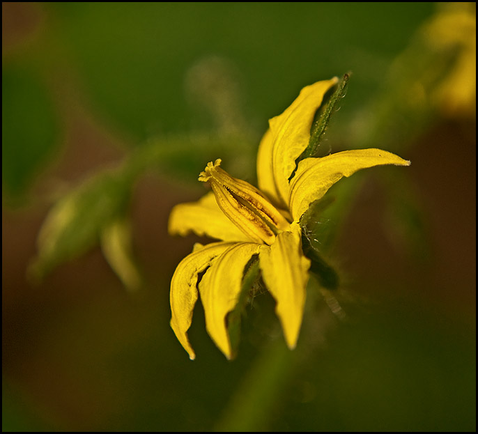
Yes, I knew it would be a bit on the low side, but was trying to eliminate the rest of the Fern behind the flower. But I do agree with you or I would not have asked the question. I've been playing again with some wilted flowers, I just have to find that happy medium where I can have both.

-
7th July 2011, 02:01 AM #324

- Join Date
- Jan 2011
- Location
- Kennewick, WA
- Posts
- 565
- Real Name
- Bob R
Re: Macro flower photographs
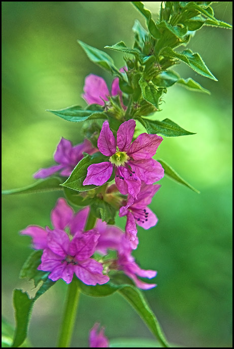
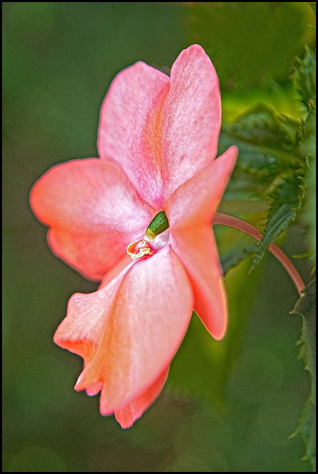
Here is an example of the pic above and this is only for DOF, Perhaps I was too close the first time as well 6" no cropping, this time I backed off to 48" and did some cropping. I tried various f stops and shutter speeds this is what seemed most acceptable to me,
f11 at 1/32 sec. ISO 200 FL-100mm using manual --- what do you think?

Last edited by SpiderBob; 7th July 2011 at 02:10 AM.
-
7th July 2011, 07:57 AM #325
Re: Macro flower photographs
I like this photo better than the first one, partly I think because the colour of the flower is in nice contrast with the darker green background. It looks very delicate. But I would try the other closer focus as well with this kind of F stop and see what you get. The first shot you took was more from the side and I found the other colours in the background were distracting me a bit. You might try a few different angles and see what you can do with the background (sometimes you just can't get rid of some of the background, but hey, that's nature for you).
What kind of lens are you using for this by the way?
-
7th July 2011, 12:32 PM #326
Re: Macro flower photographs
What an amazing collection of flower photos
I would like to share a couple of mine

Eucalpypt Flower by indigo37, on Flickr
Eucalpypt Flower

Bird of Paradise by indigo37, on Flickr
[Bird Of Paradise Flower
-
7th July 2011, 01:10 PM #327
Re: Macro flower photographs
Welcome here Wendy!
I like your first one best. I guess what I am noticing about myself is that I really like delicate (looking) flowers. I guess a bit more zoom or crop would bring out the flower even better, you have a few open spaces now at the bottom and top that distract slightly.
-
7th July 2011, 01:27 PM #328

- Join Date
- Jan 2011
- Location
- Kennewick, WA
- Posts
- 565
- Real Name
- Bob R
-
7th July 2011, 02:06 PM #329
-
8th July 2011, 03:34 AM #330

- Join Date
- Aug 2009
- Location
- Canada
- Posts
- 3,113
- Real Name
- Wendy
-
8th July 2011, 08:13 AM #331
-
8th July 2011, 12:37 PM #332

- Join Date
- Sep 2010
- Posts
- 2,064
Re: Macro flower photographs
I'm glad Peter said it because I was second guessing myself, there - campanula or bellflower.
The rose is lovely, too - I have a William Shakespeare rose that is so tremendously beautiful - loads of ruffly petals and the color....! I just can't get it. I've finally pressed the "go" button on ordering a gray card - those deep colors are impossible to capture. SO! Lovely job, Wendy!
-
8th July 2011, 01:51 PM #333

- Join Date
- Aug 2009
- Location
- Canada
- Posts
- 3,113
- Real Name
- Wendy
Re: Macro flower photographs
Thanks Peter and Katy. I was thinking Bellflower too. The flower is very similar to the Bellflower that I purchased this year and have shown in a previous post, but the leaves and placement of the flowers on the stem are entirely different, so I was not sure. I looked up some bellflowers last night but was too tired to go through them all.
Katy, I know what you mean about these deep colours. You would not believe how many shots of this red rose I have binned. This one still does not do it justice, and as always with most of my shots, there are photographic faults that I just can't seem to conquer (i think I will call it my style and try to make the best of it ) but on my screen the colours look pretty true. I'm having trouble with the yellow and pink sweetheart rose also. I've taken so many, and I do love some of the shots, but with my current skills some flowers just look better in real life than in any shot I have managed to get.
Thanks for the feedback, I am off to try and identify my 2 types of Bellflower
Wendy
-
11th July 2011, 03:54 PM #334

- Join Date
- Aug 2009
- Location
- Canada
- Posts
- 3,113
- Real Name
- Wendy
-
19th July 2011, 01:41 AM #335

- Join Date
- Aug 2009
- Location
- Canada
- Posts
- 3,113
- Real Name
- Wendy
Re: Macro flower photographs
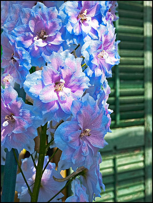
Not sure how these will go over. I'm not quite where I want to be with these, but they are purposely out of focus. I have this figured out in my head how I want it to look and I'm getting close, but not quite there yet. These are more about the blending of the colours and in a way I'm trying to photograph florals the way they look to me from a distance, which is not sharp and detailed but just colours and patterns, if that makes sense.

#1. This different coloured lobelia in my planter caught my eye. It's taken very close up with 8x close up filters, but it is supposed to look like it is far away. Maybe it just looks like it would to a person with poor vision, I don't know, like I say, I'm not quite where I want to be. Any comments or suggestions are appreciated.
#2. Dahlia; again taken with close up filters, but not going for detail, but the blending and patterns of colours. C&C welcome and appreciated.
Wendy
-
19th July 2011, 08:22 AM #336
Re: Macro flower photographs
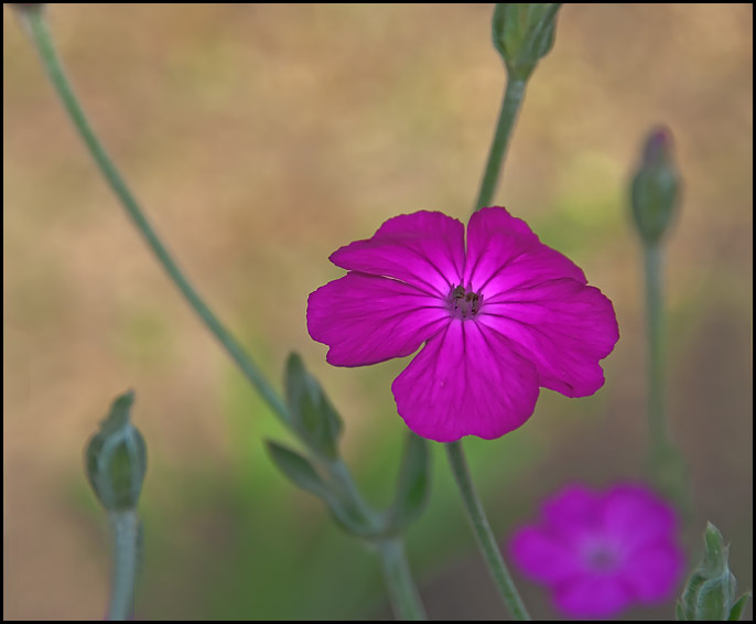
why do photographers insist on putting flowers in the bull-eye of the frame? It's the way we think... Gee what a nice flower and click..
-
19th July 2011, 02:51 PM #337

- Join Date
- Sep 2010
- Posts
- 2,064
-
19th July 2011, 03:23 PM #338
-
19th July 2011, 03:41 PM #339

- Join Date
- Sep 2010
- Posts
- 2,064
Re: Macro flower photographs
Wendy, it's that impressionistic photography thing - I keep wondering if it exists. Let's you and I say it does and start a movement!
 I really like the last one - the sweep of the petals is still softly there - even though it's oof and the whole thing speaks delicacy and peacefulness. So, maybe, when it's oof - is still has to speak or have a reason for being in the frame. (I just came up with that - what do you think? I don't know what I'm talking about but it sounds good to me.
 )
)
Well, if you figure it out - let me know.
-
19th July 2011, 03:49 PM #340
Re: Macro flower photographs
I like them too, Wendy. I also don't agree with Paul's comment about being centered... the first one is fine because the flower bends into the center, giving pleasing leading line - at least for me. And the second seems to spiral into the center like a vortex sucking me into the shot - had it not been centered, I don't think it would have worked that way. Additionally, the square crop tends to balance it a bit as well.
Count me as a fan.
- Bill

 Helpful Posts:

 Reply With Quote
 ? Yes, that is definitely on the low side for this kind of photo. I use F/11 or higher and shutterspeed of 1/250 or slightly higher for this. You might experiment a bit and see what your camera can handle.
