 Helpful Posts: 0
Results 1 to 6 of 6
Thread: Full Moon Weekend
-
22nd March 2011, 01:52 AM #1
-
22nd March 2011, 02:31 AM #2
Re: Full Moon Weekend
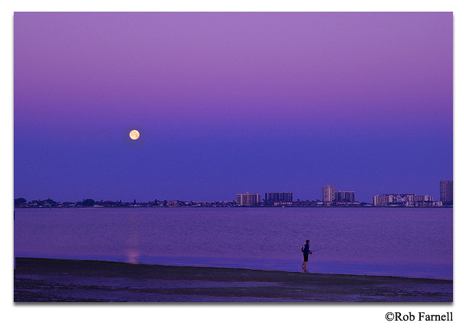
I like #1 and #4 on this series, Rob. The water reflection on #1 compliment the way you composed the shot. As for #4, I like the way you used the moon and the fisherman as your contrasting subject. My only comment is that I wish you had included more shore detail so the fisherman is not totally at the far end corner of the frame for balance. Nice work!

-
22nd March 2011, 11:27 AM #3
-
22nd March 2011, 11:57 AM #4
Re: Full Moon Weekend
Rob, here's one possible edit to the shot to make it balanced.

I added some shore area, Leveled the horizon and positioned it 1/3 from the bottom (using the rule of thirds in composition), moved the moon and its water reflection towards the inside of the frame for balance, and also I moved the fisherman a little bit for some drama. This is just a suggestion. Sometimes, it doesn't hurt to edit your work if necessary to bring out the vision that you had in your mind when you took the shot. Hope I did not offend you. Thanks.
-
22nd March 2011, 04:54 PM #5
Re: Full Moon Weekend
Jiro,
Not offended at all. It does look much better. I think it's like writting, you write something and read it a bunch of times and you start to miss little things that a new reader would pick up on right away.
What program did you use for the edits?
Rob
-
22nd March 2011, 06:56 PM #6


 Reply With Quote

