 Helpful Posts: 0
Results 1 to 15 of 15
Thread: Newbie here,What's lacking
-
13th February 2009, 03:28 AM #1
Newbie here,What's lacking
-
13th February 2009, 03:47 AM #2
Re: Newbie here,What's lacking
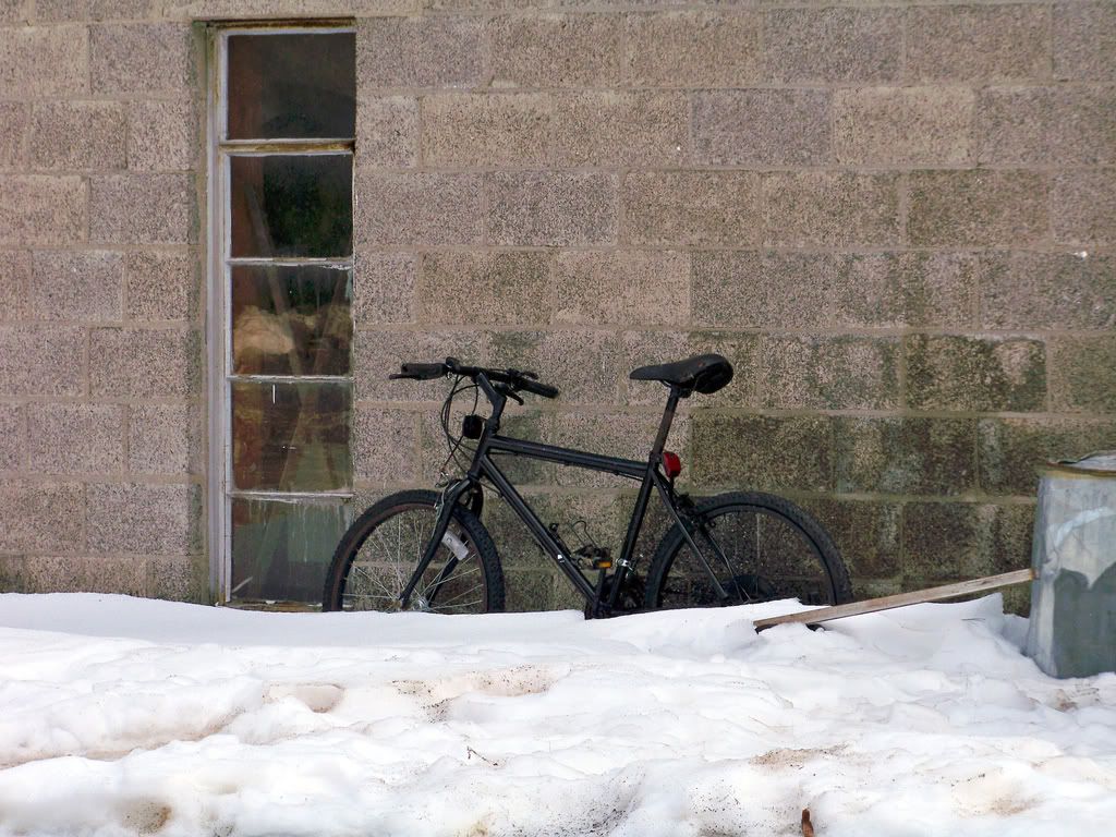
well, what exactly caught your eye?...I can see a crop on the window (although the bike is in the way...)
-
13th February 2009, 03:52 AM #3
Re: Newbie here,What's lacking
I guess the image of the bike leaning against the wall, I remember that image somewhere in B&W.... or I could be mistaken
-
13th February 2009, 04:15 AM #4

- Join Date
- Dec 2008
- Location
- New Zealand
- Posts
- 17,660
- Real Name
- Have a guess :)
Re: Newbie here,What's lacking
Hi Jack (don't say that too loud on an aeroplane!),
First up, welcome to the forums - great to have you with us. If you get a chance, pop a reply onto the welcome thread so we can all welcome you properly
With regards to the image - Hmmm - tough one. Personally, I think it's exposed and processed nicely enough - might be possible to coax a bit more saturation / texture / range out of it, but at the end of the day it just looks to me like a relatively bland scene.
I've struck this kind of thing before myself - I see something that catches my eye - I photograph it (sometimes several times over several days), but for some reason the beauty we saw just doesn't translate into something that appeals in a photograph.
Tell you what though - you did VERY well to get it displaying inline first time without help - not many manage to do that!
-
13th February 2009, 04:21 AM #5
Re: Newbie here,What's lacking
Thank for the kind words,
-
13th February 2009, 08:18 AM #6
Re: Newbie here,What's lacking
Hi & welcome Jack
this sort of image reminds of university days mid 60s when the new buildings were mostly brutalist concrete and one was never quite sure whether it was 'sculpture' or abandoned bicycles on the side. Bicycles tended to be nicked, so more probably sculpture. I don't think the garbage can to the right is helping, maybe a square crop.....hey that looks like rather a good bicycle to be left
-
13th February 2009, 10:24 AM #7
Re: Newbie here,What's lacking
Hi Jack, from a newbie to a newbie....maybe if you could have taken the piece of wood and the container out of the scene, you still can do it with some PP, the viewer attention will have just two objets to focus, the bike and the window, however, if you follow the "rule of thirds" I believe that one line with two intersections will be placed exactly where the window is, therefore the "main" attention will be the window.
Also I do believe, that the window has some glare that catches the attention, maybe if you reduce it might help.
-
14th February 2009, 01:41 AM #8
Re: Newbie here,What's lacking
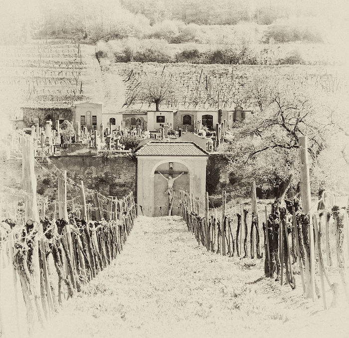
The description reminds me of this (it's been edited to include about 15 colours hence the hatching and banding, a necessary evil of the past considering where I got the image)

Might not be the one you meant but it's always stuck in my mind (was the first image I got my bootloader to display a while back, I found that pic on a website about the same thing). I used to see it every day for a while so that's why I think of it when pics of bikes come to mind. I always liked something about it and think the main thing is the placement of the bike. A recapture of the image to recompose with rule of 3rds in mind would be ideal but not possible I'm guessing (something I can't advise on since I'm rubbish at composition, I have tips to make you worse though you'll feel better I guarantee, with hindsight that is).
The only thing I can think is remove the wood and bin in pp because they distract from the bike. Window is more awkward to remove easily. Colour is hard one because the bike is dark and the rest of the scene isn't particularly vibrant. Perhaps making the bike stand out by tweaking contrast is an option. Others here more likely to give you better advice on this (and how etc) but maybe try lightening stuff other than the bike and darken the bike if need be (but keep highlight details on it or make some so it stands out) to make a huge contrast which will pull your eyes to the bike being the opposite end of everything else in the image. Might not work on the window (brightening it I mean). Taking all the local contrast/variation out the window would help so it seems bland and doesn't stand out at all, that coupled with bringing the bike "out" should make your eyes stick to the bike in my opinion. Hope some of this helps, Dave
-
14th February 2009, 07:07 AM #9
Re: Newbie here,What's lacking
Hi Jack, what about this:

I know that is not WOW but here is what I did:
- Pre-sharpening
- Some straightening
- removed the wood and the bin
- "cleaning" the snow
- applied a filter to contrast the colors
- enhanced some color of the bike, e.g. the red color of the stop light, the rust down the seat and the bike.Last edited by Daniel Salazar; 14th February 2009 at 07:12 AM.
-
14th February 2009, 01:04 PM #10
-
15th February 2009, 04:37 AM #11
Re: Newbie here,What's lacking
That's it Dave. That's probably what was lacking.
Very nice.
-
15th February 2009, 04:40 AM #12
Re: Newbie here,What's lacking
I'm still working on composition and thirds and such.
-
15th February 2009, 05:50 AM #13

- Join Date
- Jan 2009
- Location
- Sydney, Australia
- Posts
- 362
Re: Newbie here,What's lacking
I like David's rework on this photo.
-
15th February 2009, 11:17 AM #14
Re: Newbie here,What's lacking
I've just twigged Colin's comment re "Hi Jack"!!!! Must be my age.
David
-
20th February 2009, 09:28 AM #15
Re: Newbie here,What's lacking
this pic is packed with different things that are competing with each for the viewers attention
 but the best part is all these things lack point of interest,or beauty or color to impress a viewer
 the cycle,the window,the foreground, the wall, etc have taken equal share in size,in the frame,but none can keep the viewer glued to itself for long
 very strange pic this one!
 i do like the tweaks the this pic has undergone in the ps......specially mrdavids tweak


 Reply With Quote

