 Helpful Posts: 0
Results 1 to 20 of 31
Thread: Found me some fog this morning
-
9th April 2011, 01:56 PM #1

- Join Date
- Nov 2010
- Location
- Panama City, FL
- Posts
- 3,540
- Real Name
- Chris
Found me some fog this morning
-
9th April 2011, 02:55 PM #2

- Join Date
- Mar 2009
- Posts
- 2,522
Re: Found me some fog this morning
Chris
Nos 2 and 3 have a beautiful liquid feel to them. No 3 is particularly good, although I would be tempted to remove the boats in the background. I think I commented about a certain quality of production relating to a rose shot you did a couple of weeks ago. These images have the same polish to them.
-
9th April 2011, 02:59 PM #3
Re: Found me some fog this morning
Nice little fog series Chris. My favorite is #3.
-
9th April 2011, 03:17 PM #4
Re: Found me some fog this morning
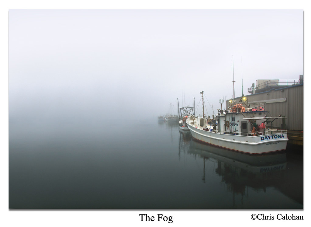
I prefer the first Chris.
I really like the simplicity of it. The boat pointing in the opposite direction of the graduate white to black and the contradiction between empty space and boats.
Very good shot. I like it!
-
9th April 2011, 03:51 PM #5
Re: Found me some fog this morning
Chris,
As for #1, the bright orange on the boat just spoils it (for me, anyway). These spots could be burned or de-saturated a bit (or more than a bit) because as it is, it's the only thing my eye will look at.
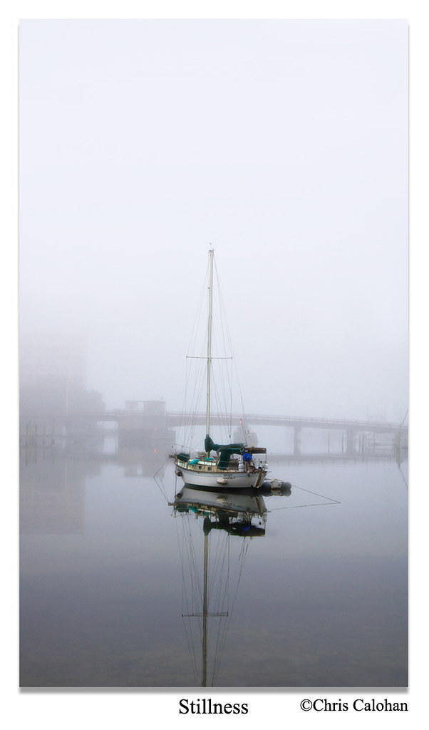
#2 is just about perfect. You nailed this one. The reflection of the tall mast really emphasizes the stillness and serenity. Even the ropes rigged to the mast are visible in the reflection. Well done indeed.
I like #3, and I'd probably like it even more if it weren't right next to #2, which sort of steals the show, imo. Maybe Steve has a good point about the boats in the background, or maybe it just needs something in the foreground to give me a sense of "being there", as #2 does.
-
9th April 2011, 04:02 PM #6
Re: Found me some fog this morning
Your recent shots are showing a lot more character, Chris; stronger messages if I may say. I like #1 a lot. A small comment though, I prefer more empty space on top to show more fogginess on the shot so I'll forego with the detail on the sea in exchange for that space. For #2 another stellar shot. Another request would be to get rid of the foreground element as it does not seem to add a lot to the message. In exchange, I would love to see more empty space also on top for drama. #3 is borderline for me. I like it but I am looking for something but I don't know what that is. Maybe some more drama on the tone contrast by lightening some part of the fog and darkening the shadow and lower part of the dock, something like that. If I were to pick which among this 3 is the probable winner I'd pick #1 without a sweat.
 Thanks for sharing Chris, another set of good shots coming from your good buddy D7000.
-
9th April 2011, 05:10 PM #7Moderator


- Join Date
- Feb 2009
- Location
- Glenfarg, Scotland
- Posts
- 21,402
- Real Name
- Just add 'MacKenzie'
Re: Found me some fog this morning
I just stopped and stared at #1. I didn't realise there was a #2 and a #3 until I scrolled down. By that time I was completely besotted by #1. I love the way you've darkened up the foreground to really contrast with the fog. And I love the way you have the Daytona just 'popping' in the image. And I love the way you have left that space on the left hand side so that we can look out to seas beyond the boats. Gorgeous.
Last edited by Donald; 9th April 2011 at 06:20 PM.
-
9th April 2011, 07:34 PM #8

- Join Date
- Nov 2010
- Location
- Panama City, FL
- Posts
- 3,540
- Real Name
- Chris
-
9th April 2011, 07:37 PM #9
-
9th April 2011, 07:48 PM #10

- Join Date
- Nov 2010
- Location
- Panama City, FL
- Posts
- 3,540
- Real Name
- Chris
-
9th April 2011, 07:54 PM #11
Re: Found me some fog this morning
If you're talking about the 2 yellow lights, I don't think so. It adds good element to the whole image so I wouldn't touch a thing. I would still prefer to add more mystery by adding a lot of negative space on the left and top part though. Hehe. Sorry, your shot reminded me of numerous old movies I've watched that's why I already have a good idea on how to manipulate it in my mind.

-
9th April 2011, 08:02 PM #12
Re: Found me some fog this morning
I like the neon jackets toned down a little. It is slight and the shot is nice either way. Infact I had not really found the jackets distracting until you pointed them out.
-
9th April 2011, 08:03 PM #13

- Join Date
- Nov 2010
- Location
- Panama City, FL
- Posts
- 3,540
- Real Name
- Chris
Re: Found me some fog this morning
It would take a lot of Cloning, expanding, etc to get more space out there...next time I shoot it, I'll leave more space over there..but I do have a condo to contend with as well over there.
Did play with htis one a bit..took out two boats from the background and eliminated the sawgrass in the foreground...but not sure on that one yet. I thought the grass gave reason why there wasn't more reflected mast...


-
9th April 2011, 08:07 PM #14
Re: Found me some fog this morning
This one I would have to agree with you on the grass Chris. Whithout it I look for more reflection and the shot looks chopped off. The mast leads my eye off the bottom of the page.
-
9th April 2011, 08:15 PM #15
-
9th April 2011, 08:25 PM #16
Re: Found me some fog this morning
-
9th April 2011, 08:33 PM #17

- Join Date
- Nov 2010
- Location
- Panama City, FL
- Posts
- 3,540
- Real Name
- Chris
Re: Found me some fog this morning
Thanks, Paul...I've been in there doing the same thing this morning..but wanted as much feedback on the color as I could get before going down another road.
-
9th April 2011, 08:35 PM #18
-
9th April 2011, 08:37 PM #19

- Join Date
- Nov 2010
- Location
- Panama City, FL
- Posts
- 3,540
- Real Name
- Chris
-
9th April 2011, 08:38 PM #20

- Join Date
- Nov 2010
- Location
- Panama City, FL
- Posts
- 3,540
- Real Name
- Chris
Re: Found me some fog this morning
you gotta knock off that caffiene, willie


 Reply With Quote


