OVERVIEW OF COLOR MANAGEMENT
"Color management" is a process where the color characteristics for every device in the imaging chain is known precisely and utilized in color reproduction. It often occurs behind the scenes and doesn't require any intervention, but when color problems arise, understanding this process can be critical.
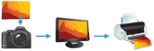
In digital photography, this imaging chain usually starts with the camera and concludes with the final print, and may include a display device in between:

Many other imaging chains exist, but in general, any device which attempts to reproduce color can benefit from color management. For example, with photography it is often critical that your prints or online gallery appear how they were intended. Color management cannot guarantee identical color reproduction, as this is rarely possible, but it can at least give you more control over any changes which may occur.
THE NEED FOR PROFILES & REFERENCE COLORS
Color reproduction has a fundamental problem: a given "color number" doesn't necessarily produce the same color in all devices. We use an example of spiciness to convey both why this creates a problem, and how it is managed.
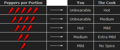
Let's say that you're at a restaurant and are about to order a spicy dish. Although you enjoy spiciness, your taste buds are quite sensitive, so you want to be careful that you specify a pleasurable amount. The dilemma is this: simply saying "medium" might convey one level of spice to a cook in Thailand, and a completely different level to someone from England. Restaurants could standardize this based on the number of peppers included in the dish, but this alone wouldn't be sufficient. Spice also depends on how sensitive the taster is to each pepper:

To solve your spiciness dilemma, you could undergo a one-time taste test where you eat a series of dishes, with each containing slightly more peppers (shown above). You could then create a personalized table to carry with you at restaurants which specifies that 3 equals "mild," 5 equals "medium," and so on (assuming that all peppers are the same). Next time, when you visit a restaurant and say "medium," the waiter could look at your personal table and translate this into a standardized concentration of peppers. This waiter could then go to the cook and say to make the dish "extra mild," knowing all too well what this concentration of peppers would actually mean to the cook.
As a whole, this process involved (1) characterizing each person's sensitivity to spice, (2) standardizing this spice based on a concentration of peppers and (3) being able to collectively use this information to translate the "medium" value from one person into an "extra mild" value for another. These same three principles are used to manage color.
COLOR PROFILES
A device's color response is characterized similar to how the personalized spiciness table was created in the above example. Various numbers are sent to this device, and its output is measured in each instance:
| Input Number (Green) | Output Color | ||
| Device 1 | Device 2 | ||
| 200 | → | ||
| 150 | → | ||
| 100 | → | ||
| 50 | → | ||
Real-world color profiles include all three colors, more values, and are usually more sophisticated than the above table — but the same core principles apply. However, just as with the spiciness example, a profile on its own is insufficient. These profiles have to be recorded in relation to standardized reference colors, and you need color-aware software that can use these profiles to translate color between devices.
COLOR MANAGEMENT OVERVIEW
Putting it all together, the following diagram shows how these concepts might apply when converting color between a display device and a printer:

Characterized
Input Device
RGB
Color Profile
(color space)


Standardized
Profile Connection Space


Characterized
Output Device
CMYK
Color Profile
(color space)
- Characterize. Every color-managed device requires a personalized table, or "color profile," which characterizes the color response of that particular device.
- Standardize. Each color profile describes these colors relative to a standardized set of reference colors (the "Profile Connection Space").
- Translate. Color-managed software then uses these standardized profiles to translate color from one device to another. This is usually performed by a Color Management Module (CMM).
The above color management system was standardized by the International Color Consortium (ICC), and is now used in most computers. It involves several key concepts: color profiles (discussed above), color spaces, and translation between color spaces.
Color Space. This is just a way of referring to the collection of colors/shades that are described by a particular color profile. Put another way, it describes the set of all realizable color combinations. Color spaces are therefore useful tools for understanding the color compatibility between two different devices. See the tutorial on color spaces for more on this topic.
Profile Connection Space (PCS). This is a color space that serves as a standardized reference (a "reference space"), since it is independent of any particular device's characteristics. The PCS is usually the set of all visible colors defined by the Commission International de l'éclairage (CIE) and used by the ICC.
Note: The thin trapezoidal region drawn within the PCS is what is called a "working space." The working space is used in image editing programs (such as Adobe Photoshop), and defines the subset of colors available to work with when performing any image editing.
Color Translation. The Color Management Module (CMM) is the workhorse of color management, and is what performs all the calculations needed to translate from one color space into another. Contrary to previous examples, this is rarely a clean and simple process. For example, what if the printer weren't capable of producing as intense a color as the display device? This is called a "gamut mismatch," and would mean that accurate reproduction is impossible. In such cases the CMM therefore just has to aim for the best approximation that it can. See the tutorial on color space conversion for more on this topic.
This all may seem a bit confusing at first, so for a more in-depth explanation of color spaces, profiles, and conversion, please visit:
Color Management, Part 2: Color Spaces
Color Management, Part 3: Color Space Conversion
